1. Introduction
Gluon provides Java Enterprise capabilities for Java Client development. With Gluon, Java Client developers use an API in a familiar language (Java) to perform familiar Enterprise operations.
Gluon consists of [A] a client component named Gluon Mobile and [B] a server component named Gluon CloudLink.
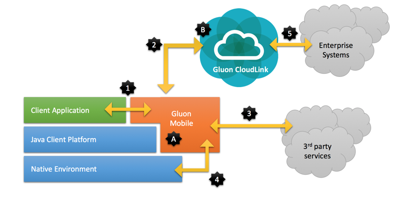
Gluon Mobile [A] is the client-side library and development tool that:
-
provides UI controls for the client application
-
handles communication with the server-side Gluon CloudLink
-
handles communication with other 3rd party services
-
abstracts (parts of) the platform specific APIs.
Gluon CloudLink [B] is the bridge between your application running on devices (desktop, laptop, mobile or embedded) and optional enterprise systems at your backend (5). See the Gluon CloudLink documentation for more information.
1.1. Gluon Mobile
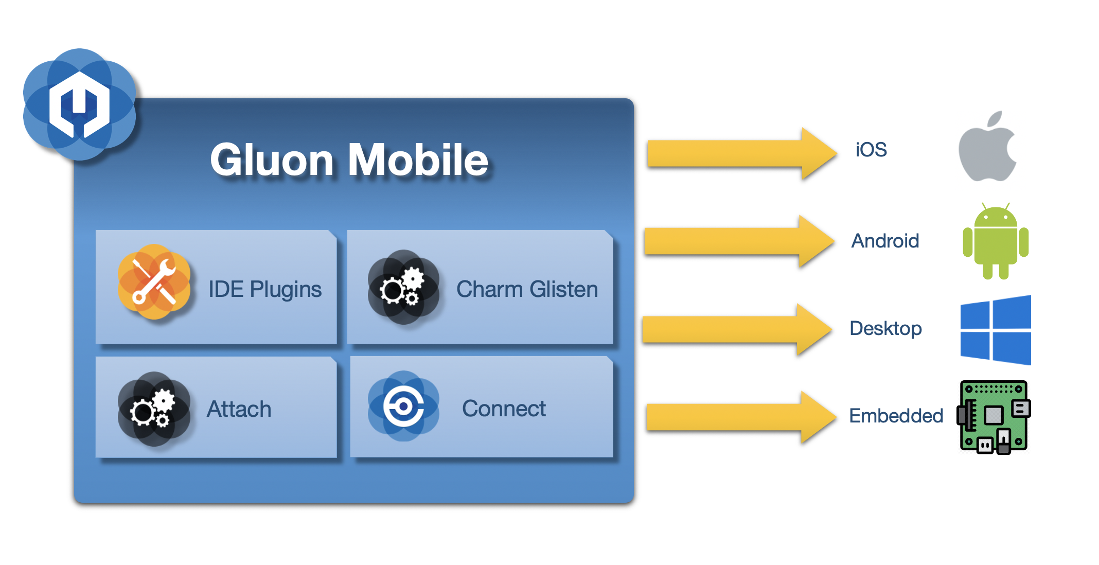
Gluon Mobile provides:
-
Tooling to build and deploy your Java app to desktop, Android and iOS platforms
-
Glisten, the UI component which offers JavaFX Controls that have a cross platform behavior, but a platform specific look and feel. They make your application look like a native application.
-
Connect, the API for communicating to Gluon CloudLink or other 3rd party webservices.
-
Attach, which makes device APIs available in a device-independent fashion, like the storage systems, accelerometers, screen details, GPS devices, and more.
2. Getting started
JavaFX applications using Gluon Mobile can target three different platforms: Android, iOS and the regular desktop. Our IDE plugins (see below) helps the developer getting started with creation of a project and deploy it on any specified target platform.
2.1. Prerequisites
The prerequisites for Gluon Mobile is same as that of Gluon Client.
2.2. Project setup
Once you have checked the list of prerequisites, there are multi ways to get your project up and running:
-
Use Gluon Start
-
Use Maven Archetype
-
Download a sample application
2.2.1. IDE Plugins
At Gluon, we introduced IDE plugins to help developers get started with Gluon Mobile as quickly as possible. The plugin aids in creating a Gluon application project inside your IDE.
At present, we support NetBeans, IntelliJ IDEA and Eclipse.
Once the plugin is installed into your IDE, you can create a new project.
- NetBeans
-
Choose
File→New→Project…from the menu and select an appropriate Gluon application template from the Gluon category - IntelliJ
-
Choose
File→New→Project…from the menu and select an appropriate Gluon application template from the Gluon category - Eclipse
-
Choose
File→New→Project…from the menu and select an appropriate Gluon application template from the Gluon category
2.2.2. Gluon Start
Gluon Start is a website which enables you to generate the structure and skeleton of your Java client application. You can configure the following properties of the application:
-
Name, groupId and artifactId to use for the generated Maven project
-
JavaFX version and modules required by the project
-
Gluon Mobile stack to include in the project. For example, Glisten (for the UI toolkit) and Gluon Maps can be selected to be used in the same project
-
Gluon Attach services required in the project
-
If the application needs a flexible and secure way to connect to an existing or new backend or cloud service, Gluon CloudLink can be selected as well
All options are easily selectable and Gluon Start will generate the project with correct dependencies for you!
2.2.3. Maven Archetype
A simple Gluon Mobile application can be created by using the Client Maven Archetype for simple Gluon Mobile application.
For example:
mvn archetype:generate \
        -DarchetypeGroupId=com.gluonhq \
        -DarchetypeArtifactId=client-archetype-mobile \
        -DarchetypeVersion=0.0.2 \
        -DgroupId=com.gluonhq  \
        -DartifactId=gluon-mobile-sample \
        -Dversion=1.0.0-SNAPSHOT \
        -Djavafx-version=15
2.2.4. Sample Applications
Even if you don’t want to use one of the IDE plugins, it’s easy to get started. You can clone our Gluon Samples repository at GitHub: https://github.com/gluonhq/client-samples/ and open the HelloGluon sample with your IDE or text editor to get you started. All of our samples are Maven projects, so you can run Maven goals to build the application and run it on any of the three platforms.
2.2.5. Adding Gluon Mobile to an existing project
If you already have an existing project, it’s very easy to include Gluon Mobile features.
Open up the pom.xml file and add the Gluon Nexus repository https://nexus.gluonhq.com/nexus/content/repositories/releases/ to the repositories section.
To be able to make use of Gluon Charm, you also need to add its dependencies. Your updated pom.xml file will now look something like this:
...
<repositories>
  <repository>
    <id>gluon-releases</id>
    <url>https://nexus.gluonhq.com/nexus/content/repositories/releases/</url>
  </repository>
</repositories>
<dependencies>
  ...
  <dependency>
    <groupId>com.gluonhq</groupId>
    <artifactId>charm</artifactId>
    <version>6.0.5</version>
  </dependency>
</dependencies>
Clean and build the project and check if those dependencies are downloaded (only the first time).
Now that everything is in place, you can start including Charm features in your project.
2.3. Adding your license
Gluon Mobile requires developers to buy a license if they don’t want the nag screen popup when starting their application.
For all information about Gluon Mobile licenses see this link.
After you have created the project or downloaded an existing one, there are 2 ways to add the license:
1. Using an annotation:
Add your valid license key to your main application class using the @License annotation:
import com.gluonhq.charm.glisten.license.License;

@License(key="XXXXXXXX-XXXX-XXXX-XXXX-XXXXXXXXXXXX")
public class HelloWorld extends MobileApplication {
    ...
}
2. Using a license file:
Add a file called gluonmobile.license to your resources and add your valid license key as the content.
This method allows you to keep your license private by excluding it from your source version control system.
src/main/resources/gluonmobile.license
XXXXXXXX-XXXX-XXXX-XXXX-XXXXXXXXXXXXLicenses are validated online once per application install. If for some reason the license service can’t be contacted, your end-users won’t be annoyed by the popup, but the license check will be retried each time the application starts until successful.
2.4. IDE Live templates
A live template specifies an abbreviation that you may type into your IDE that auto-completes a large chunk of code for you. We have defined live templates for IntelliJ IDEA to create JavaFX properties, including getters, setters, and the property method, and we have done this with support for all property types, and both read-only and read/write properties.
You can download them from here. Once you have the file on your machine, simply do the following to import them into your IntelliJ IDEA install:
-
Extract settings.jar file from the zip file
-
In IntelliJ, click on the ‘File’ menu
-
Click on ‘Import Settings…’
-
Find the settings.jar file on your file system
-
Restart IntelliJ when asked
Once the IDE has restarted, type ‘fxprop‘ in the editor window, and you should see a popup that lets you choose the type of property you want. Press tab (or enter), the code will be generated inside your editor. You can then immediately start typing the property name, and this will automatically update all the method names. Once you’ve done this, all you need to do is import the relevant classes.
3. Charm Glisten
Glisten is the UI component of Gluon Mobile which offers cross platform behavior, but a platform specific look and feel. Based on Material Design Specification: Glisten comes with a set of cross platform JavaFX controls.
3.1. Glisten APIs
3.1.1. MobileApplication
MobileApplication class extends from Application, hence for Glisten-based applications it will be considered the base class.
Let’s have a look at the hierarchy of components added to generate the user interface.
GlassPane
GlassPane is the root node added automatically by Glisten to the primary scene.
It can be seen as the invisible container for all the nodes that will be added: views, layers, dialogs or toolbars.
Usually, there won’t be any need to access this container directly. But it can be retrieved with MobileApplication.getInstance().getGlassPane(), if needed.
The first children of the GlassPane container will always be a View and the AppBar.
The nodes on top will be layers (like a side menu), popups or dialogs.
In between, there is a semi-transparent node that will ensure that the node on top appears distinct from the content beneath it, whenever this is shown. Otherwise it won’t be visible.
AppBar
AppBar is a special node acting as a toolbar for branding, navigation, search and other actions.
It is placed at the top of the layout and is generally made up of some buttons (nav icon and action items), a title and a menu.
The content (in terms of nodes and their respective actions) will be managed directly by each of the different views,
so the AppBar will be like a toolbar placeholder for each one of them.
Typically, the developer sets up the AppBar for a given View by overriding its updateAppBar method:
public class HomeView extends View {

    public HomeView() {
        FloatingActionButton fab = new FloatingActionButton();
        fab.showOn(this);
    }

    @Override
    protected void updateAppBar(AppBar appBar) {
        appBar.setNavIcon(MaterialDesignIcon.MENU.button(e -> System.out.println("nav icon")));
        appBar.setTitleText("The AppBar");
        appBar.getActionItems().addAll(
            MaterialDesignIcon.SEARCH.button(e -> System.out.println("search")),
            MaterialDesignIcon.FAVORITE.button(e -> System.out.println("fav")));
        appBar.getMenuItems().addAll(new MenuItem("Settings"));
    }
}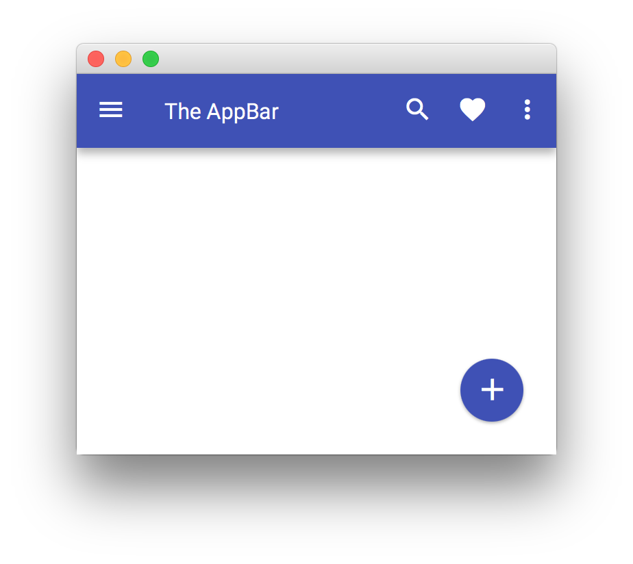
If the developer doesn’t require the AppBar for a given view, it can be hidden by setting its visibility to false: appBar.setVisible(false).
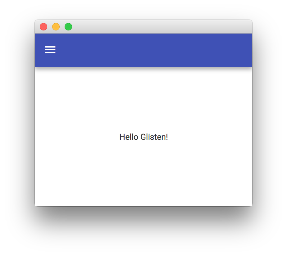
Another way to update the AppBar will be adding a listener to each view’s showingProperty:
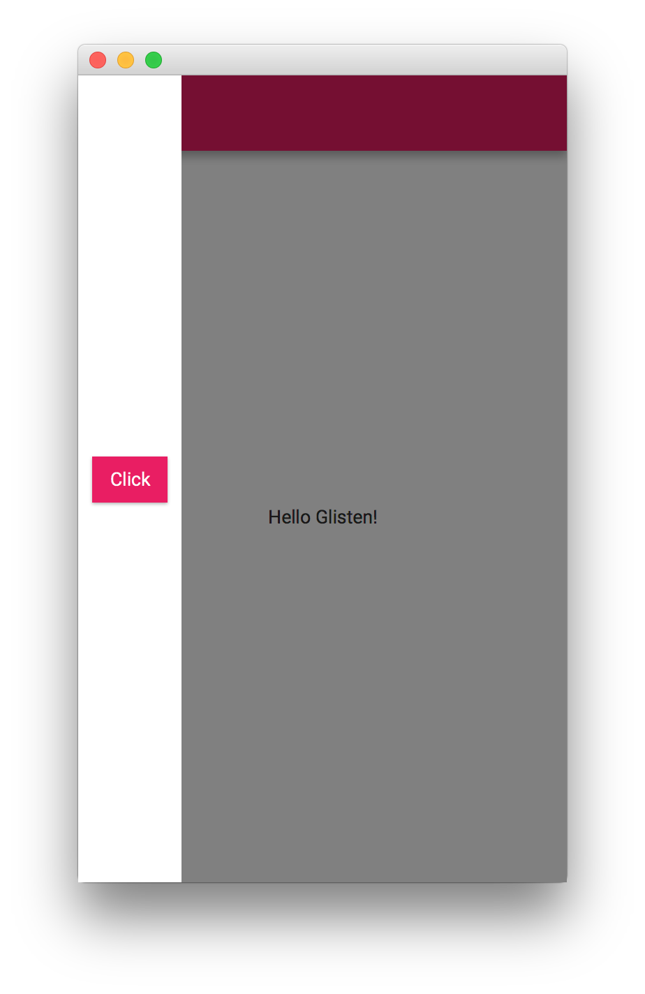
public class MyApp extends MobileApplication {

    @Override
    public void init() {
        addViewFactory(HOME_VIEW, () -> {
            View view = new View(new Label("Hello Glisten!"));
            view.showingProperty().addListener((obs, oldValue, newValue) -> {
                if (newValue) {
                    AppBar appBar = MobileApplication.getInstance().getAppBar();
                    appBar.setNavIcon(MaterialDesignIcon.MENU.button(e -> System.out.println("nav icon")));
                }
            });
            return view;
        });
    }
}
View
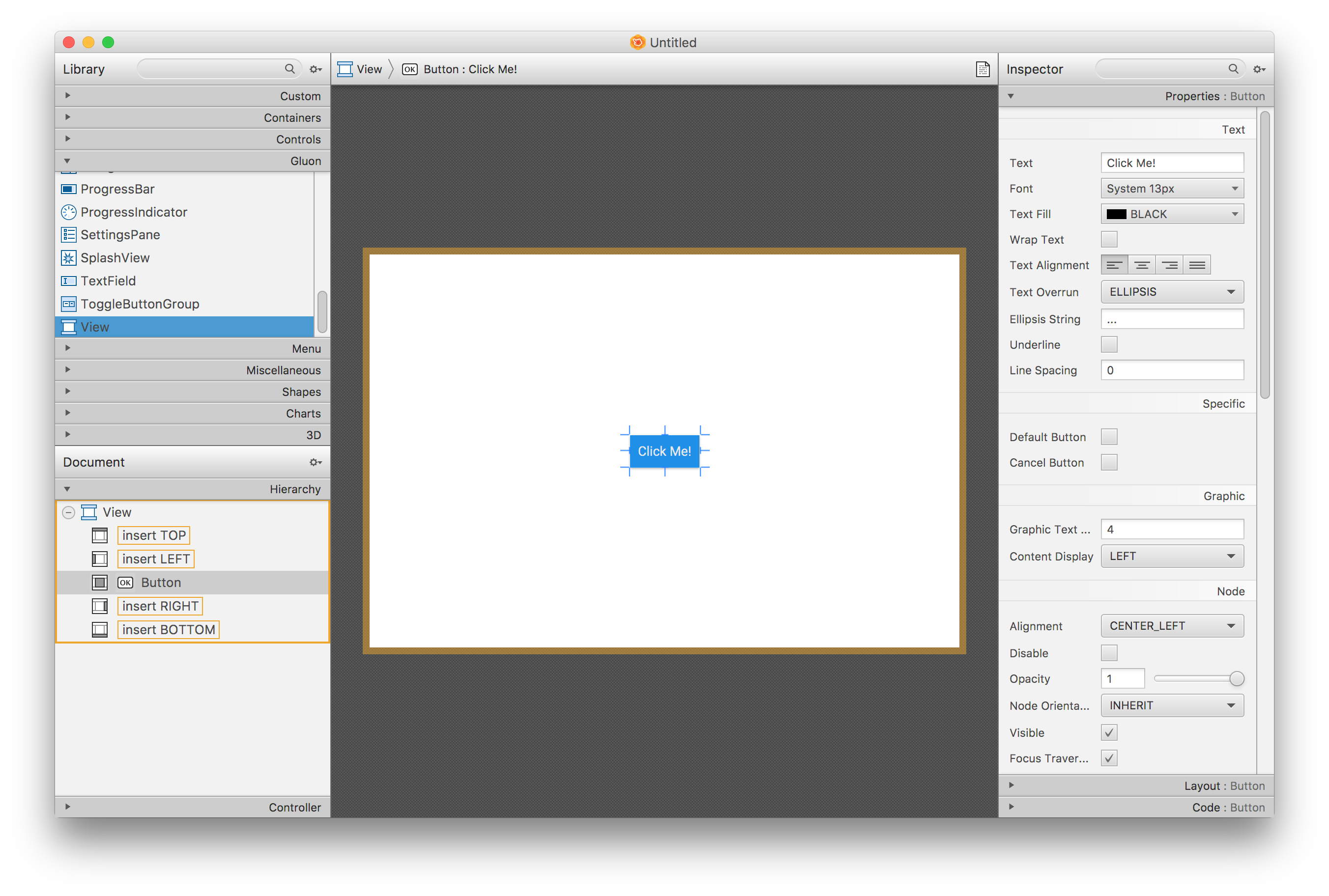
View is a Glisten container that will allow adding nodes in its top, left, right, bottom, and center positions.
Usually a View instance is created by providing a node for its content.
This instance is added to a factory of views with a name, so the Glisten UI can load and unload them on demand.
Home View
By default, the home view will be the first view displayed when the stage is shown.
It has no predefined content, so this view has to be designed by the developer, but its name is already assigned: MobileApplication.HOME_VIEW.
This short snippet will create a very simple mobile application with a single view:
public class MyApp extends MobileApplication {

    @Override
    public void init() {
        addViewFactory(HOME_VIEW, () -> new View(new Label("Hello Glisten!")));
    }

}
3.1.2. How it works
In order to understand how Glisten works, let’s have a look at the initial JavaFX application lifecycle. Whenever an application is launched, the JavaFX runtime does the following:
-
Constructs an instance of the specified
Applicationclass -
Calls the
init()method -
Calls the
start(javafx.stage.Stage)method
Typically, the developer of a Glisten application will only override the init() method, in order to add one or more View objects,
and provide them as factories that can be called on-demand. The MobileApplication implementation will take care of the rest:
when start() is called, it will create a Scene, adding a root node to it. Finally, it will put the scene in the primary stage and show it.
When the runtime calls init(), we just provide a Supplier<View> for HOME_VIEW, but the view is not instantiated at this point yet.
Then start(Stage) is called. At this moment, MobileApplication creates an instance of Scene, sets the root an empty instance of a GlassPane and adds the scene to the primary stage.
After some internal settings, like adding the default Swatch, it calls switchView("HOME_VIEW"). This is the moment when an instance of the home view is created and added to the pane.
Finally, the stage is shown.
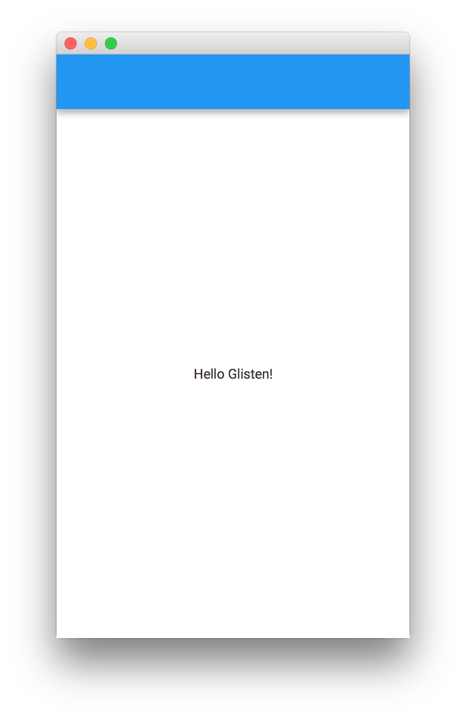
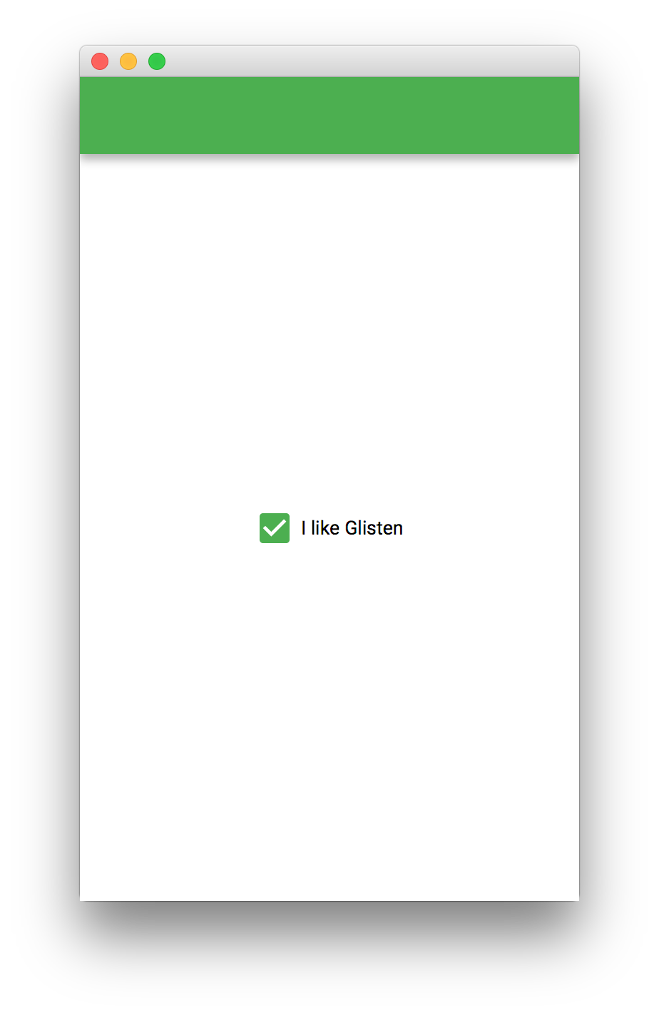
Changing the default Swatch
What if we want to modify some scene settings before it is shown?
Before showing the stage, there’s a call to the postInit(Scene) method, that can be used by the developer for one time initialization.
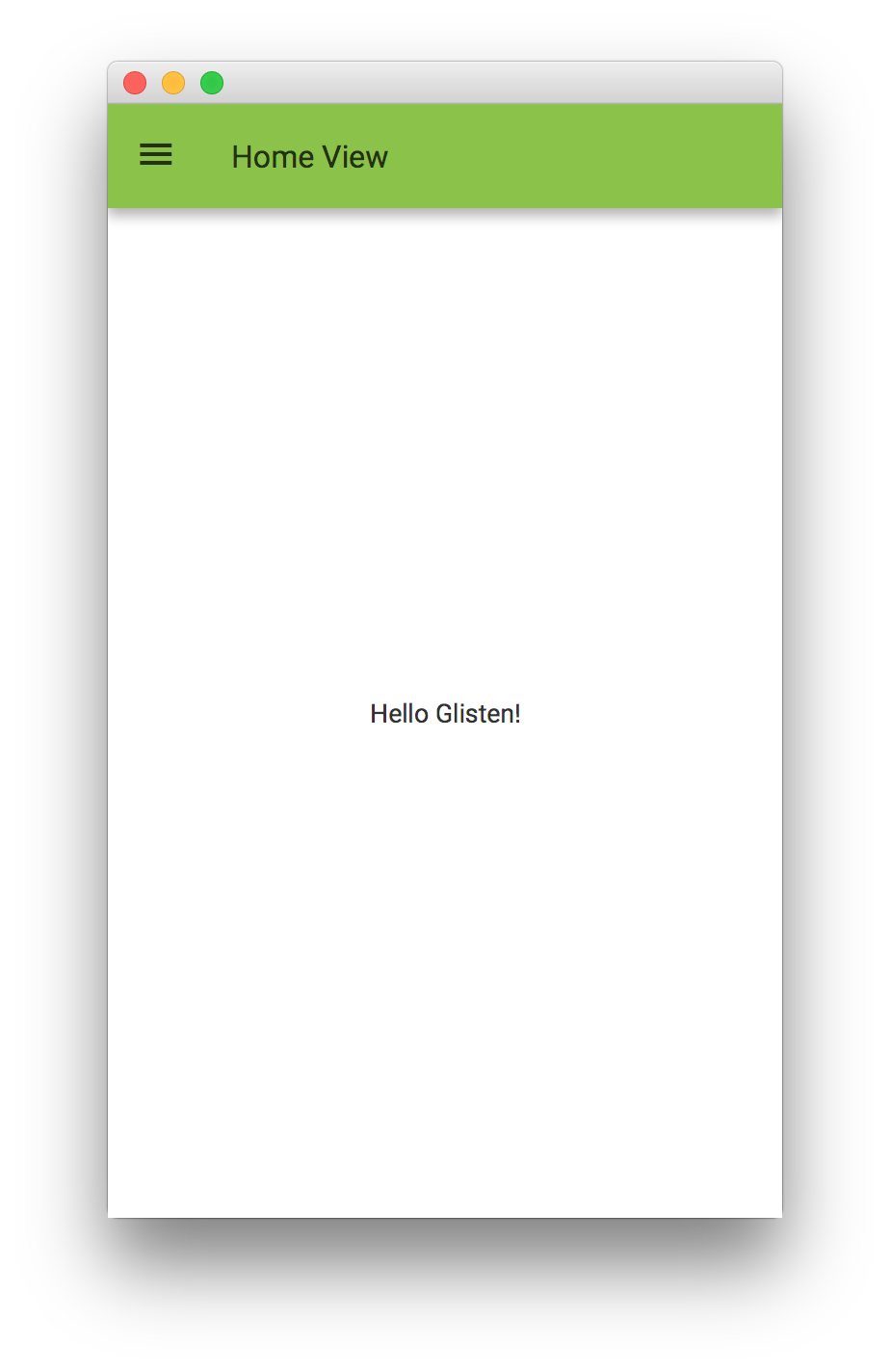
public class MyApp extends MobileApplication {

    @Override
    public void init() {
        addViewFactory(HOME_VIEW, () -> new View(new CheckBox("I like Glisten")));
    }

    @Override
    public void postInit(Scene scene) {
        Swatch.GREEN.assignTo(scene);
    }

}
In case the developer wants to change the swatch for each view, this can be done by listening to the changes in the
viewProperty of a MobileApplication instance, and assigning the corresponding Swatch:
public class MyApp extends MobileApplication {

    private static final String OTHER_VIEW = "other";

    @Override
    public void init() {
        addViewFactory(HOME_VIEW, () -> new View(new Label("Hello Glisten!")) {
            {
                FloatingActionButton fab = new FloatingActionButton(MaterialDesignIcon.ADD_BOX.text, e -> switchView(OTHER_VIEW));
                fab.showOn(this);
            }
        });
        addViewFactory(OTHER_VIEW, () -> new View(new CheckBox("I like Glisten")) {
            {
                FloatingActionButton fab = new FloatingActionButton(MaterialDesignIcon.ADD_CIRCLE_OUTLINE.text, e -> switchView(HOME_VIEW));
                fab.showOn(this);
            }
        });

        viewProperty().addListener((obs, oldView, newView) -> {
            switch(newView.getName()) {
                case HOME_VIEW:
                    Swatch.INDIGO.assignTo(newView.getScene());
                    break;
                case OTHER_VIEW:
                    Swatch.GREEN.assignTo(newView.getScene());
                    break;
                default:
                    Swatch.getDefault().assignTo(newView.getScene());
            }
        });
    }
}
Another way to accomplish the same will be by adding a listener to each view’s showingProperty:
public class MyApp extends MobileApplication {
private static final String OTHER_VIEW = "other";
@Override
public void init() {
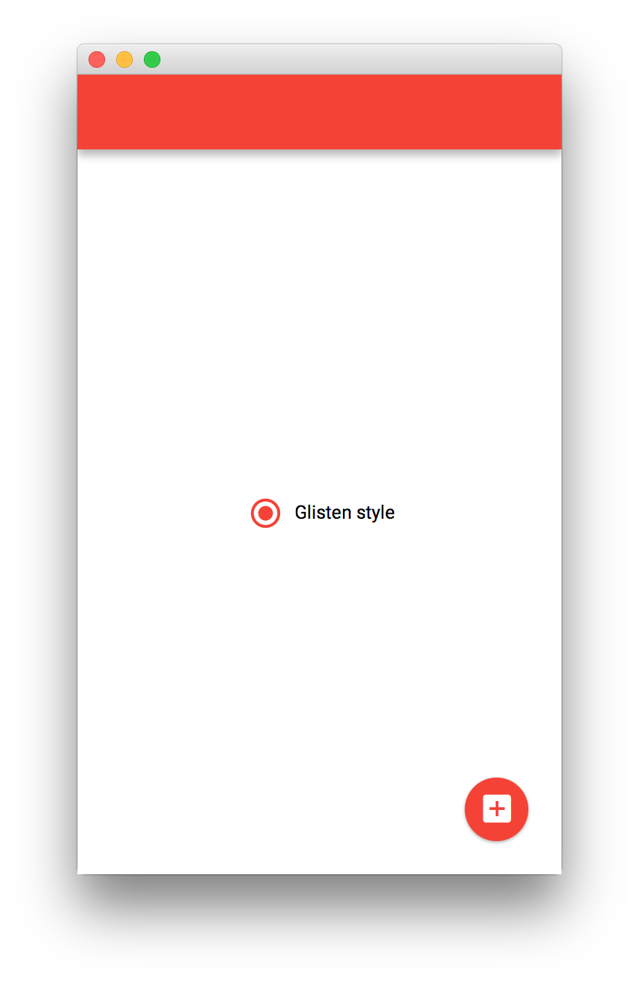
addViewFactory(HOME_VIEW, () -> {
View view = new View(new RadioButton("Glisten style"));
FloatingActionButton fab = new FloatingActionButton(MaterialDesignIcon.ADD_BOX.text, e -> switchView(OTHER_VIEW));
fab.showOn(view);
view.showingProperty().addListener((obs, oldValue, newValue) -> {
if (newValue) {
Swatch.RED.assignTo(view.getScene());
}
});
return view;
});
addViewFactory(OTHER_VIEW, () -> {
View view = new View(new CheckBox("I like Glisten"));
FloatingActionButton fab = new FloatingActionButton(MaterialDesignIcon.ADD_CIRCLE_OUTLINE.text, e -> switchView(HOME_VIEW));
fab.showOn(view);
view.showingProperty().addListener((obs, oldValue, newValue) -> {
if (newValue) {
Swatch.TEAL.assignTo(view.getScene());
}
});
return view;
});
}
}
Creating a View
As we have already seen in the previous code snippets, there are several possible ways to create a View.
Extending View
A custom view can be created by extending View. This allows for more complex views, for adding a view transition, customizing the AppBar…
public class MyApp extends MobileApplication {

    private static final String OTHER_VIEW = "other";

    @Override
    public void init() {
        addViewFactory(HOME_VIEW, () -> new HomeView());
        addViewFactory(OTHER_VIEW, () -> new View(new CheckBox("I like Glisten")));
    }

    @Override
    public void postInit(Scene scene) {
        Swatch.LIGHT_GREEN.assignTo(scene);
    }

    class HomeView extends View {

        public HomeView() {
            setCenter(new Label("Hello Glisten!"));
        }

        @Override
        protected void updateAppBar(AppBar appBar) {
            appBar.setNavIcon(MaterialDesignIcon.MENU.button(e -> switchView(OTHER_VIEW)));
            appBar.setTitleText("Home View");
        }
    }
}
Adding content
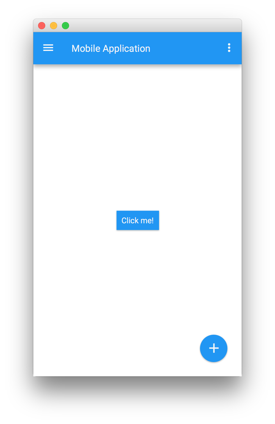
A View can be created by using one of its constructors, where the content is set. Any Node will work as content for the View.
public class MyApp extends MobileApplication {
private static final String OTHER_VIEW = "other";
@Override
public void init() {
addViewFactory(HOME_VIEW, () -> new View(new Home()) {
@Override protected void updateAppBar(AppBar appBar) {
appBar.setNavIcon(MaterialDesignIcon.MENU.button(e -> switchView(OTHER_VIEW)));
appBar.setTitleText("Home View");
}
});
}
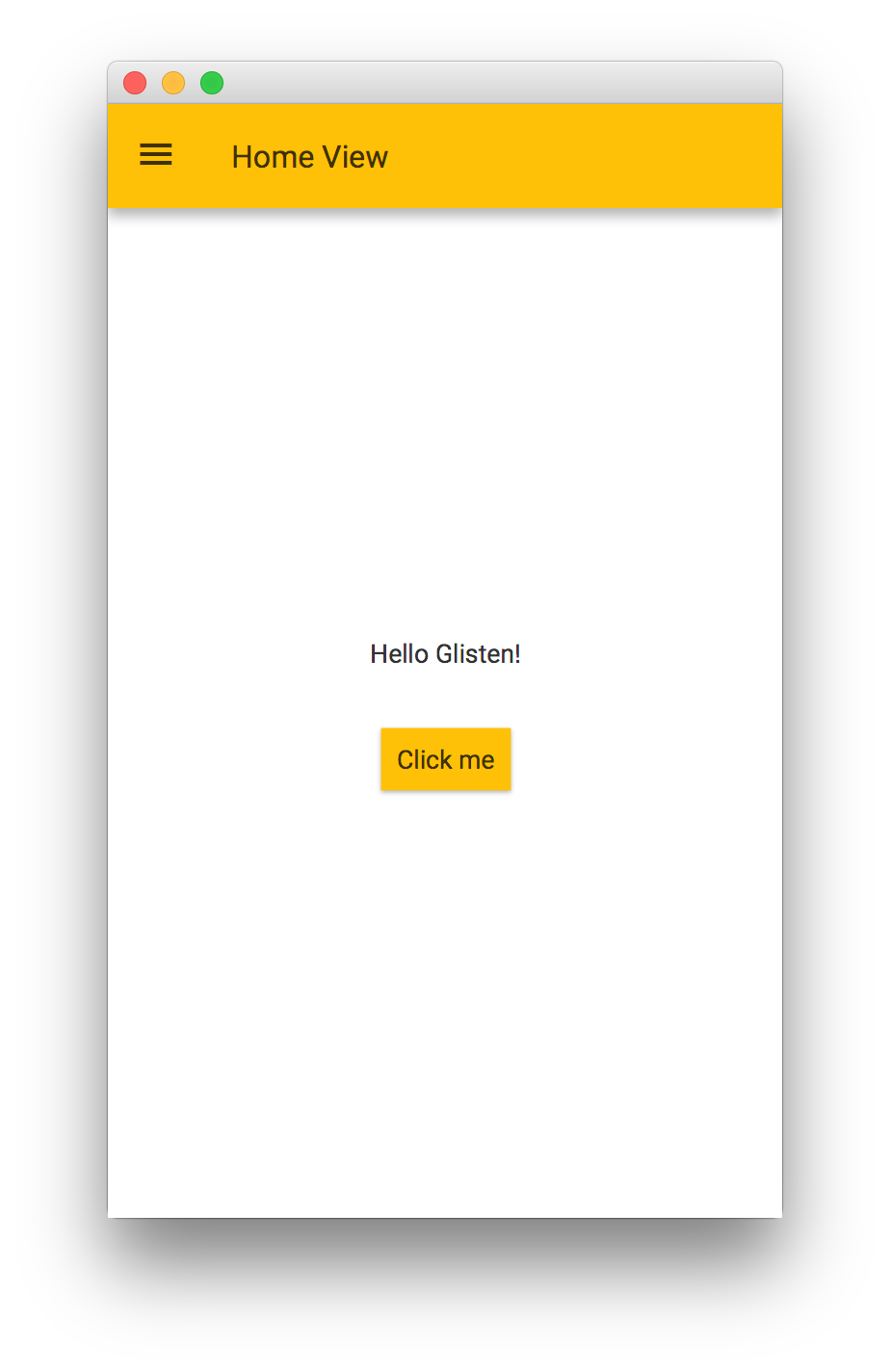
class Home extends VBox {
public Home() {
setSpacing(30);
setAlignment(Pos.CENTER);
getChildren().addAll(new Label("Hello Glisten!"), new Button("Click me"));
}
}
}
Creating Views with FXML
View can be used within FXML, by adding the proper import.
<?xml version="1.0" encoding="UTF-8"?>

<?import com.gluonhq.charm.glisten.mvc.View?>
<?import javafx.scene.control.Button?>

<View fx:id="home" prefHeight="400.0" prefWidth="600.0" styleClass="mainFxmlClass" xmlns="http://javafx.com/javafx/11" xmlns:fx="http://javafx.com/fxml/1">
   <center>
      <Button fx:id="button" onAction="#onClick" text="Click me!" />
   </center>
</View>
Load the fxml file using the FXMLLoader. Assuming the home.fxml file is under the same package as the application,
but in the 'resources' directory:
public class MyApp extends MobileApplication {

    private static final String OTHER_VIEW = "other";

    @Override
    public void init() {
        addViewFactory(HOME_VIEW, () -> {
            try {
                return (View)FXMLLoader.load(getClass().getResource("views/home_1.fxml"));
            } catch (Exception ex) { }
            return null;
        });
        addViewFactory(OTHER_VIEW, () -> new View(new CheckBox("I like Glisten")));
        viewProperty().addListener((obs, ov, nv) -> {
            AppBar appBar = MobileApplication.getInstance().getAppBar();
            switch(nv.getName()) {
                case HOME_VIEW:
                    appBar.setNavIcon(MaterialDesignIcon.MENU.button(e -> switchView(OTHER_VIEW)));
                    appBar.setTitleText("Home View");
                    Swatch.TEAL.assignTo(appBar.getScene());
                    break;
                case OTHER_VIEW:
                    appBar.setVisible(false);
                    break;
            }
        });
    }
}
Using Gluon’s Scene Builder
View is available under the Gluon titled pane on the top left of Scene Builder.
Note: Prior to Scene Builder 8.3.0, charm-glisten-6.0.5.jar should be imported into the Scene Builder.
Afterburner framework
Adding the dependency to the build.gradle script, allows using this MVP framework from Adam Bien.
dependencies {
    compile 'com.airhacks:afterburner.mfx:1.6.3'
}
For every view, these files are required:
In the code folder:
-
The view i.e.
HomeView. An empty class that just extendsFXMLView. -
The presenter. I.e.
HomePresenter. -
A service (optional), i.e.
HomeService.
And in the resources folder:
-
The fxml, i.e.
home.fxml -
The css (optional), i.e.
home.css.
In the presenter, controls can be added to the view, like a Button to trigger some action when the user clicks on it.
A transition can be set for switching views from a large list of available transitions (see the Charm JavaDoc).
In case no transition is desired, the developer can select NoTransition().
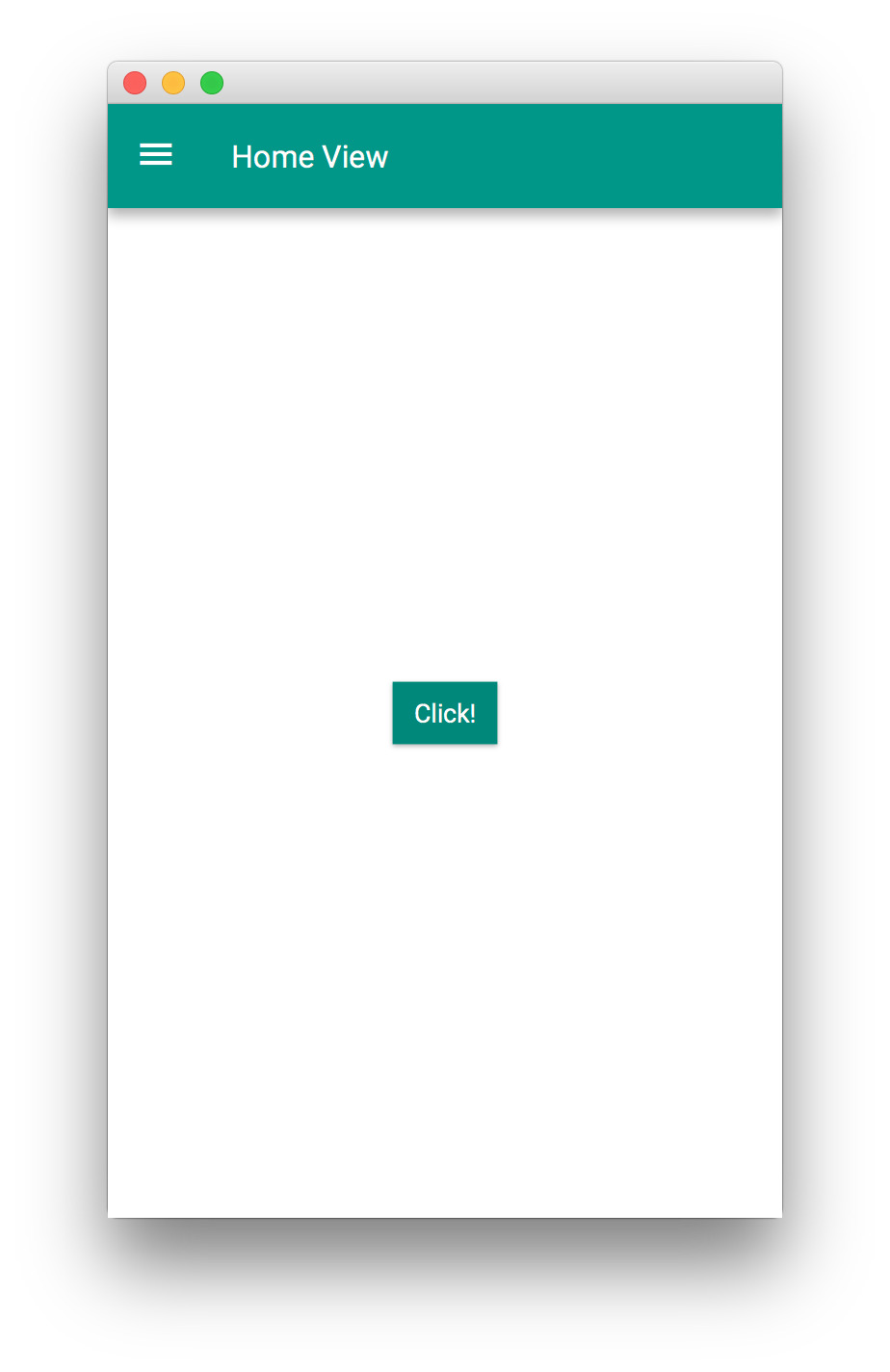
<View fx:id="home" xmlns="http://javafx.com/javafx/11" xmlns:fx="http://javafx.com/fxml/1" fx:controller="HomePresenter">
    <center>
        <StackPane>
            <Button text="Click!" onAction="#onClick"/>
        </StackPane>
    </center>
</View>
The presenter can be created to directly interact with the nodes in the FXML.
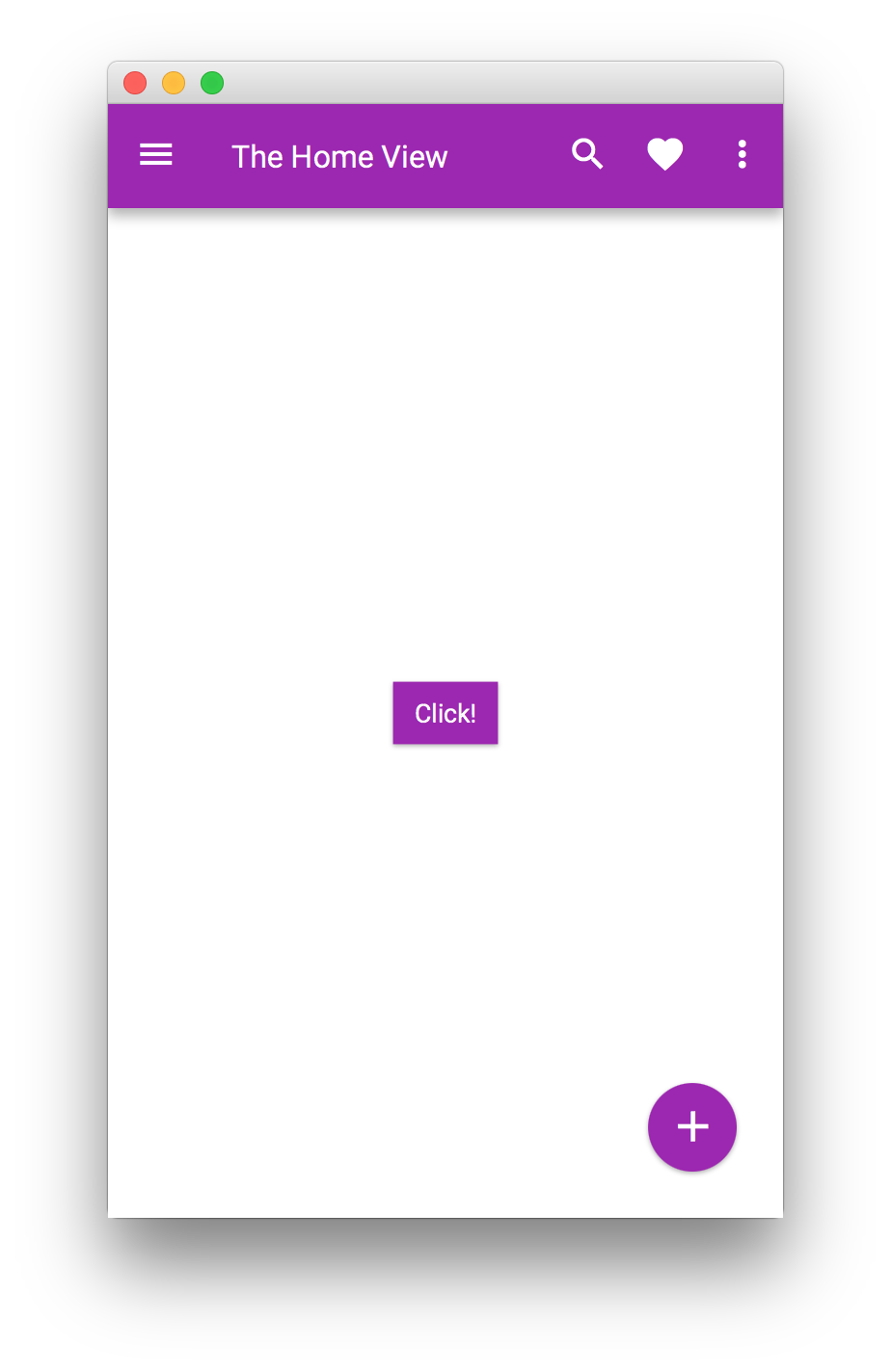
public class HomePresenter implements Initializable {

    @FXML
    private View home;

    @Override
    public void initialize(URL url, ResourceBundle rb) {
        FloatingActionButton fab = new FloatingActionButton();
        fab.setOnAction(e -> {
            System.out.println("FAB click");
        });
        fab.showOn(home);

        home.setShowTransitionFactory(v -> new FadeInLeftBigTransition(v));

        home.showingProperty().addListener((obs, ov, nv) -> {
            if (nv) {
                final AppBar appBar = MobileApplication.getInstance().getAppBar();
                appBar.setNavIcon(MaterialDesignIcon.MENU.button(e -> System.out.println("menu")));
                appBar.setTitleText("The Home View");
                appBar.getActionItems().addAll(
                        MaterialDesignIcon.SEARCH.button(),
                        MaterialDesignIcon.FAVORITE.button());
                appBar.getMenuItems().addAll(new MenuItem("Settings"));

                Swatch.PURPLE.assignTo(home.getScene());
            }
        });
    }

    @FXML
    public void onClick() {
       System.out.println("click");
    }
}
Then, a view can be created:
public class HomeView extends FXMLView {

}
This View can be loaded in a MobileApplication:
public class MyApp extends MobileApplication {

    @Override
    public void init() {
        addViewFactory(HOME_VIEW, () -> {
            final HomeView homeView = new HomeView();
            return (View) homeView.getView();
        });
    }
}
In order to perform some actions while the transition is running or when it finishes, a custom ActionEvent
can be provided to the end of the transition.
This can be done as well based on the LifecycleEvent events. The following code snippet will set the view transparent
to mouse clicks just during the time it is added to the scene and the transition ends.
public class MyApp extends MobileApplication {

    @Override
    public void init() {
        addViewFactory(HOME_VIEW, () -> {
            final HomeView homeView = new HomeView();
            final View view = (View) homeView.getView();
            view.addEventHandler(LifecycleEvent.SHOWING, e ->
                view.setMouseTransparent(true));
            view.addEventHandler(LifecycleEvent.SHOWN, e ->
                view.setMouseTransparent(false));
            return view;
        });
    }
}
3.1.3. Layers
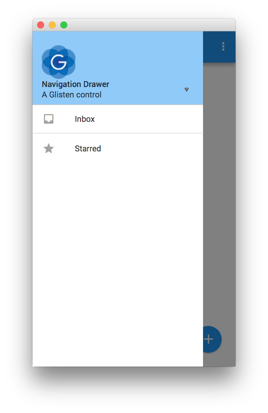
A Layer is an overlay that can be shown above any View.
Layers can be provided as factories by using MobileApplication.getInstance().addLayerFactory(), and
can be shown on demand by using MobileApplication.getInstance().showLayer().
public class MyApp extends MobileApplication {

    @Override
    public void init() {
        addViewFactory(HOME_VIEW, () -> new View(new Label("Hello Glisten!")) {
            @Override
            protected void updateAppBar(AppBar appBar) {
                appBar.setNavIcon(MaterialDesignIcon.MENU.button(e -> showLayer("New Layer")));
            }
        });

        addLayerFactory("New Layer", () -> {
            final StackPane stackPane = new StackPane(new Button("Click"));
            stackPane.setStyle("-fx-background-color: white; -fx-padding: 10;");
            SidePopupView sidePopupView = new SidePopupView(stackPane);
            return sidePopupView;
        });
    }
}
Layers can also be be shown and hidden, without the use of factories, by calling show() and hide() respectively.
SidePopupView sidePopupView = new SidePopupView(stackPane);
sidePopupView.show();
By calling setBackgroundFade(double) the developer will be able to fade the background of a layer to a darker color,
obscuring the main application and drawing focus to the popup.
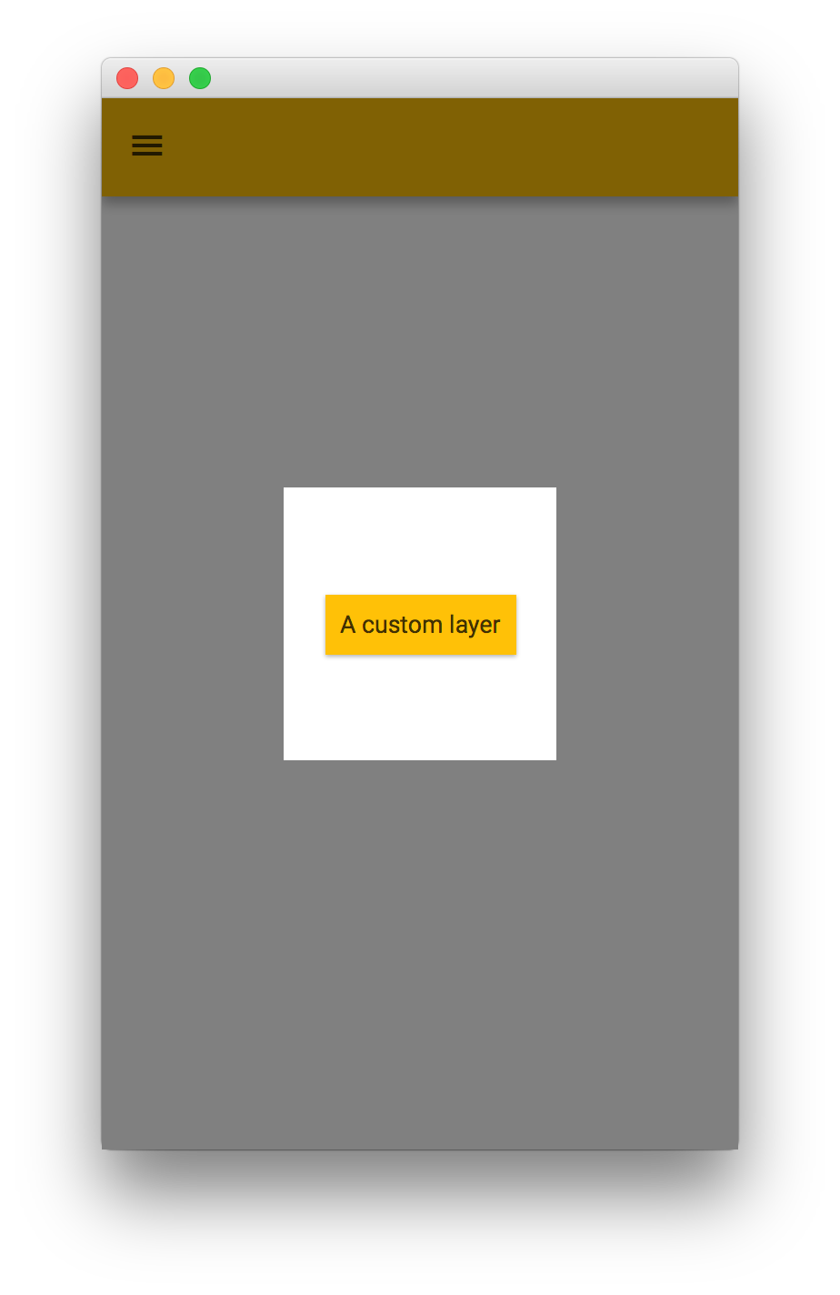
Creating a Layer
Developers can create custom Layer nodes. This is a minimal implementation, including a faded background when the layer is shown.
public class MyApp extends MobileApplication {

    @Override
    public void init() {

        addViewFactory(HOME_VIEW, () -> new View(new Label("Hello Glisten!")) {
            @Override
            protected void updateAppBar(AppBar appBar) {
                appBar.setNavIcon(MaterialDesignIcon.MENU.button(e -> showLayer("New Layer")));
            }
        });

        addLayerFactory("New Layer", () -> new Layer() {
            private final Node root;
            private final double size = 150;
            final GlassPane glassPane = MobileApplication.getInstance().getGlassPane();

            {
                setBackgroundFade(0.5);
                root = new StackPane(new Button("A custom layer"));
                root.setStyle("-fx-background-color: white;");
                getChildren().add(root);
            }

            @Override
            public void layoutChildren() {
                super.layoutChildren();
                root.setVisible(isShowing());
                if (!isShowing()) {
                    return;
                }
                root.resize(size, size);
                resizeRelocate((glassPane.getWidth() - size)/2, (glassPane.getHeight()- size)/2, size, size);
            }
        });
    }
}
Layers can also be created and shown without using the factory methods.
public class MyApp extends MobileApplication {

    private Layer layer;

    @Override
    public void init() {

        addViewFactory(HOME_VIEW, () -> new View(new Label("Hello Glisten!")) {
            @Override
            protected void updateAppBar(AppBar appBar) {
                appBar.setNavIcon(MaterialDesignIcon.MENU.button(e -> {
                    if (layer == null) {
                        layer = createLayer();
                    }
                    layer.show();
                }));
            }
        });
    }

    private Layer createLayer() {
        return new Layer() {
            private final Node root;
            private final double size = 150;
            final GlassPane glassPane = MobileApplication.getInstance().getGlassPane();

            {
                setBackgroundFade(0.5);
                root = new StackPane(new Button("A custom layer"));
                root.setStyle("-fx-background-color: white;");
                getChildren().add(root);
            }

            @Override
            public void layoutChildren() {
                super.layoutChildren();
                root.setVisible(isShowing());
                if (!isShowing()) {
                    return;
                }
                root.resize(size, size);
                resizeRelocate((glassPane.getWidth() - size)/2, (glassPane.getHeight()- size)/2, size, size);
            }
        };
    }
}
However, Glisten already provides a series of built-in layers, so creating custom layers won’t be necessary in most of the occasions.
Using built-in layers
Glisten uses layers to show additional information. The most commonly used layers are:
-
MenuPopupView
-
MenuSidePopupView
-
PopupView
-
SidePopupView
For a description of each layer, check the API documentation: Glisten layers.
Many Glisten controls use layers internally, including FloatingActionButton, NavigationDrawer, Snackbar and Toast.
3.1.4. UI Controls
Glisten comes with a collection of cross platform UI controls based on the Material Design Specification: Glisten Controls.
3.2. Glisten CSS Overview
An overview of the CSS style classes and properties that are available to users of the Gluon Charm Glisten library. Users of Glisten CSS should be familiar with the JavaFX CSS functionality.
3.2.1. Glisten Themes
Glisten ships with two CSS themes: light and dark. Despite the connotation, the amount of CSS required to specify these themes is incredibly minimal - and as a courtesy is reproduced here:
.root {
  -fx-background: white;
  -fx-text-fill: -text-light;
  -fx-prompt-text-fill: rgba(0,0,0,.3);

  -text-disabled: -text-disabled-light;
  -background-disabled:rgba(0,0,0,.12);
  -background-fill: -text-light;

  -flat-button-hover-background: rgba(#999999,.2);
  -flat-button-pressed-background: rgba(#999999,.4);
  -flat-button-disabled-fill: rgba(#000000,.26);
}.root {
-fx-background: #333333;
-fx-text-fill: -text-dark;
-fx-prompt-text-fill: rgba(255,255,255,.3);
-text-disabled: -text-disabled-dark;
-background-disabled:rgba(255,255,255,.12);
-background-fill: -text-dark;
-flat-button-hover-background: rgba(#CCCCCC,.15);
-flat-button-pressed-background: rgba(#CCCCCC,.25);
-flat-button-disabled-fill: rgba(#FFFFFF,.3);
}3.2.2. Glisten CSS Properties
There are a number of global properties that can be used by any application that uses Glisten. These properties allow for custom controls to be styled in a way that should relatively closely match up with the Glisten-styled controls. What follows is a list of such properties.
Swatches
Perhaps most importantly, Glisten supports swatches, where each swatches populates a series of pre-specified CSS properties which can be used within your own CSS. The properties that are populated for each swatch are the following:
-primary-swatch-50
-primary-swatch-100
-primary-swatch-200
-primary-swatch-300
-primary-swatch-400
-primary-swatch-500
-primary-swatch-600
-primary-swatch-700
-primary-swatch-800
-primary-swatch-900
-alternate-swatch-100
-alternate-swatch-200
-alternate-swatch-400
-alternate-swatch-700
Each of these properties is simply a color along a certain color spectrum. All swatches provided by Glisten are based on the Material Design color style guide. The Glisten CSS files do not typically make use of all swatch colors, so it is also advised that any use of these colors be restrained, outside of the -primary-swatch-500, and possibly -primary-swatch-200, -primary-swatch-600, and -primary-swatch-700.
An example of how such a property could be used is shown in the sample code below:
.button {
  -fx-background-color: -primary-swatch-500;
}

.button:hover {
  -fx-background-color:-primary-swatch-600;
}
Other Properties
There are a number of other properties that are available to use. Some of these are custom Glisten properties, but many are standard JavaFX CSS properties that Glisten simply modifies to the appropriate value. Some notable properties include the following (refer to the JavaFX CSS Reference Guide for more details of any that start with -fx-) :
-
-text-light: This is a light-colored text, best used on a dark background. -
-text-dark: This is a dark-colored text, best used on a light background. -
-fx-text-fill: This is populated based on the theme that is currently set (i.e. light or dark). -
-text-disabled: This is used in controls where the control is disabled.
Text Fill
It is important to understand how text fill works in Glisten, as the underlying JavaFX CSS engine is significantly more powerful than normal CSS engines. In particular, when it comes to deciding what color text fill to use, you can use JavaFX CSS laddering to decide. In other words, it is never a good idea to use -fx-text-fill directly, as -fx-text-fill does not take into account the background color behind the text (so it is possible that the text is unreadable).
In cases where a custom text fill is desired, it is much better to do something such as the following:
.button {
  -fx-background-color: -primary-swatch-500;
  -fx-text-fill: ladder(-primary-swatch-500, -text-dark 49%, -text-light 50%)
}
This code states to use -text-dark or -text-light, depending on the darkness of the first value, in this case -primary-swatch-500. The result of this is that when -primary-swatch-500 is a very light color (such as a bright yellow), the -fx-text-fill will be -text-light (and therefore appear as a dark color). When -primary-swatch-500 is a very dark color, -text-dark is used, and is therefore a light color that is readable on a dark background.
3.2.3. Glisten Style Classes
By default, when a UI control is instantiated in Glisten, the control does not receive any additional style classes over what is provided by the underlying JavaFX technology. However, depending on the use case for each individual control, it can make sense to apply additional style classes to have Glisten apply additional styling to these controls.
There exists a class called GlistenStyleClasses that is located in the com.gluonhq.glisten.visual package. This class provides a number of predefined style classes that can be applied to a control, via one of two methods:
final ToggleButton toggleVisibilityButton = new ToggleButton("Toggle Visibility");

/*
 * TOGGLE_BUTTON_SWITCH is a static import from GlistenStyleClasses.
 * It is simply a String consisting of 'switch'.
 */
toggleVisibilityButton.getStyleClass.add(TOGGLE_BUTTON_SWITCH);final ToggleButton toggleVisibilityButton = new ToggleButton("Toggle Visibility");
/*
* Both applyStyleClass and TOGGLE_BUTTON_SWITCH are static
* imports from GlistenStyleClasses
*/
applyStyleClass(toggleVisibilityButton, TOGGLE_BUTTON_SWITCH);Both approaches are more or less equivalent, but the second approach is recommended.
Once these additional style classes have been applied, both Glisten CSS and your own CSS can be applied as applicable. For example, a button that has been styled to be flat (using GlistenStyleClasses.BUTTON_FLAT) will be able to receive alternate styling via css such as the following:
.button.flat {
  ...
}
Of course, as noted, any styling of UI controls based on style classes from the GlistenStyleClasses class will be styled differently by Glisten CSS, so there is no need (unless desired) to apply additional styling.
What follows is a list of additional CSS style classes that are available to some UI controls:
Buttons have the CSS style class .button. There are the following additional style classes that are available in Glisten:
Style Class |
GlistenStyleClasses Property |
Description |
|
|
The |
|
|
The |
Toggle buttons have the CSS style class .toggle-button.
Style Class |
GlistenStyleClasses Property |
Description |
|
|
The |
3.2.4. Other Questions
If this document does not answer all your questions regarding Glisten CSS functionality, please reach out to Gluon staff and ask any questions. They will help us to improve future versions of this document.
3.3. Release Notes
This page provides information about the releases of Charm Glisten, including known issues, limitations, and general advisories. Please review the notes before using the library.
To discuss issues or ideas with other developers, please reach out to us.
6.0.0
Glisten 6.0.0 comes with JavaFX 11 support.
5.0.0
Glisten 5.0.0 release has a significant number of breaking changes. For a detailed document on how to migrate to 5.0.0, please refer Migration Guide to Gluon Mobile 5.
New Features
-
MobileApplication exposes a new method
getDrawer()which should be used to access the application wide NavigationDrawer -
New control Snackbar replaces SnackbarPopupView
-
MobileTransition has been added to pause and resume animation along with the change in the life-cycle of the mobile application
-
View has defined
centeras the default property, which enables setting a center child in fxml without using the <center> tag -
Layer is managed using life-cycle. They are four life-cycle events: showing, shown, hiding, hidden.
-
Layers can now be shown on MobileApplication without adding them to GlassPane or View.
-
NavigationDrawer has been improved to automatically show and hide without the need to add it to a SidePopupView.
-
NavigationDrawer closes automatically when an item is selected
-
Support for notch in iPhone X devices.
Package Changes
-
FAB has been moved from
com.gluonhq.charm.glisten.layout.layertocom.gluonhq.charm.glisten.control
API changes
-
MobileLayoutPane has been removed
-
GlassPane and View extend from BorderPane instead of MobileLayoutPane
-
GlassPane and View no longer expose the list of layers. The method
getLayers()has been removed -
View no longer exposes a
nameproperty -
View’s show transition factory has been changed from
Function<View,Transition>toFunction<View,MobileTransition> -
Layers can be shown using the new API. In order to show and hide a layer, call
show()andhide()respectively -
ActionItemsin BottomNavigation only accept instances of BottomNavigationButton instead of Node -
Deprecated method
createButton()has been removed from BottomNavigation -
New constructor has been added to most of the Transitions to help developers define custom duration
-
PopupView gives more control to the developer by allowing them to control the
sideandpaddingof the popup. Additionally, height and width of the popup can now be changed using the pref*, min* and max* properties. -
PopupView has dropped
autofix property. AutoFix is now set to true for all usage of PopupView. -
AutoCompleteTextField has a new
converterfor easy conversions between strings and objects. -
FAB can bind to a View using
showOn(View view) -
New methods have been added to NavigationDrawer to open and close the drawer -
open()andclose()
Bug Fixes
-
MenuPopupView and AutoCompletePopup support text wrapping
-
AutoCompleteTextField selection of a node from the popup, converts the selected object to a string and shows it in the TextField.
-
Animation duration for PopupView and SidePopupView has been reduced to match Material Design specification
-
Floating text translates to the top when TextField has text, irrespective of state of focus property
-
Nag window no longer throws exception when no home view has been defined
-
ToggleButtonGroup minWidth should never outgrow prefWidth
-
SettingsPane is updated after any change in the options list
-
Layer has been updated to fix multiple issues
-
Javadoc has been updated to fix multiple issues
4. Attach
Attach addresses the integration with low-level platform APIs. Using Attach, you write code that accesses device and hardware features using a uniform, platform-independent API. At runtime, the appropriate implementation (desktop, android, ios) makes sure the platform specific code is used to deliver the functionality.
Learn more about Gluon Attach: Gluon Attach Documentation.
4.1. Attach source code
Attach is open source, and it is freely licensed under the GPL license. Its source code can be found under the Gluon Github repository.
5. Gluon Connect
Gluon Connect is a client-side library that simplifies binding your data from any source and format to JavaFX UI controls. It works by retrieving data from a data source and converting that data from a specific format into JavaFX observable lists and objects. It is designed to allow developers to easily add support for custom data sources and data formats.
Learn more about Gluon Connect: Gluon Connect Documentation or Gluon Mobile JavaDoc
5.1. Connect source code
Connect is open source, and it is freely licensed under the BSD-3 license. Its source code can be found under the Gluon Github repository.
6. Building and deploying
Gluon Mobile applications make use of Gluon Client underneath to build native images for different platforms. Targets can be configured in the Client Maven plugin configuration to create native-image for a specified platform. Client Maven goals can be used to natively build, package and install the application. Moreover, Gluon has IDE plugin for your favourite IDE to help create, build, and deploy applications.
7. Samples
Our samples page contains a lot of samples for a number of different use cases. Make sure to check out their sources and documentation.
All of our samples are also hosted on Github.
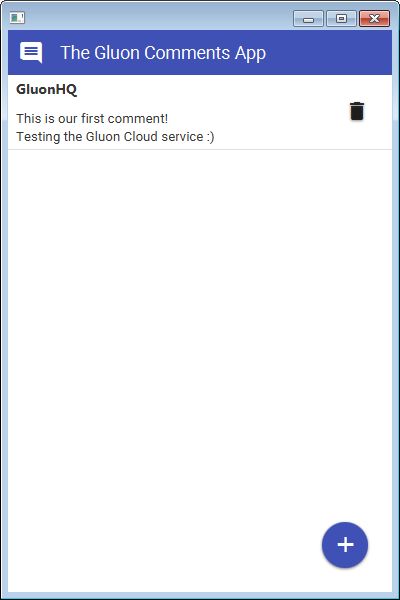
7.1. 'Comments App' Example
This section uses the Comments App to help you get started with Gluon Mobile.
You can fork or clone the Gluon Samples repository here.
Comments App sample is located in the comments directory in the 'substrate' branch.
7.1.1. Maven Configuration
The project is hosted on Github, and the Maven pom.xml is located here: https://github.com/gluonhq/gluon-samples/blob/substrate/comments/pom.xml
If you clean and verify the project, the dependencies will be downloaded the first time.
Alternatively, the project can also be imported on one of your favourite IDEs:
-
On NetBeans, if you right-click on the project’s root and select
Reload Project, the dependencies will show up under theDependenciesfolder of the project. -
On IntelliJ, click on the refresh button on the Maven Tool Window (View→Tool Windows→Maven) to refresh the Maven project, and you will see the dependencies under
External Librariesin the Project Tool Window.
7.1.2. The MobileApplication class
Have a look at the documentation for MobileApplication.
This class should be considered as the base class for any Gluon Mobile project, in a similar fashion that the Application class is for JavaFX applications.
In fact, MobileApplication extends from Application, and our class will extend it, so there is no need for a start method.
We’ll add View instances on its constructor or by overriding the init method.
There is a postInit method that can be used for one time initialization, because it’s called once there is a valid scene instance.
In this sample, we will install an indigo Swatch.
@License(key="XXXXXXXX-XXXX-XXXX-XXXX-XXXXXXXXXXXX")
public class CommentsFX extends MobileApplication {

    @Override
    public void init() {

        /**
        * Create default home view
        */
        addViewFactory(HOME_VIEW,()-> {
            HomeView homeView = new HomeView();
            return (View)homeView.getView();
        });
    }

    @Override
    public void postInit(Scene scene) {
        Swatch.INDIGO.assignTo(scene);
    }
}
If you have a valid license key for Gluon Mobile, add it to your application with the @License annotation, and you will avoid the initial nag popup dialog.
7.1.3. Adding Views
Views (check the docs) can be added easily. Content can be added to these views by placing JavaFX nodes on the top, center, or bottom of the View, or by using FXML files created with Scene Builder. In this sample, we’ll use the mobile-enabled version of the Afterburner MVP framework.
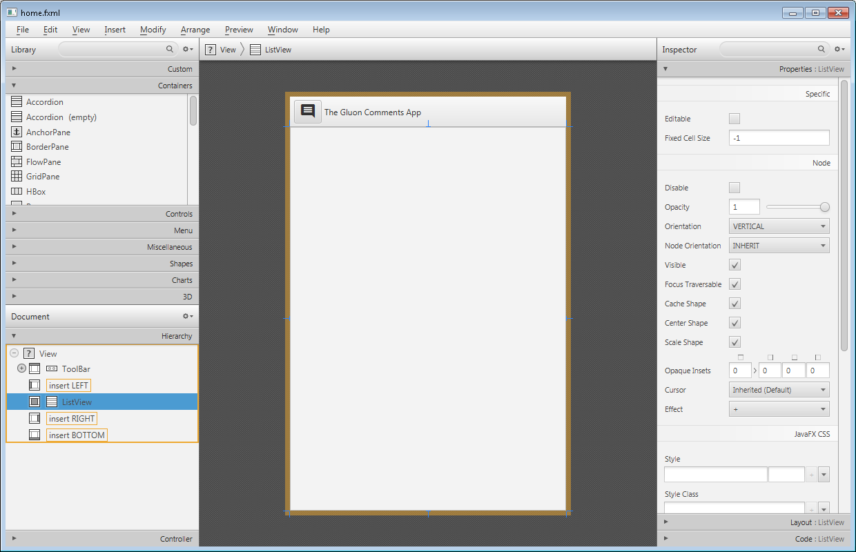
You can check the FXML file code. Besides, the View pane, an Icon is used, selected from the MaterialDesignIcon list of icons, based on the Material Design style guide.
<View fx:id="homeView" prefHeight="600.0" prefWidth="400.0" xmlns="http://javafx.com/javafx/11" xmlns:fx="http://javafx.com/fxml/1" fx:controller="com.gluonhq.demo.comments.views.home.HomePresenter">
    <top>
        <ToolBar fx:id="topHome" prefHeight="40.0" prefWidth="200.0">
            <items>
                <Button styleClass="icon-toggle">
                    <graphic>
                        <Icon content="COMMENT"/>
                    </graphic>
                </Button>
                <Label text="The Gluon Comments App"/>
            </items>
        </ToolBar>
    </top>
    <center>
        <ListView fx:id="comments" />
    </center>
</View>
7.1.4. Gluon CloudLink
This sample uses Gluon CloudLink to store and synchronize data. The Data Storage section in the Gluon CloudLink documentation contains detailed information for the following steps.
Gluon CloudLink Portal
Before you can start using Gluon CloudLink, you will need to register your application. Go to the Gluon CloudLink Product page and click on "Sign up" under "Free".
Select Sign up and register for a new account (or login if you already have one). You will be able to see the dashboard with your existing applications and their key and secret tokens. As a word of advice, keep them safe and don’t send them to anyone.
DataClientProvider class
We can now build a new DataClient, which is the access point to the Data Storage service of Gluon CloudLink.
DataClient dataClient = DataClientBuilder.create().build();CommentsService class
Once you have a DataClient reference, you can retrieve data from and store data to Gluon CloudLink.
In this case, the data will be a list with comments. The way we can get this list from this service is:
GluonObservableList<Comment> comments =
    DataProvider.retrieveList(dataClient.createListDataReader("comments",
        Comment.class, SyncFlag.LIST_WRITE_THROUGH, SyncFlag.LIST_READ_THROUGH));
Finally, we wrap this observable list into an ObjectProperty in order to expose it to the view and bind it with the ListView content.
You can find out how the rest of the views are added to this application by following this link.
8. Gluon Mobile JavaDoc
The Gluon Mobile JavaDoc can be found here.