- java.lang.Object
-
- javafx.scene.Node
-
- javafx.scene.Parent
-
- javafx.scene.layout.Region
-
- javafx.scene.control.Control
-
- com.gluonhq.charm.glisten.control.CardPane<T>
-
- Type Parameters:
T- This type is used to represent the type of the objects stored in the CardPane'sgetItems()items} ObservableList.
- All Implemented Interfaces:
Styleable,EventTarget,Skinnable
@DefaultProperty("items")
public class CardPane<T>
extends Control
CardPane is a container of cards. Any node can be added to this container as a card and will be laid out vertically, taking all available width. The content of CardPane is scrollable.
By default, cards are styled according to the Material Design guidelines.
Example
The following example illustrates the usage of the CardPane class.
 CardPane cardPane = new CardPane();
 cardPane.getItems().addAll( label("Card 1"), label("Card 2"), label("Card 3"));

 private Label label( String caption ) {
   Label label = new Label( caption );
   label.setStyle("-fx-padding:10;");
   return label;
 }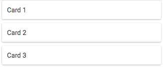
The CardPane is prepared for a big number of items by reusing its cards.
A developer may personalize cell creation by specifying a cell factory through
cellFactoryProperty(). The default cell factory is prepared to accept objects from classes that extendNodeor other classes that don't extend from Node, in the latter case the card text will be given by theObject.toString()implementation of the object.For more information refer to the cellFactory property documentation.
- Since:
- 4.2.0
- See Also:
CardCell
-
-
Property Summary
Properties Type Property Description ObjectProperty<Callback<CardPane<T>,CardCell<T>>>cellFactoryThe cell factory.ObjectProperty<EventHandler<ActionEvent>>onPullToRefreshTheEventHandlerto be called whenever there's a Swipe Refresh.ObjectProperty<Node>placeholderTheNodeto show in case there are no items in the CardPane.-
Properties inherited from class javafx.scene.control.Control
contextMenu, skin, tooltip
-
Properties inherited from class javafx.scene.layout.Region
background, border, cacheShape, centerShape, height, insets, maxHeight, maxWidth, minHeight, minWidth, opaqueInsets, padding, prefHeight, prefWidth, scaleShape, shape, snapToPixel, width
-
Properties inherited from class javafx.scene.Parent
needsLayout
-
Properties inherited from class javafx.scene.Node
accessibleHelp, accessibleRoleDescription, accessibleRole, accessibleText, blendMode, boundsInLocal, boundsInParent, cacheHint, cache, clip, cursor, depthTest, disabled, disable, effectiveNodeOrientation, effect, eventDispatcher, focused, focusTraversable, hover, id, inputMethodRequests, layoutBounds, layoutX, layoutY, localToParentTransform, localToSceneTransform, managed, mouseTransparent, nodeOrientation, onContextMenuRequested, onDragDetected, onDragDone, onDragDropped, onDragEntered, onDragExited, onDragOver, onInputMethodTextChanged, onKeyPressed, onKeyReleased, onKeyTyped, onMouseClicked, onMouseDragEntered, onMouseDragExited, onMouseDragged, onMouseDragOver, onMouseDragReleased, onMouseEntered, onMouseExited, onMouseMoved, onMousePressed, onMouseReleased, onRotate, onRotationFinished, onRotationStarted, onScrollFinished, onScroll, onScrollStarted, onSwipeDown, onSwipeLeft, onSwipeRight, onSwipeUp, onTouchMoved, onTouchPressed, onTouchReleased, onTouchStationary, onZoomFinished, onZoom, onZoomStarted, opacity, parent, pickOnBounds, pressed, rotate, rotationAxis, scaleX, scaleY, scaleZ, scene, style, translateX, translateY, translateZ, viewOrder, visible
-
-
Field Summary
-
Fields inherited from class javafx.scene.layout.Region
USE_COMPUTED_SIZE, USE_PREF_SIZE
-
Fields inherited from class javafx.scene.Node
BASELINE_OFFSET_SAME_AS_HEIGHT
-
-
Constructor Summary
Constructors Constructor Description CardPane()The constructor for CardPane.
-
Method Summary
All Methods Instance Methods Concrete Methods Modifier and Type Method Description ObjectProperty<Callback<CardPane<T>,CardCell<T>>>cellFactoryProperty()The cell factory.protected Skin<?>createDefaultSkin()Callback<CardPane<T>,CardCell<T>>getCellFactory()Gets the value of the property cellFactory.ObservableList<T>getItems()The list of items to be shown.EventHandler<ActionEvent>getOnPullToRefresh()Gets the value of the property onPullToRefresh.NodegetPlaceholder()Gets the value of the property placeholder.ObjectProperty<EventHandler<ActionEvent>>onPullToRefreshProperty()TheEventHandlerto be called whenever there's a Swipe Refresh.ObjectProperty<Node>placeholderProperty()TheNodeto show in case there are no items in the CardPane.voidsetCellFactory(Callback<CardPane<T>,CardCell<T>> factory)Sets the value of the property cellFactory.voidsetOnPullToRefresh(EventHandler<ActionEvent> eventHandler)Sets the value of the property onPullToRefresh.voidsetPlaceholder(Node node)Sets the value of the property placeholder.-
Methods inherited from class javafx.scene.control.Control
computeMaxHeight, computeMaxWidth, computeMinHeight, computeMinWidth, computePrefHeight, computePrefWidth, contextMenuProperty, executeAccessibleAction, getBaselineOffset, getClassCssMetaData, getContextMenu, getControlCssMetaData, getCssMetaData, getInitialFocusTraversable, getSkin, getTooltip, isResizable, layoutChildren, queryAccessibleAttribute, setContextMenu, setSkin, setTooltip, skinProperty, tooltipProperty
-
Methods inherited from class javafx.scene.layout.Region
backgroundProperty, borderProperty, cacheShapeProperty, centerShapeProperty, getBackground, getBorder, getHeight, getInsets, getMaxHeight, getMaxWidth, getMinHeight, getMinWidth, getOpaqueInsets, getPadding, getPrefHeight, getPrefWidth, getShape, getUserAgentStylesheet, getWidth, heightProperty, insetsProperty, isCacheShape, isCenterShape, isScaleShape, isSnapToPixel, layoutInArea, layoutInArea, layoutInArea, layoutInArea, maxHeight, maxHeightProperty, maxWidth, maxWidthProperty, minHeight, minHeightProperty, minWidth, minWidthProperty, opaqueInsetsProperty, paddingProperty, positionInArea, positionInArea, prefHeight, prefHeightProperty, prefWidth, prefWidthProperty, resize, scaleShapeProperty, setBackground, setBorder, setCacheShape, setCenterShape, setHeight, setMaxHeight, setMaxSize, setMaxWidth, setMinHeight, setMinSize, setMinWidth, setOpaqueInsets, setPadding, setPrefHeight, setPrefSize, setPrefWidth, setScaleShape, setShape, setSnapToPixel, setWidth, shapeProperty, snappedBottomInset, snappedLeftInset, snappedRightInset, snappedTopInset, snapPosition, snapPositionX, snapPositionY, snapSize, snapSizeX, snapSizeY, snapSpace, snapSpaceX, snapSpaceY, snapToPixelProperty, widthProperty
-
Methods inherited from class javafx.scene.Parent
getChildren, getChildrenUnmodifiable, getManagedChildren, getStylesheets, isNeedsLayout, layout, lookup, needsLayoutProperty, requestLayout, requestParentLayout, setNeedsLayout, updateBounds
-
Methods inherited from class javafx.scene.Node
accessibleHelpProperty, accessibleRoleDescriptionProperty, accessibleRoleProperty, accessibleTextProperty, addEventFilter, addEventHandler, applyCss, autosize, blendModeProperty, boundsInLocalProperty, boundsInParentProperty, buildEventDispatchChain, cacheHintProperty, cacheProperty, clipProperty, computeAreaInScreen, contains, contains, cursorProperty, depthTestProperty, disabledProperty, disableProperty, effectiveNodeOrientationProperty, effectProperty, eventDispatcherProperty, fireEvent, focusedProperty, focusTraversableProperty, getAccessibleHelp, getAccessibleRole, getAccessibleRoleDescription, getAccessibleText, getBlendMode, getBoundsInLocal, getBoundsInParent, getCacheHint, getClip, getContentBias, getCursor, getDepthTest, getEffect, getEffectiveNodeOrientation, getEventDispatcher, getId, getInitialCursor, getInputMethodRequests, getLayoutBounds, getLayoutX, getLayoutY, getLocalToParentTransform, getLocalToSceneTransform, getNodeOrientation, getOnContextMenuRequested, getOnDragDetected, getOnDragDone, getOnDragDropped, getOnDragEntered, getOnDragExited, getOnDragOver, getOnInputMethodTextChanged, getOnKeyPressed, getOnKeyReleased, getOnKeyTyped, getOnMouseClicked, getOnMouseDragEntered, getOnMouseDragExited, getOnMouseDragged, getOnMouseDragOver, getOnMouseDragReleased, getOnMouseEntered, getOnMouseExited, getOnMouseMoved, getOnMousePressed, getOnMouseReleased, getOnRotate, getOnRotationFinished, getOnRotationStarted, getOnScroll, getOnScrollFinished, getOnScrollStarted, getOnSwipeDown, getOnSwipeLeft, getOnSwipeRight, getOnSwipeUp, getOnTouchMoved, getOnTouchPressed, getOnTouchReleased, getOnTouchStationary, getOnZoom, getOnZoomFinished, getOnZoomStarted, getOpacity, getParent, getProperties, getPseudoClassStates, getRotate, getRotationAxis, getScaleX, getScaleY, getScaleZ, getScene, getStyle, getStyleableParent, getStyleClass, getTransforms, getTranslateX, getTranslateY, getTranslateZ, getTypeSelector, getUserData, getViewOrder, hasProperties, hoverProperty, idProperty, inputMethodRequestsProperty, intersects, intersects, isCache, isDisable, isDisabled, isFocused, isFocusTraversable, isHover, isManaged, isMouseTransparent, isPickOnBounds, isPressed, isVisible, layoutBoundsProperty, layoutXProperty, layoutYProperty, localToParent, localToParent, localToParent, localToParent, localToParent, localToParentTransformProperty, localToScene, localToScene, localToScene, localToScene, localToScene, localToScene, localToScene, localToScene, localToScene, localToScene, localToSceneTransformProperty, localToScreen, localToScreen, localToScreen, localToScreen, localToScreen, lookupAll, managedProperty, mouseTransparentProperty, nodeOrientationProperty, notifyAccessibleAttributeChanged, onContextMenuRequestedProperty, onDragDetectedProperty, onDragDoneProperty, onDragDroppedProperty, onDragEnteredProperty, onDragExitedProperty, onDragOverProperty, onInputMethodTextChangedProperty, onKeyPressedProperty, onKeyReleasedProperty, onKeyTypedProperty, onMouseClickedProperty, onMouseDragEnteredProperty, onMouseDragExitedProperty, onMouseDraggedProperty, onMouseDragOverProperty, onMouseDragReleasedProperty, onMouseEnteredProperty, onMouseExitedProperty, onMouseMovedProperty, onMousePressedProperty, onMouseReleasedProperty, onRotateProperty, onRotationFinishedProperty, onRotationStartedProperty, onScrollFinishedProperty, onScrollProperty, onScrollStartedProperty, onSwipeDownProperty, onSwipeLeftProperty, onSwipeRightProperty, onSwipeUpProperty, onTouchMovedProperty, onTouchPressedProperty, onTouchReleasedProperty, onTouchStationaryProperty, onZoomFinishedProperty, onZoomProperty, onZoomStartedProperty, opacityProperty, parentProperty, parentToLocal, parentToLocal, parentToLocal, parentToLocal, parentToLocal, pickOnBoundsProperty, pressedProperty, pseudoClassStateChanged, relocate, removeEventFilter, removeEventHandler, requestFocus, resizeRelocate, rotateProperty, rotationAxisProperty, scaleXProperty, scaleYProperty, scaleZProperty, sceneProperty, sceneToLocal, sceneToLocal, sceneToLocal, sceneToLocal, sceneToLocal, sceneToLocal, sceneToLocal, sceneToLocal, screenToLocal, screenToLocal, screenToLocal, setAccessibleHelp, setAccessibleRole, setAccessibleRoleDescription, setAccessibleText, setBlendMode, setCache, setCacheHint, setClip, setCursor, setDepthTest, setDisable, setDisabled, setEffect, setEventDispatcher, setEventHandler, setFocused, setFocusTraversable, setHover, setId, setInputMethodRequests, setLayoutX, setLayoutY, setManaged, setMouseTransparent, setNodeOrientation, setOnContextMenuRequested, setOnDragDetected, setOnDragDone, setOnDragDropped, setOnDragEntered, setOnDragExited, setOnDragOver, setOnInputMethodTextChanged, setOnKeyPressed, setOnKeyReleased, setOnKeyTyped, setOnMouseClicked, setOnMouseDragEntered, setOnMouseDragExited, setOnMouseDragged, setOnMouseDragOver, setOnMouseDragReleased, setOnMouseEntered, setOnMouseExited, setOnMouseMoved, setOnMousePressed, setOnMouseReleased, setOnRotate, setOnRotationFinished, setOnRotationStarted, setOnScroll, setOnScrollFinished, setOnScrollStarted, setOnSwipeDown, setOnSwipeLeft, setOnSwipeRight, setOnSwipeUp, setOnTouchMoved, setOnTouchPressed, setOnTouchReleased, setOnTouchStationary, setOnZoom, setOnZoomFinished, setOnZoomStarted, setOpacity, setPickOnBounds, setPressed, setRotate, setRotationAxis, setScaleX, setScaleY, setScaleZ, setStyle, setTranslateX, setTranslateY, setTranslateZ, setUserData, setViewOrder, setVisible, snapshot, snapshot, startDragAndDrop, startFullDrag, styleProperty, toBack, toFront, toString, translateXProperty, translateYProperty, translateZProperty, usesMirroring, viewOrderProperty, visibleProperty
-
Methods inherited from class java.lang.Object
clone, equals, finalize, getClass, hashCode, notify, notifyAll, wait, wait, wait
-
Methods inherited from interface javafx.css.Styleable
getStyleableNode
-
-
-
-
Property Detail
-
cellFactory
public final ObjectProperty<Callback<CardPane<T>,CardCell<T>>> cellFactoryProperty
The cell factory. Each cell corresponds to a card. Setting a cell factory allows the developer to personalize cell creation, which allows for total customization of the cell. In this case the developer typically sets the items property with the items in the data model and then modifies the cell, which might later be reused, according to the data model item that is to be shown on that cell.
Setting a new cell factory forces all old
CardCells to be thrown away and new CardCells created with the new cell factory.- Default value:
- Cell factory that accepts
Nodes in the items property. It also accepts other classes that don't extend from Node, in that case the text in the card will be given by theObject.toString()implementation of the object. - See Also:
getCellFactory(),setCellFactory(Callback)
-
placeholder
public final ObjectProperty<Node> placeholderProperty
TheNodeto show in case there are no items in the CardPane.- Default value:
- null
- See Also:
getPlaceholder(),setPlaceholder(Node)
-
onPullToRefresh
public final ObjectProperty<EventHandler<ActionEvent>> onPullToRefreshProperty
The
EventHandlerto be called whenever there's a Swipe Refresh. ThisEventHandlerwill run on a background thread.To enable pull to refresh set a handler for this property.
- Default value:
- null
- See Also:
getOnPullToRefresh(),setOnPullToRefresh(EventHandler)
-
-
Method Detail
-
getItems
public final ObservableList<T> getItems()
The list of items to be shown. This could be the collection of items of the data model or a collection of Nodes to be directly shown inside the card.- Returns:
- the list of items.
-
createDefaultSkin
protected Skin<?> createDefaultSkin()
- Overrides:
createDefaultSkinin classControl
-
cellFactoryProperty
public final ObjectProperty<Callback<CardPane<T>,CardCell<T>>> cellFactoryProperty()
The cell factory. Each cell corresponds to a card. Setting a cell factory allows the developer to personalize cell creation, which allows for total customization of the cell. In this case the developer typically sets the items property with the items in the data model and then modifies the cell, which might later be reused, according to the data model item that is to be shown on that cell.
Setting a new cell factory forces all old
CardCells to be thrown away and new CardCells created with the new cell factory.- Default value:
- Cell factory that accepts
Nodes in the items property. It also accepts other classes that don't extend from Node, in that case the text in the card will be given by theObject.toString()implementation of the object. - See Also:
getCellFactory(),setCellFactory(Callback)
-
setCellFactory
public final void setCellFactory(Callback<CardPane<T>,CardCell<T>> factory)
Sets the value of the property cellFactory.- Property description:
The cell factory. Each cell corresponds to a card. Setting a cell factory allows the developer to personalize cell creation, which allows for total customization of the cell. In this case the developer typically sets the items property with the items in the data model and then modifies the cell, which might later be reused, according to the data model item that is to be shown on that cell.
Setting a new cell factory forces all old
CardCells to be thrown away and new CardCells created with the new cell factory.- Default value:
- Cell factory that accepts
Nodes in the items property. It also accepts other classes that don't extend from Node, in that case the text in the card will be given by theObject.toString()implementation of the object.
-
getCellFactory
public final Callback<CardPane<T>,CardCell<T>> getCellFactory()
Gets the value of the property cellFactory.- Property description:
The cell factory. Each cell corresponds to a card. Setting a cell factory allows the developer to personalize cell creation, which allows for total customization of the cell. In this case the developer typically sets the items property with the items in the data model and then modifies the cell, which might later be reused, according to the data model item that is to be shown on that cell.
Setting a new cell factory forces all old
CardCells to be thrown away and new CardCells created with the new cell factory.- Default value:
- Cell factory that accepts
Nodes in the items property. It also accepts other classes that don't extend from Node, in that case the text in the card will be given by theObject.toString()implementation of the object.
-
placeholderProperty
public final ObjectProperty<Node> placeholderProperty()
TheNodeto show in case there are no items in the CardPane.- Default value:
- null
- See Also:
getPlaceholder(),setPlaceholder(Node)
-
setPlaceholder
public final void setPlaceholder(Node node)
Sets the value of the property placeholder.- Property description:
- The
Nodeto show in case there are no items in the CardPane. - Default value:
- null
-
getPlaceholder
public Node getPlaceholder()
Gets the value of the property placeholder.- Property description:
- The
Nodeto show in case there are no items in the CardPane. - Default value:
- null
-
onPullToRefreshProperty
public final ObjectProperty<EventHandler<ActionEvent>> onPullToRefreshProperty()
The
EventHandlerto be called whenever there's a Swipe Refresh. ThisEventHandlerwill run on a background thread.To enable pull to refresh set a handler for this property.
- Default value:
- null
- See Also:
getOnPullToRefresh(),setOnPullToRefresh(EventHandler)
-
setOnPullToRefresh
public final void setOnPullToRefresh(EventHandler<ActionEvent> eventHandler)
Sets the value of the property onPullToRefresh.- Property description:
The
EventHandlerto be called whenever there's a Swipe Refresh. ThisEventHandlerwill run on a background thread.To enable pull to refresh set a handler for this property.
- Default value:
- null
-
getOnPullToRefresh
public final EventHandler<ActionEvent> getOnPullToRefresh()
Gets the value of the property onPullToRefresh.- Property description:
The
EventHandlerto be called whenever there's a Swipe Refresh. ThisEventHandlerwill run on a background thread.To enable pull to refresh set a handler for this property.
- Default value:
- null
-
-