1. Gluon High-Level Architecture
Gluon provides Java Enterprise capabilities for Java Client development. With Gluon, Java Client developers use an API in a familiar language (Java) to perform familiar Enterprise operations.
Gluon consists of [A] a client component named Gluon Charm and [B] a server component named Gluon Cloud.
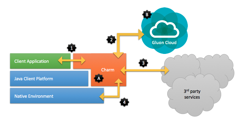
Charm [A] is the client-side library that
-
provides UI controls for the client application
-
handles communication with the server-side Gluon Cloud
-
handles communication with other 3rd party services
-
abstracts (parts of) the platform specific APIs.
Gluon Cloud [B] provides an easy way for client applications to store and retrieve data, manage your users and synchronize all data across different clients.
1.1. Charm
Charm is composed of three sub-components, with names [1] Glisten, [2] Connect, and [3] Down.
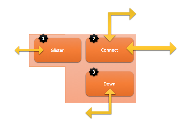
[1] Glisten is the UI component that offers JavaFX Controls that have a cross platform behavior, but a platform specific look and feel. They make your application look like a native application.
[2] Connect provides the API for communicating to Gluon Cloud or other 3rd party webservices.
[3] Down makes available all the storage systems, accelerometers, screen details, GPS devices, and more in a device-independent fashion.
1.2. Gluon Cloud
Gluon Cloud manages the persistent storage of your data and your users. It can synchronise your data: if one user changes data, it can be reflected in the data visible to other users immediately.
Gluon Cloud is offered as a hosted service but it can also be installed on-premise in case there is a need to keep everything in the local network.
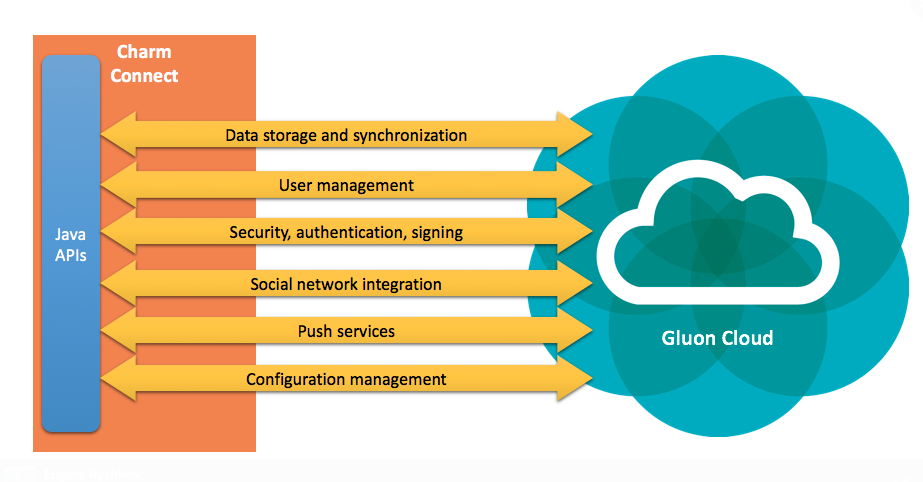
Charm Connect is designed to seamlessly talk to Gluon Cloud. Though Charm Connect works fine without Gluon Cloud (e.g. by communication with 3rd party services), development speed increases a lot by using Gluon Cloud, which is specifically created for providing Enterprise Services to Java Client applications.
1.3. Charm JavaDoc
The Charm JavaDoc can be found here.
2. Project Setup
JavaFX applications using Gluon Charm can target three different platforms: Android, iOS and the regular desktop. Creating a project that is able to build the packages for those platforms and get them deployed on your devices is not an easy task. However, by using the jfxmobile plugin on top of a gradle configuration, all of this should be a breeze.
2.1. Prerequisites
Before getting any further, please check the list of prerequisites for the use of the Gradle jfxmobile-plugin. Mainly you will need Gradle and Android SDK installed on your system. Once you have checked the list of prerequisites, there are two ways to get your project up and running:
-
Use the Gluon IDE plugins
-
Download a sample application
2.2. Gluon IDE plugins
At Gluon we are introducing IDE plugins to support the community in making use of our technology. The plugin aids in creating a basic Gluon application project inside your IDE. At present we support NetBeans, IntelliJ IDEA and Eclipse.
2.2.1. Gluon NetBeans Plugin
On NetBeans, you can install it directly from Tools→Plugins or you can download it manually from the NetBeans plugins website and then add the nbm file in NetBeans. If you don’t know how to do that, you can watch this video to help you along and read the details here. Note that the current version of the Gluon NetBeans Plugin is 1.0.3.
2.2.2. Gluon IntelliJ Plugin
If you use IntelliJ IDEA as your IDE, you can install this plugin from File→Settings→Plugins, or download the plugin from the IntelliJ plugins website and install the zip file in IntelliJ. If you don’t know how to do that, you can read the details here. Note that the current version of the Gluon IntelliJ Plugin is 1.0.
2.2.3. Gluon Eclipse Plugin
If you use Eclipse as your IDE, you can install the Gluon plugin from the Eclipse Marketplace or by using the following Update Site: http://download.gluonhq.com/tools/eclipse/updates/1.0.0. You can read the detailed instructions here. Note that the current version of the Gluon Eclipse Plugin is 1.0.0.
2.2.4. Basic Gluon Application
After having installed the plugin into your IDE, you can create a new project.
- NetBeans
-
Choose
File→New→Project…from the menu and selectBasic Gluon Applicationunder theJavaFXcategory - IntelliJ
-
Choose
File→New→Project…from the menu and selectGluon Basic Projectunder theGluoncategory - Eclipse
-
Choose
File→New→Project…from the menu and selectBasic Gluon Applicationunder theJavaFXcategory
2.3. Download Sample Application
If you don’t use NetBeans, IntelliJ IDEA or Eclipse, you can download our HelloWorld sample application to get you started. Just unzip it and open the project with your IDE. It is a gradle project, so you can run gradle tasks to build your application and run it on any of the three platforms. See the Getting Started page to know which tasks are used to build for which platform.
2.4. Adding Charm to the project
Gluon Charm requires developers to buy a license if they don’t want the nag screen popup when starting their application.
For all information about Charm licenses see this link.
After you have created the basic project or downloaded an existing one, add your valid license key to your main application class using the @License annotation like this:
import com.gluonhq.charm.glisten.license.License;

@License(key="XXXXXXXX-XXXX-XXXX-XXXX-XXXXXXXXXXXX")
public class HelloWorld extends MobileApplication {
    ...
}
Licenses are validated online once per application install. If for some reason the license service can’t be contacted, your end-users won’t be annoyed by the popup, but the license check will be retried each time the application starts until successful.
Finally, open up the build.gradle file (which in NetBeans is located under Build Scripts/Project) and add the Gluon Nexus repository http://nexus.gluonhq.com/nexus/content/repositories/releases/
to the repositories section. To be able to make use of Gluon Charm, you also need to add its dependencies. Your updated
build.gradle file will now look something like this:
repositories {
    jcenter()
    maven {
        url 'http://nexus.gluonhq.com/nexus/content/repositories/releases/'
    }
}

dependencies {
    compile 'com.gluonhq:charm:2.0.0'

    androidRuntime 'com.gluonhq:charm-android:2.0.0'
    iosRuntime 'com.gluonhq:charm-ios:2.0.0'
    desktopRuntime 'com.gluonhq:charm-desktop:2.0.0'
}
Clean and build the project and check that those dependencies are downloaded (only the first time).
Now that everything is in place, you can start including Charm features in your project.
2.5. The 'Comments App' Example
This section uses the Comments App to help you getting started with Charm. You can fork or clone the repository here.
2.5.1. The build script
This is the full build.gradle file:
buildscript {
    repositories {
        jcenter()
    }
    dependencies {
        classpath 'org.javafxports:jfxmobile-plugin:1.0.6'
    }
}

apply plugin: 'org.javafxports.jfxmobile'

repositories {
    jcenter()
    maven {
        url 'http://nexus.gluonhq.com/nexus/content/repositories/releases/'
    }
}

mainClassName = 'com.gluonhq.demo.comments.CommentsFX'

dependencies {
    compile 'com.airhacks:afterburner.mfx:1.6.2'

    compile "com.gluonhq:charm:2.0.0"
    androidRuntime "com.gluonhq:charm-android:2.0.0"
    iosRuntime "com.gluonhq:charm-ios:2.0.0"
    desktopRuntime "com.gluonhq:charm-desktop:2.0.0"
}

jfxmobile {
    android {
        manifest = 'src/android/AndroidManifest.xml'
    }
    ios {
        infoPList = file('src/ios/Default-Info.plist')
        forceLinkClasses = ['com.gluonhq.**.*', \
                            'com.airhacks.afterburner.**.*', \
                            'org.glassfish.json.**.*']
    }
}
If you clean and build the project, the dependencies will be downloaded the first time. On NetBeans, if you right-click on the
project’s root and select Reload Project, the dependencies will show up under the Dependencies folder of the project.
On IntelliJ, click on the refresh button on the Gradle Tool Window (View→Tool Windows→Gradle) to refresh the Gradle projects
and you will see them under External Libraries in the Project Tool Window.
2.5.2. The MobileApplication class
Have a look at the documentation for MobileApplication. This class should be considered as the base class for any Charm project, in a similar fashion that the Application class is for JavaFX applications.
In fact, MobileApplication extends from Application, and our class will extend it, so there is no need for a start method. We’ll add View instances on its constructor or by overriding the init method.
There is a postInit method that can be used for one time initialization, because it’s called once there is a valid scene instance. In this sample, we will install an indigo Swatch.
@License(key="XXXXXXXX-XXXX-XXXX-XXXX-XXXXXXXXXXXX")
public class CommentsFX extends MobileApplication {

    @Override
    public void init() {

        /**
        * Create default home view
        */
        addViewFactory(HOME_VIEW,()->{
            HomeView homeView = new HomeView();
            return (View)homeView.getView();
        });
    }

    @Override
    public void postInit(Scene scene){
        Swatch.INDIGO.assignTo(scene);
    }
}
If you have a valid license key for Gluon Charm, add it to your application with the @License annotation, and you will avoid the initial nag popup dialog.
2.5.3. Adding Views
Views (check the docs) can be added easily, just by placing JavaFX nodes on the top, center or bottom of the View, or by using FXML files created with Scene Builder. In this sample, we’ll use the mobile-enabled version of the Afterburner MVP framework.
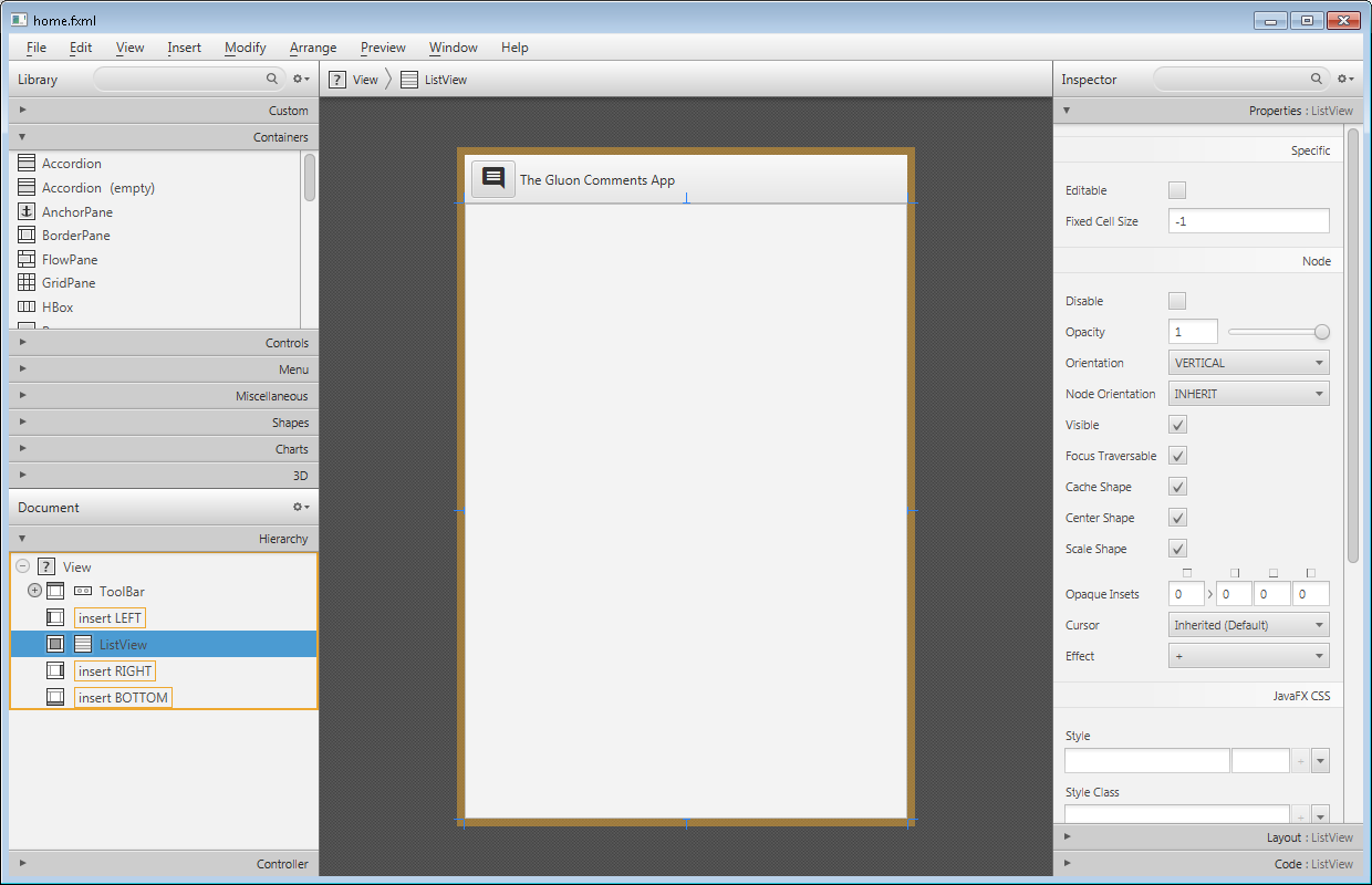
You can check the FXML file code. Besides the View pane, an Icon is used, selected from the MaterialDesignIcon list of icons, based on the Material Design style guide.
<View fx:id="homeView" prefHeight="600.0" prefWidth="400.0" xmlns="http://javafx.com/javafx/8" xmlns:fx="http://javafx.com/fxml/1" fx:controller="com.gluonhq.demo.comments.views.home.HomePresenter">
<top>
<ToolBar fx:id="topHome" prefHeight="40.0" prefWidth="200.0">
<items>
<Button styleClass="icon-toggle">
<graphic>
<Icon content="COMMENT"/>
</graphic>
</Button>
<Label text="The Gluon Comments App"/>
</items>
</ToolBar>
</top>
<center>
<ListView fx:id="comments" />
</center>
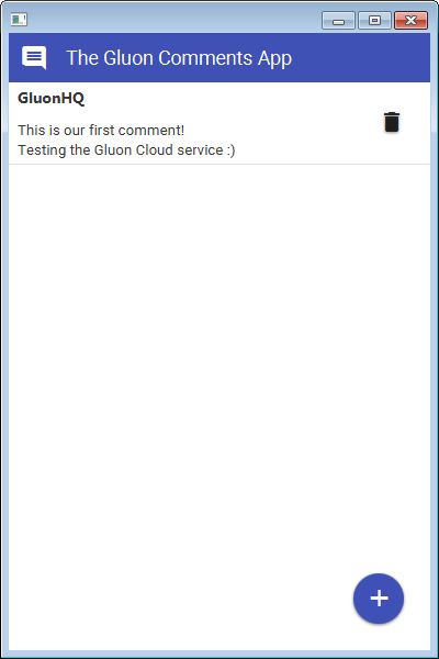
</View>2.5.4. The Gluon Cloud
This link contains detailed information for the following steps.
The Gluon Cloud Portal
Before you can start using the Gluon Charm Connect library, you will need to register your application on the Gluon Cloud Portal. If you haven’t got an account yet, just fill in the sign up form by clicking the link below the login button. Once you are successfully logged in, you are able to create a Gluon Application by providing a name in the form on the Dashboard page. An application key and secret will be generated for you when the application is created. Please keep the key and secret safe and don’t send them to anyone.
The GluonClientProvider class
We can now build a GluonClient instance, which acts as the access point to the Gluon Cloud service.
GluonClient gluonClient = GluonClientBuilder.create()
    .credentials(new GluonCredentials(APPKEY, APPSECRET))
    .build();
The CommentsSevice class
Once you have a GluonClient reference, you can obtain a StorageService from it:
StorageService storageService = gluonClient.getStorageService();This service can be used to retrieve data from and store data to the Gluon Cloud service. In this case, the data will be a list with comments. The way we can get this list from this service is:
CharmObservableList<Comment> comments =
    storageService.<Comment>retrieveList("comments",
        Comment.class, StorageWhere.GLUONCLOUD,
        SyncFlag.LIST_WRITE_THROUGH, SyncFlag.LIST_READ_THROUGH);
Finally, we wrap this observable list into an ObjectProperty in order to expose it to the view and bind it with the ListView content.
You can follow how the rest of the views are added to this app on this link.
3. Charm Glisten
3.1. Glisten APIs
3.1.1. MobileApplication
The MobileApplication class extends from Application, hence for Glisten-based applications it will be considered the base class.
Let’s have a look at the hierarchy of components added to generate the user interface.
The GlassPane
The GlassPane is the root node added automatically by Glisten to the primary scene.
It can be seen as the invisible container for all the nodes that will be added: views, layers, dialogs or toolbars.
Usually, there won’t be any need to access this container directly. But it can be retrieved with MobileApplication.getInstance().getGlassPane(), if needed.
The first children of the GlassPane container will always be a View and the AppBar.
The nodes on top will be layers (like a side menu), popups or dialogs.
In between, there is a semi-transparent node that will ensure that the node on top appears distinct from the content beneath it, whenever this is shown. Otherwise it won’t be visible.
By calling setBackgroundFade(double) the developer will be able to fade this layer to a darker color, obscuring the main application and drawing focus to the popup.
The AppBar
The AppBar is a special node acting as a toolbar for branding, navigation, search and other different actions.
It is placed at the top of the layout and is generally made up of some buttons (nav icon and action items), a title and a menu.
The content (in terms of nodes and their respective actions) will be managed directly by each of the different views, so the AppBar will be like a toolbar placeholder for each one of them.
Typically, the developer sets up the AppBar for a given View by overriding its updateAppBar method:
class HomeView extends View {

    public HomeView(String name) {
        super(name);
        getLayers().add(new FloatingActionButton());
    }

    @Override
    protected void updateAppBar(AppBar appBar) {
        appBar.setNavIcon(MaterialDesignIcon.MENU.button(e -> System.out.println("nav icon")));
        appBar.setTitleText("The AppBar");
        appBar.getActionItems().addAll(
            MaterialDesignIcon.SEARCH.button(e -> System.out.println("search")),
            MaterialDesignIcon.FAVORITE.button(e -> System.out.println("fav")));
        appBar.getMenuItems().addAll(new MenuItem("Settings"));
    }
}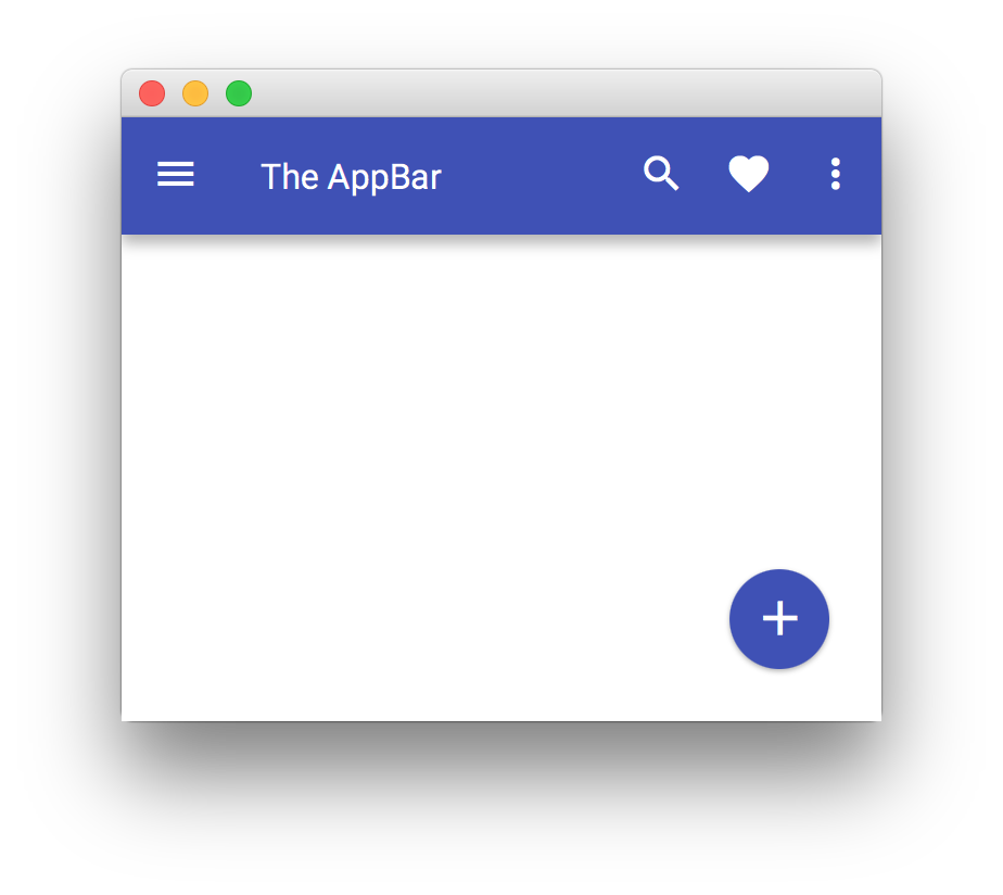
If the developer doesn’t require the AppBar for a given view, it can be hidden by setting its visibility to false: appBar.setVisible(false).
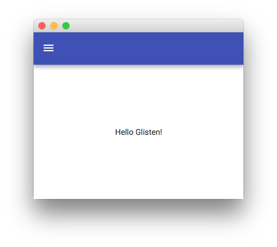
Another way to update the AppBar will be adding a listener to each view’s showingProperty:
public class MyApp extends MobileApplication {

    @Override
    public void init() {
        addViewFactory(HOME_VIEW, () -> {
            View view = new View(new Label("Hello Glisten!"));
            view.showingProperty().addListener((obs, oldValue, newValue) -> {
                if (newValue) {
                    AppBar appBar = MobileApplication.getInstance().getAppBar();
                    appBar.setNavIcon(MaterialDesignIcon.MENU.button(e -> System.out.println("nav icon")));
                }
            });
            return view;
        });
    }
}
The Views
Glisten user interfaces are built using views, which are extensions of MobileLayoutPane. A View is a Glisten container that will allow adding nodes to its top, center and bottom.
Usually a View instance is created by providing a name for the view and the node for its content, this instance is added to a factory of views, so the Glisten UI can load and unload them on demand.
The Home View
By default, the home view will be the first view displayed when the stage is shown.
It has no predefined content, so this view has to be designed by the developer, but its name is already assigned: MobileApplication.HOME_VIEW.
This short snippet will create a very simple mobile application with a single view:
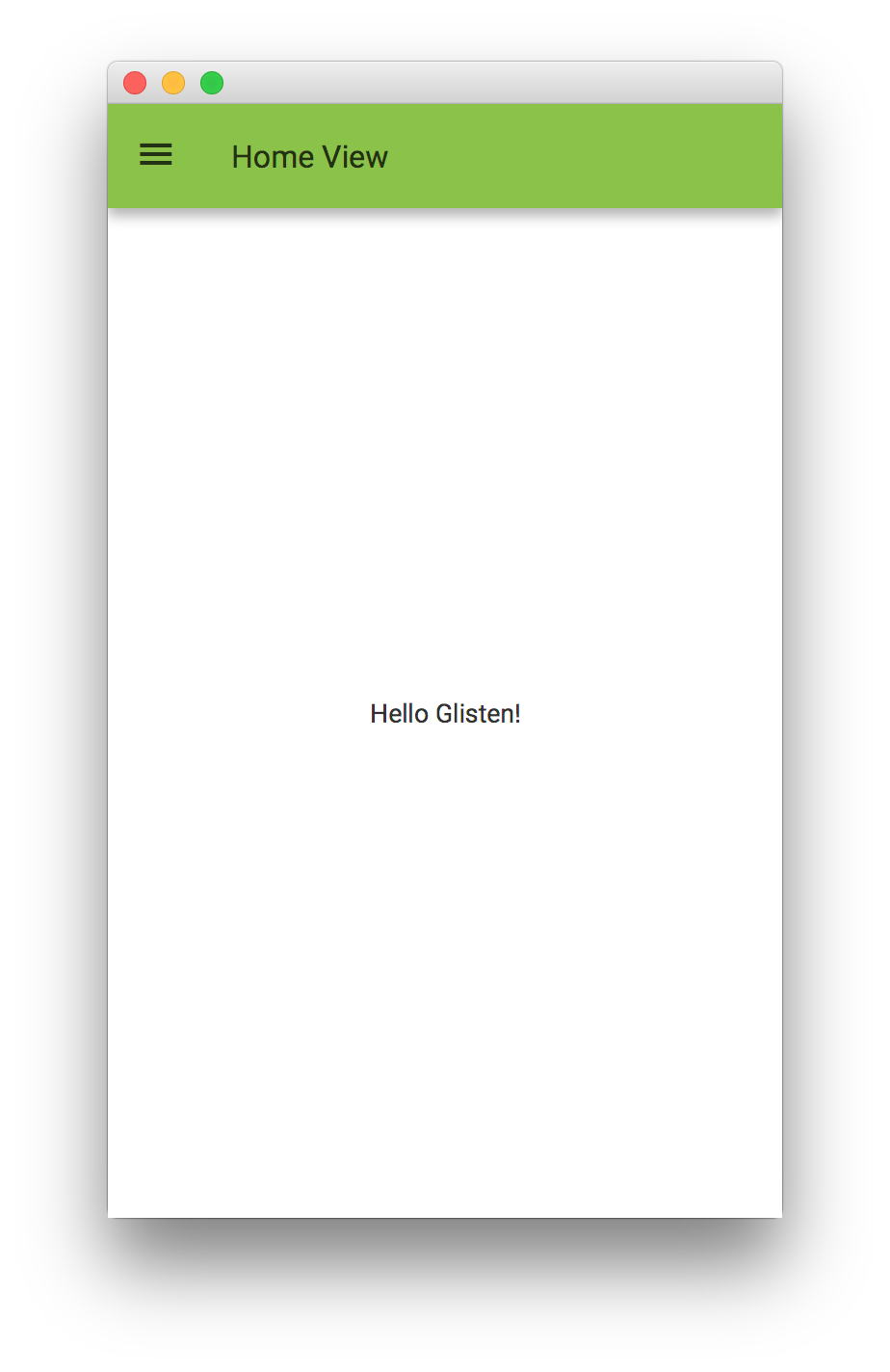
public class MyApp extends MobileApplication {

    @Override
    public void init() {
        addViewFactory(HOME_VIEW, () -> new View(new Label("Hello Glisten!")));
    }

}
Note that if the View is constructed without a name it will take the one given to the factory.
3.1.2. How it works
In order to understand how Glisten works, let’s have a look at the initial JavaFX application lifecycle. Whenever an application is launched, the JavaFX runtime:
-
Constructs an instance of the specified
Applicationclass -
Calls the
init()method -
Calls the
start(javafx.stage.Stage)method
Typically, the developer of a Glisten application will only override the init() method, in order to add one or more View objects, and provide them as factories that can be called on-demand. The MobileApplication implementation will take care of the rest: when start() is called, it will create a Scene, adding a root node to it, and finally it will put the scene in the primary stage and show it.
When the runtime calls init(), we just provide a Supplier<View> for HOME_VIEW, but the view is not instantiated at this point yet.
Then start(Stage) is called. In this moment, MobileApplication creates an instance of Scene, sets as root an empty instance of a GlassPane and adds the scene to the primary stage.
After some internal settings, like adding the default Swatch, it calls switchView("HOME_VIEW"). This is the moment when an instance of the home view is created and added to the pane.
Finally the stage is shown.
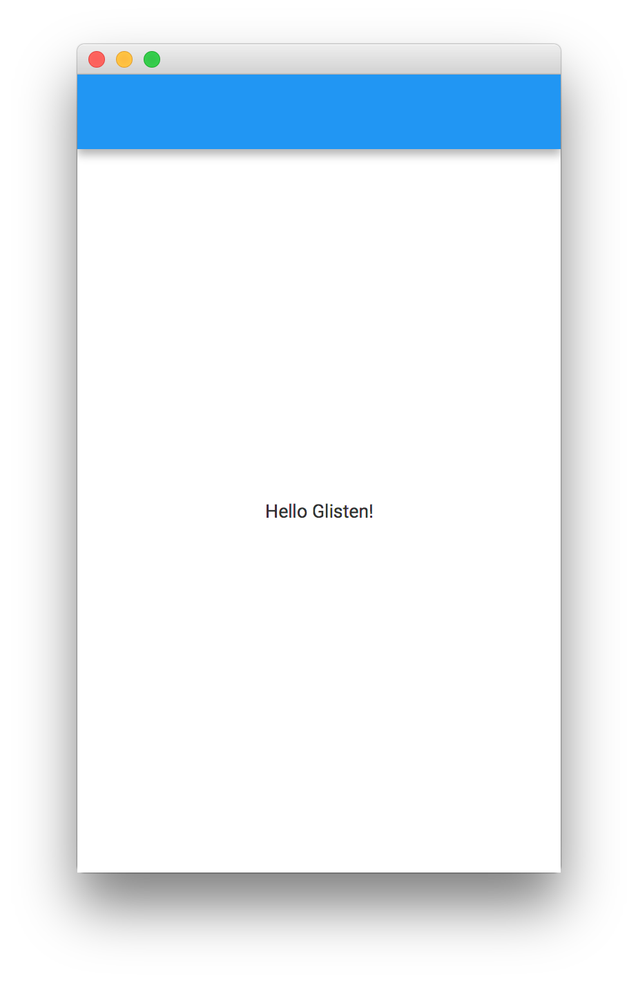
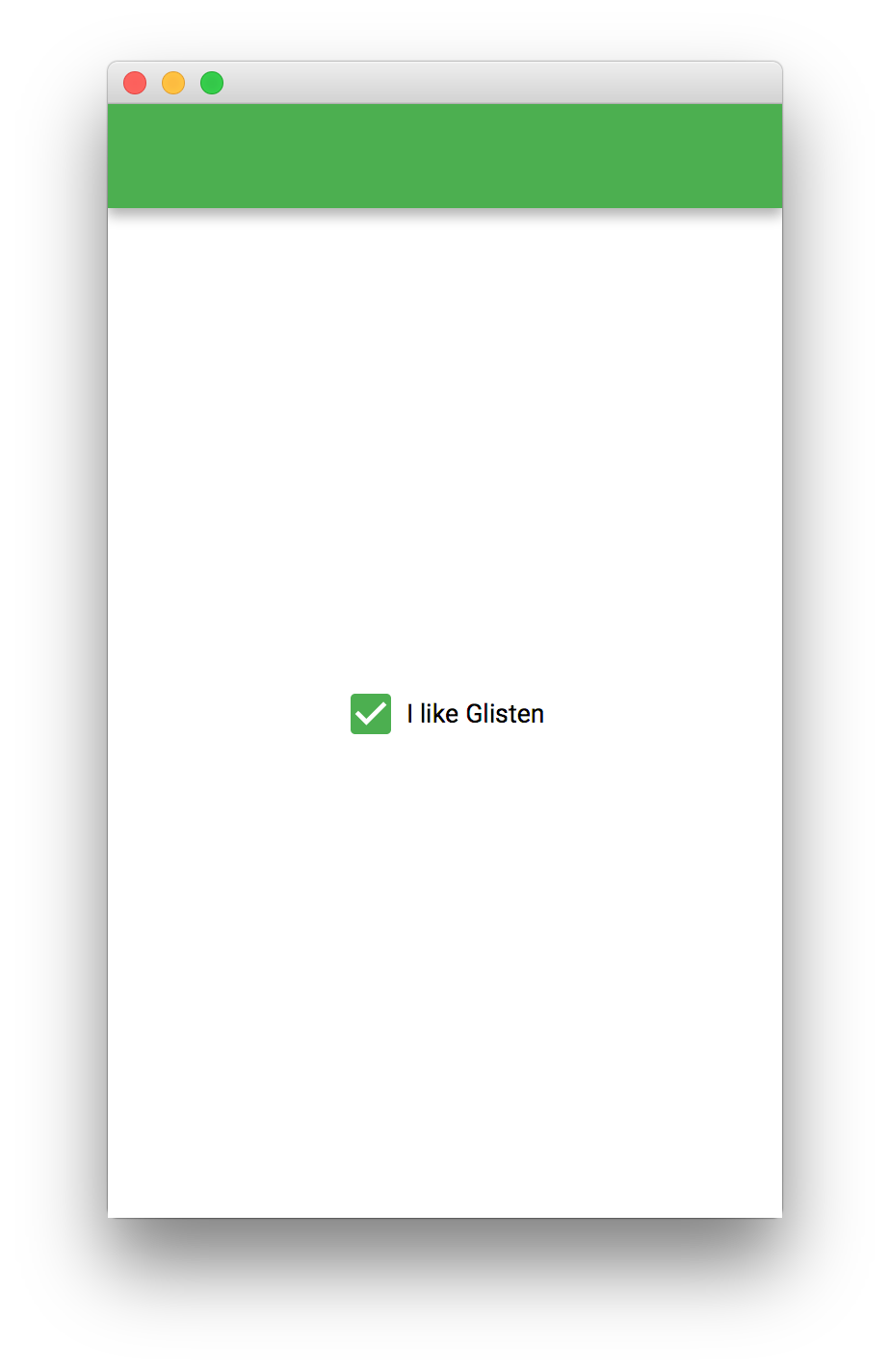
Changing the default Swatch
What if we want to modify some scene settings before it is shown?
Before showing the stage, there’s a call to the postInit(Scene) method, that can be used by the developer for one time initialization.
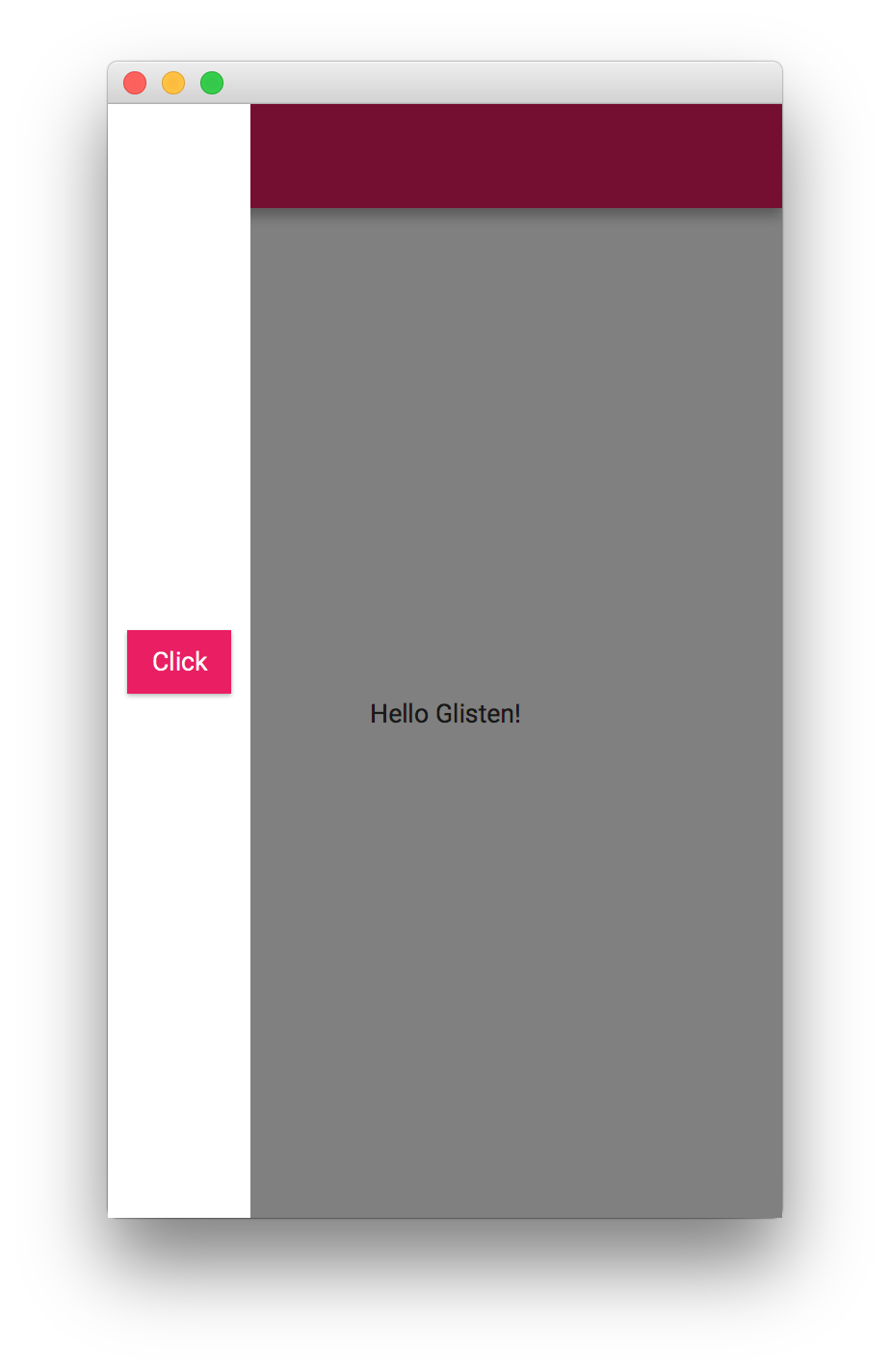
public class MyApp extends MobileApplication {

    @Override
    public void init() {
        addViewFactory(HOME_VIEW, () -> new View(CheckBox("I like Glisten")));
    }

    @Override
    public void postInit(Scene scene) {
        Swatch.GREEN.assignTo(scene);
    }

}
In case the developer wants to change the swatch for each view, this can be done by listening to the changes in the viewProperty of a MobileApplication instance, and assigning the corresponding Swatch:
public class MyApp extends MobileApplication {

    @Override
    public void init() {
        addViewFactory(HOME_VIEW, () -> new View(new Label("Hello Glisten!")) {
            {
                getLayers().add(new FloatingActionButton(MaterialDesignIcon.ADD_BOX.text, e -> switchView(OTHER_VIEW)));
            }
        });
        addViewFactory(OTHER_VIEW, () -> new View(new CheckBox("I like Glisten")) {
            {
                getLayers().add(new FloatingActionButton(MaterialDesignIcon.ADD_CIRCLE_OUTLINE.text, e -> switchView(HOME_VIEW)));
            }
        });

        viewProperty().addListener((obs, oldView, newView) -> {
            switch(newView.getName()) {
                case HOME_VIEW:
                    Swatch.INDIGO.assignTo(newView.getScene());
                    break;
                case OTHER_VIEW:
                    Swatch.GREEN.assignTo(newView.getScene());
                    break;
                default:
                    Swatch.getDefault().assignTo(newView.getScene());
            }
        });
    }
}
Another way to accomplish the same will be by adding a listener to each view’s showingProperty:
public class MyApp extends MobileApplication {
@Override
public void init() {
addViewFactory(HOME_VIEW, () -> {
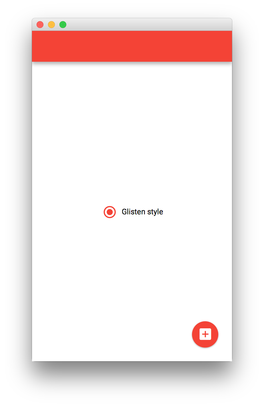
View view = new View(new RadioButton("Glisten style"));
view.getLayers().add(new FloatingActionButton(MaterialDesignIcon.ADD_BOX.text, e -> switchView(OTHER_VIEW)));
view.showingProperty().addListener((obs, oldValue, newValue) -> {
if (newValue) {
Swatch.RED.assignTo(view.getScene());
}
});
return view;
});
addViewFactory(OTHER_VIEW, () -> {
View view = new View(new CheckBox("I like Glisten"));
view.getLayers().add(new FloatingActionButton(MaterialDesignIcon.ADD_CIRCLE_OUTLINE.text, e -> switchView(HOME_VIEW)));
view.showingProperty().addListener((obs, oldValue, newValue) -> {
if (newValue) {
Swatch.TEAL.assignTo(view.getScene());
}
});
return view;
});
}
}
Creating a View
As we have already seen in the previous code snippets, there are several possible ways to create a View.
Extending View
A custom view can be created by extending View. This allows for more complex views, for adding a view transition, customizing the AppBar…
public class MyApp extends MobileApplication {

    @Override
    public void init() {
        addViewFactory(HOME_VIEW, () -> new HomeView(HOME_VIEW));
        addViewFactory(OTHER_VIEW, () -> new View(new CheckBox("I like Glisten")));
    }

    @Override
    public void postInit(Scene scene) {
        Swatch.LIGHT_GREEN.assignTo(scene);
    }

    class HomeView extends View {

        public HomeView(String name) {
            super(name);

            setCenter(new Label("Hello Glisten!"));
        }

        @Override
        protected void updateAppBar(AppBar appBar) {
            appBar.setNavIcon(MaterialDesignIcon.MENU.button(e -> switchView(OTHER_VIEW)));
            appBar.setTitleText("Home View");
        }
    }
}
Adding content
A View can be created by using one of its constructors, where the content is set. Any Node will work as content for the View.
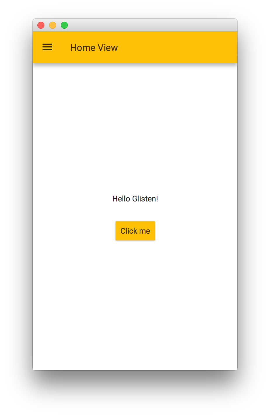
public class MyApp extends MobileApplication {
@Override
public void init() {
addViewFactory(HOME_VIEW, () -> new View(new Home()) {
@Override protected void updateAppBar(AppBar appBar) {
appBar.setNavIcon(MaterialDesignIcon.MENU.button(e -> switchView(OTHER_VIEW)));
appBar.setTitleText("Home View");
}
});
}
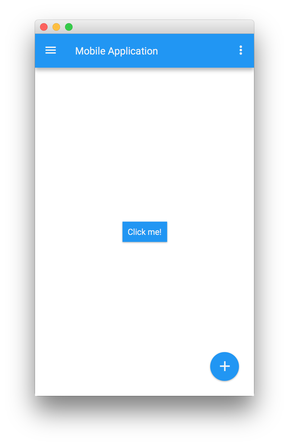
class Home extends VBox {
public Home() {
setSpacing(30);
setAlignment(Pos.CENTER);
getChildren().addAll(new Label("Hello Glisten!"), new Button("Click me"));
}
}
}
Creating Views with FXML
As well, View can be used within FXML, by adding the proper import.
<?xml version="1.0" encoding="UTF-8"?>

<?import com.gluonhq.charm.glisten.mvc.View?>
<?import javafx.scene.control.Button?>

<View fx:id="home" prefHeight="400.0" prefWidth="600.0" styleClass="mainFxmlClass" xmlns="http://javafx.com/javafx/8.0.40" xmlns:fx="http://javafx.com/fxml/1">
   <center>
      <Button fx:id="button" onAction="#onClick" text="Click me!" />
   </center>
</View>
And then loading the fxml file with FXMLLoader. Asumming the home.fxml file is under the same package as the application, but in the Resources folder:
public class MyApp extends MobileApplication {

    @Override
    public void init() {
        addViewFactory(HOME_VIEW, () -> {
            try {
                return (View)FXMLLoader.load(getClass().getResource("views/home_1.fxml"));
            } catch (Exception ex) { }
            return null;
        });
        addViewFactory(OTHER_VIEW, () -> new View(new CheckBox("I like Glisten")));
        viewProperty().addListener((obs, ov, nv) -> {
            AppBar appBar = MobileApplication.getInstance().getAppBar();
            switch(nv.getName()) {
                case HOME_VIEW:
                    appBar.setNavIcon(MaterialDesignIcon.MENU.button(e -> switchView(OTHER_VIEW)));
                    appBar.setTitleText("Home View");
                    Swatch.TEAL.assignTo(appBar.getScene());
                    break;
                case OTHER_VIEW:
                    appBar.setVisible(false);
                    break;
            }
        });
    }
}
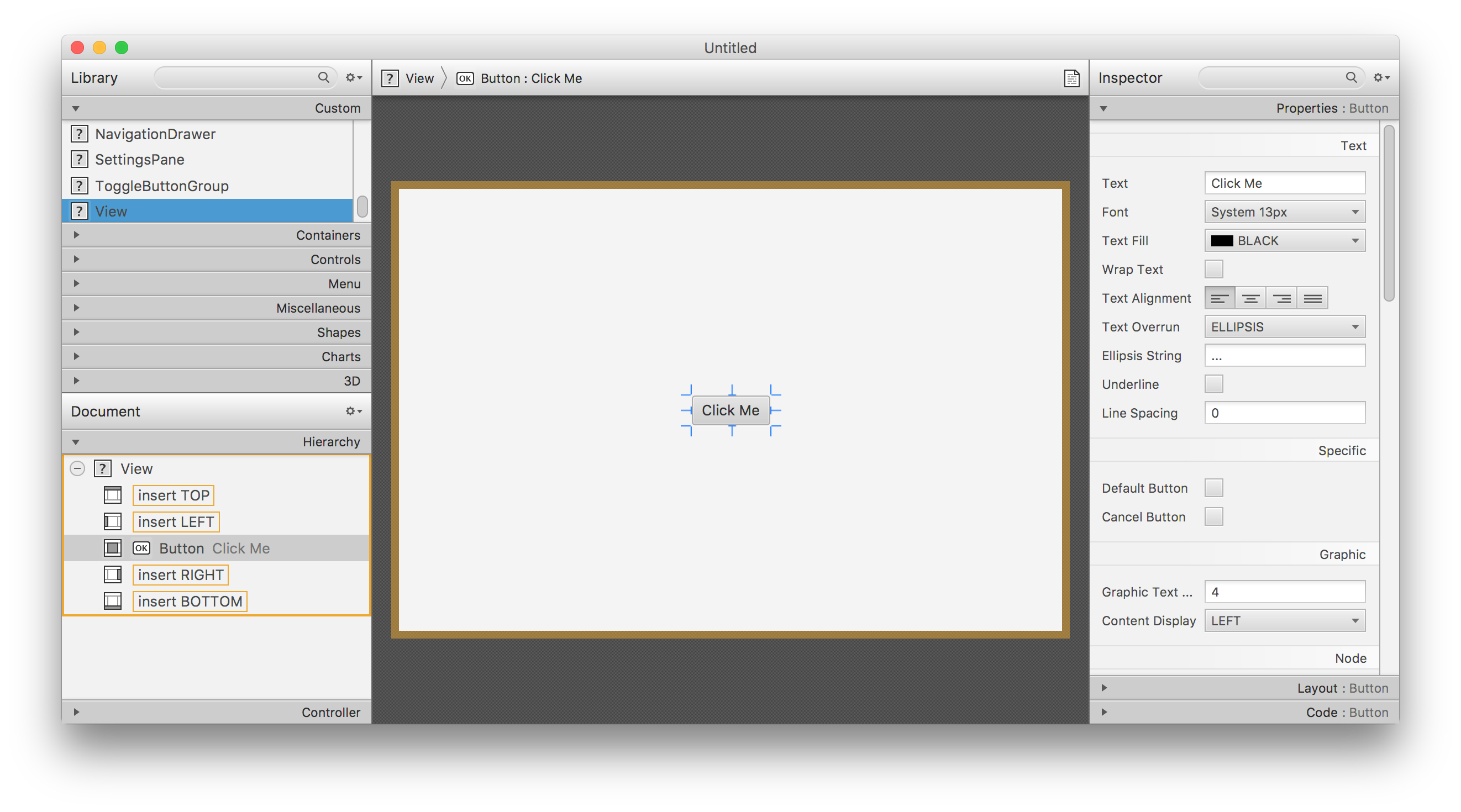
Using Gluon’s Scene Builder
In order to open home.fmxl with Scene Builder from your IDE, or to be able to add a View from Scene Builder, the file charm-common-2.0.0.jar should be imported.
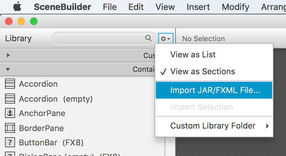
Then, View will be available on the Custom titled pane on the top left of Scene Builder.
Afterburner framework
Adding the dependency to the build.gradle script, allows using this MVP framework from Adam Bien.
dependencies {
    compile 'com.airhacks:afterburner.mfx:1.6.2'
}
For every view, these files are required:
In the code folder:
-
The view. I.e,
HomeView. An empty class that just extendsFXMLView. -
The presenter. I.e.
HomePresenter. -
A service (optional), i.e.
HomeService.
And in the resources folder:
-
The fxml, i.e.
home.fxml -
The css (optional), i.e.
home.css.
In the presenter, layers can be added to the view, like a FloatingActionButton to trigger some action when the user clicks on it.
A transition can be set for switching views from a large list of available transitions (see the Charm JavaDoc). In case no transition is desired, the developer can select NoTransition().
public class HomePresenter implements Initializable {
@FXML
private View home;
@Override
public void initialize(URL url, ResourceBundle rb) {
FloatingActionButton fab = new FloatingActionButton();
fab.setOnAction(e -> {
MobileApplication.getInstance().switchView(OTHER_VIEW);
});
home.getLayers().add(fab);
home.setShowTransitionFactory(v -> new FadeInLeftBigTransition(v));
home.showingProperty().addListener((obs, ov, nv) -> {
if (nv) {
final AppBar appBar = MobileApplication.getInstance().getAppBar();
appBar.setNavIcon(MaterialDesignIcon.MENU.button(e -> System.out.println("menu")));
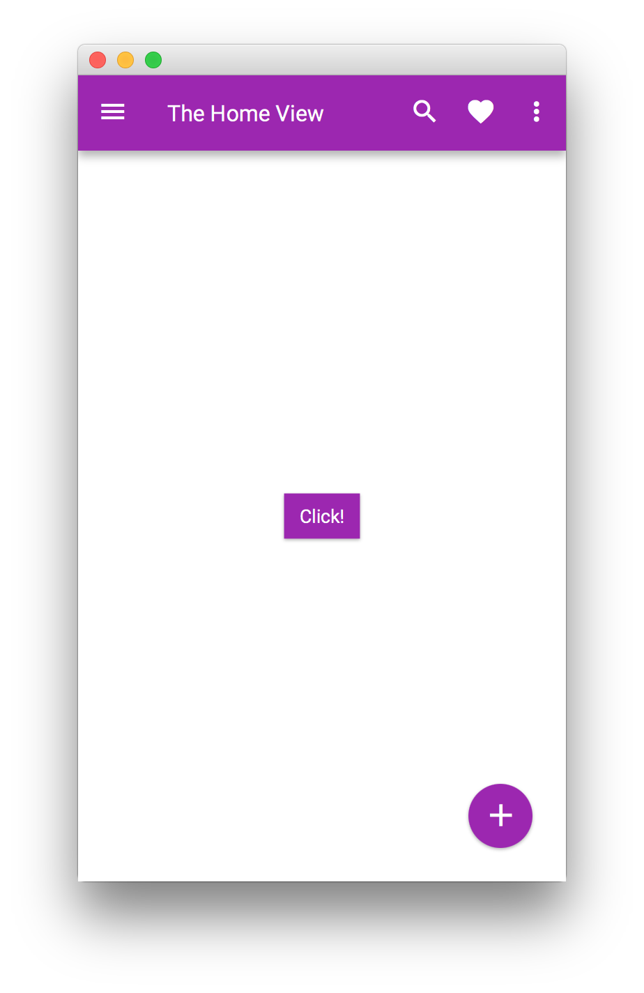
appBar.setTitleText("The Home View");
appBar.getActionItems().addAll(
MaterialDesignIcon.SEARCH.button(),
MaterialDesignIcon.FAVORITE.button());
appBar.getMenuItems().addAll(new MenuItem("Settings"));
Swatch.PURPLE.assignTo(home.getScene());
}
});
}
@FXML
public void onClick() {
System.out.println("click");
}
}Then, a view can be created and loaded:
public class MyApp extends MobileApplication {

    @Override
    public void init() {
        addViewFactory(HOME_VIEW, () -> {
            final HomeView homeView = new HomeView();
            return (View) homeView.getView();
        });
    }
}
In order to perform some actions while the transition is running or when it finishes, a custom ActionEvent can be provided to the end of the transition.
This can be done as well based on the LifecycleEvent events. The following code snippet will set the view transparent to mouse clicks just during the time it is added to the scene and the transition ends.
public class MyApp extends MobileApplication {

    @Override
    public void init() {
        addViewFactory(HOME_VIEW, () -> {
            final HomeView homeView = new HomeView();
            final View view = (View) homeView.getView();
            view.addEventHandler(LifecycleEvent.SHOWING, e ->
                view.setMouseTransparent(true));
            view.addEventHandler(LifecycleEvent.SHOWN, e ->
                view.setMouseTransparent(false));
            return view;
        });
    }
}
3.1.3. Layers
A Layer is an overlay that can be shown above any MobileLayoutPane object, like the views, or the GlassPane itself.
Layers can be provided as factories, to be shown on demand. In this case they will be added and installed to the GlassPane with MobileLayoutPane.getInstance().addLayerFactory().
Also, they can be added to any of the views (view.getLayers()), just by adding the layer into that list.
Showing a Layer is then achieved either by calling , or by using API available on MobileApplication.
If the Layer is installed in the GlassPane, it can be shown at any time by calling showLayer(layerName), regardless of the current View.
public class MyApp extends MobileApplication {

    @Override
    public void init() {
        addViewFactory(HOME_VIEW, () -> new View(new Label("Hello Glisten!")) {
            @Override
            protected void updateAppBar(AppBar appBar) {
                appBar.setNavIcon(MaterialDesignIcon.MENU.button(e -> showLayer("New Layer")));
            }
        });

        addLayerFactory("New Layer", () -> {
            final StackPane stackPane = new StackPane(new Button("Click"));
            stackPane.setStyle("-fx-background-color: white; -fx-padding: 10;");
            SidePopupView sidePopupView = new SidePopupView(stackPane);
            return sidePopupView;
        });
    }
}
But if the layer is installed in a specific MobileLayoutPane, only if that pane is currently showing, calling view.getLayers().get(index).show() will show the layer at the given index, on top of the pane.
public class MyApp extends MobileApplication {

    @Override
    public void init() {
        addViewFactory(HOME_VIEW, () -> {
            Button button = new Button("Show layer");
            View view = new View(button);
            button.setOnAction(e -> view.getLayers().get(0).show());
            final StackPane stackPane = new StackPane(new Button("Click"));
            stackPane.setStyle("-fx-background-color: white; -fx-padding: 10;");
            view.getLayers().add(new SidePopupView(stackPane));
            return view;
        });
    }
}
Creating a Layer
Developers can create custom Layer nodes. This is a minimal implementation, including a faded background when the layer is shown.
public class MyApp extends MobileApplication {

    @Override
    public void init() {
        addViewFactory(HOME_VIEW, () -> new View(new Label("Hello Glisten!")) {
            @Override
            protected void updateAppBar(AppBar appBar) {
                appBar.setNavIcon(MaterialDesignIcon.MENU.button(e -> showLayer("New Layer")));
            }
        });
        addLayerFactory("New Layer", () -> new Layer() {
            private final Node root;
            private final double size = 150;

            {
                root = new StackPane(new Button("A custom layer"));
                root.setStyle("-fx-background-color: white;");
                getChildren().add(root);
                getGlassPane().getLayers().add(this);
            }

            @Override
            public void show() {
                getGlassPane().setBackgroundFade(GlassPane.DEFAULT_BACKGROUND_FADE_LEVEL);
                super.show();
            }

            @Override
            public void hide() {
                getGlassPane().setBackgroundFade(0.0);
                super.hide();
            }

            @Override
            public void layoutChildren() {
                root.setVisible(isShowing());
                if (!isShowing()) {
                    return;
                }
                root.resize(size, size);
                resizeRelocate((getGlassPane().getWidth() - size)/2, (getGlassPane().getHeight()- size)/2, size, size);
            }
        });
    }
}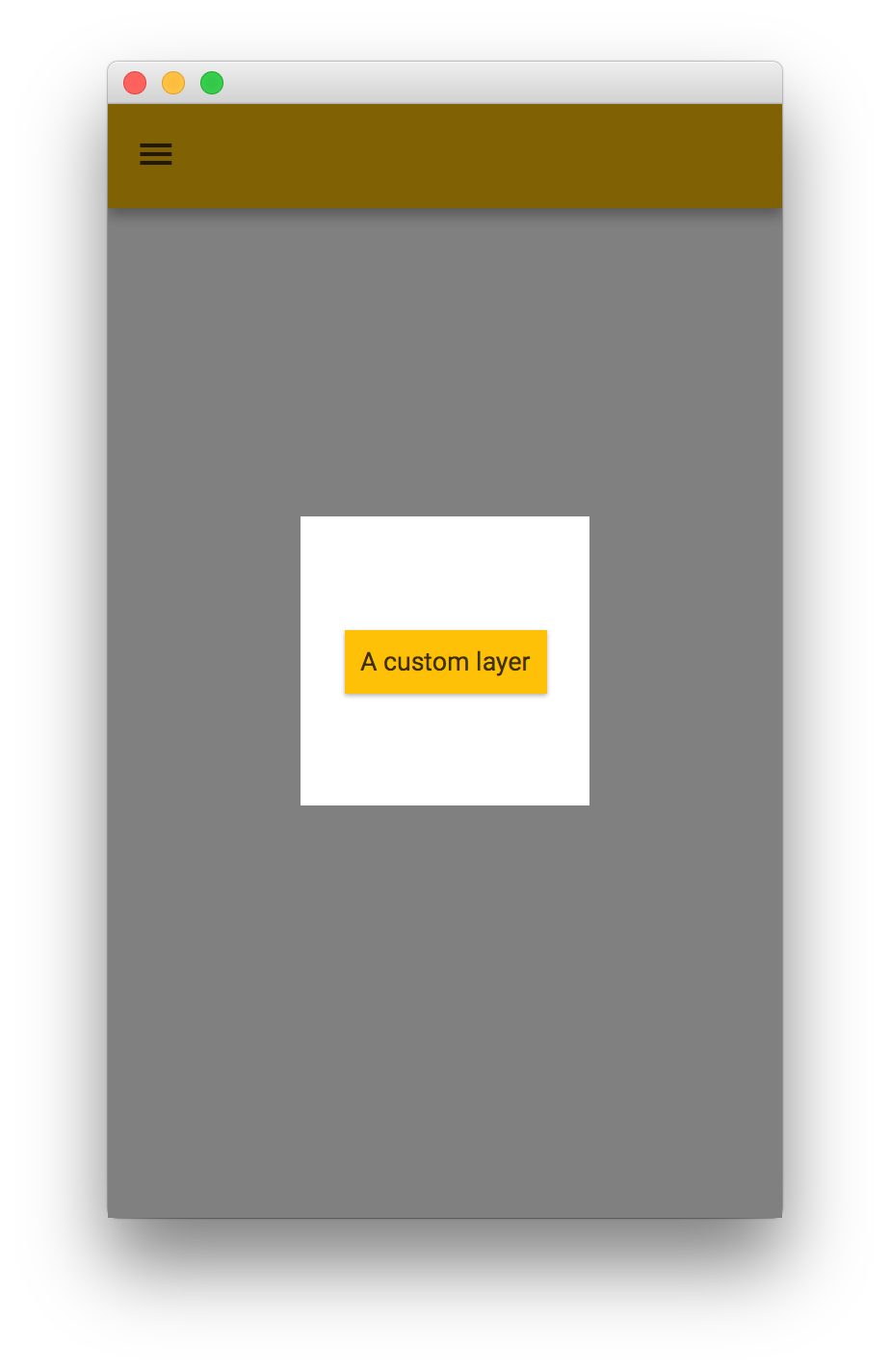
However, Glisten already provides a series of built-in layers, so this won’t be necessary in most of the occasions.
Using built-in layers
Layers that are installed in the GlassPane are: SidePopupView, and its two subclasses MenuSidePopupView and SnackbarPopupView, and MenuPopupView.
Layers installed only in the View: FloatingActionButton.
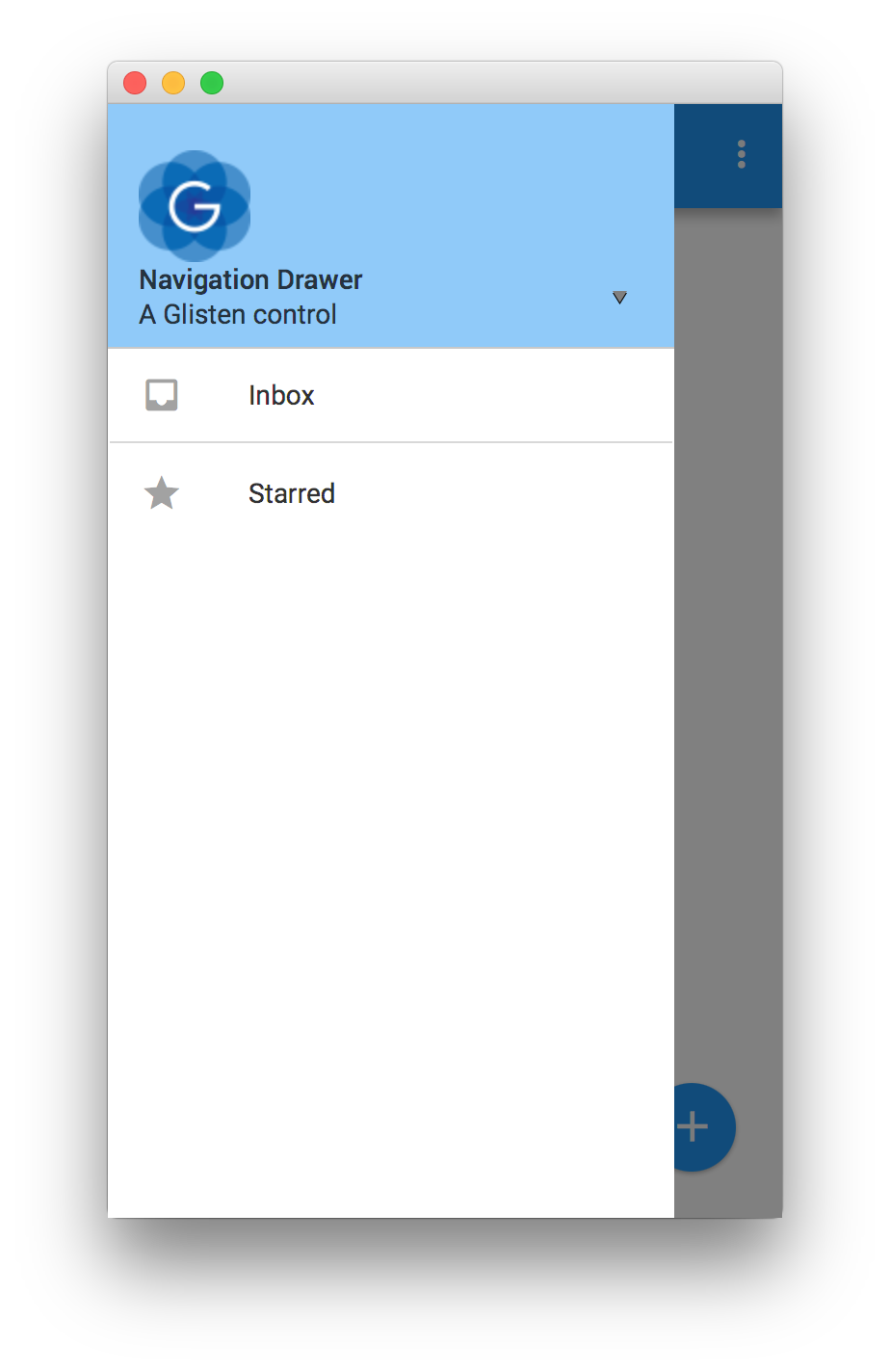
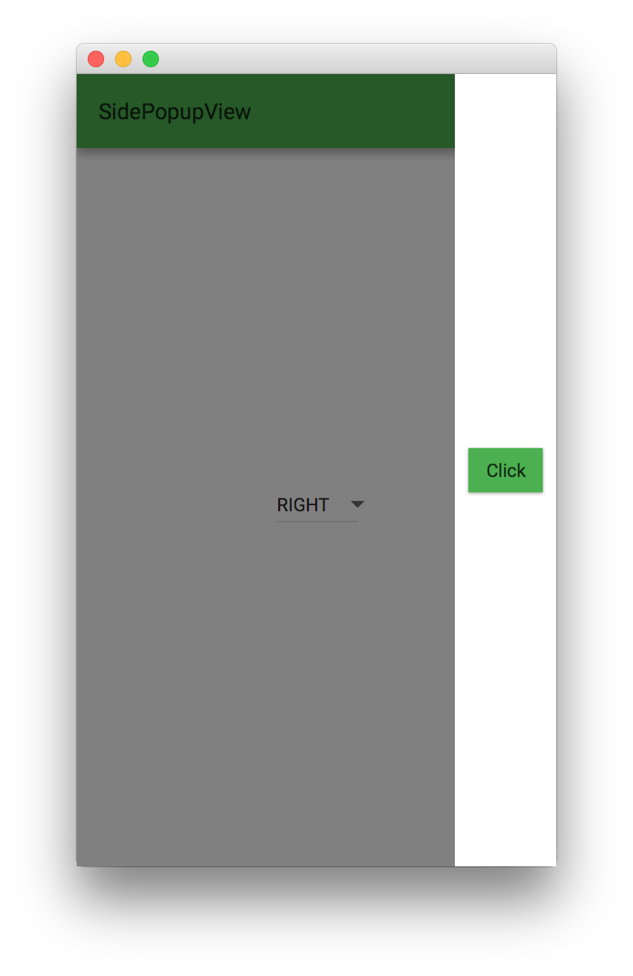
SidePopupView
The SidePopupView class is a Layer used to show a JavaFX Node that will scroll out from the edge of the screen. By default it will appear from the left, but the other sides can be set as well.
A fading animation of the background overlay will occur while the layer is being shown or hidden.
public class MyApp extends MobileApplication {

    private SidePopupView sidePopupView;

    @Override
    public void init() {
        addViewFactory(HOME_VIEW, () -> {
            DropdownButton dropdownButton = new DropdownButton();
            dropdownButton.getItems().addAll(new MenuItem("LEFT"), new MenuItem("RIGHT"), new MenuItem("TOP"), new MenuItem("BOTTOM"));
            dropdownButton.selectedItemProperty().addListener((obs, oldValue, newValue) -> {
                showLayer("New Layer");
                sidePopupView.setSide(Side.valueOf(newValue.getText()));
            });
            return new View(dropdownButton) {
                @Override
                protected void updateAppBar(AppBar appBar) {
                    appBar.setTitleText("SidePopupView");
                }
            };
        });

        addLayerFactory("New Layer", () -> {
            final StackPane stackPane = new StackPane(new Button("Click"));
            stackPane.setStyle("-fx-background-color: white; -fx-padding: 10;");
            sidePopupView = new SidePopupView(stackPane);
            return sidePopupView;
        });
    }
}
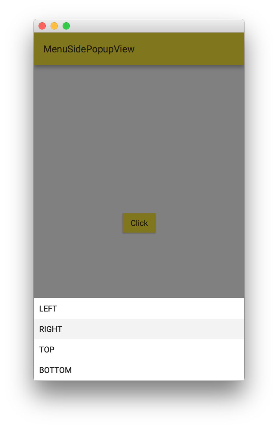
MenuSidePopupView
The MenuPopupView class is a layer used to show JavaFX Menu instances within the user interface that will scroll out from the edge of the screen.
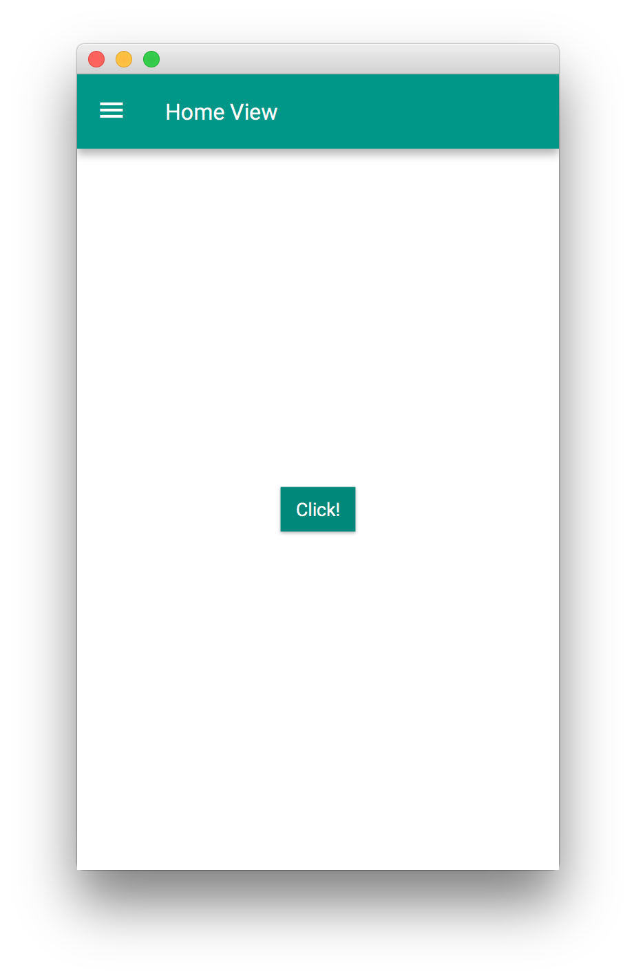
public class MyApp extends MobileApplication {

    @Override
    public void init() {
        addViewFactory(HOME_VIEW, () -> {
            Button button = new Button("Click");
            button.setOnAction(e -> showLayer("New Layer"));
            return new View(button) {
                @Override
                protected void updateAppBar(AppBar appBar) {
                    appBar.setTitleText("MenuSidePopupView");
                }
            };
        });

        addLayerFactory("New Layer", () -> {
            Menu menu = new Menu();
            menu.getItems().addAll(new MenuItem("LEFT"), new MenuItem("RIGHT"), new MenuItem("TOP"), new MenuItem("BOTTOM"));
            MenuSidePopupView popup = new MenuSidePopupView(menu);
            return popup;
        });
    }
}
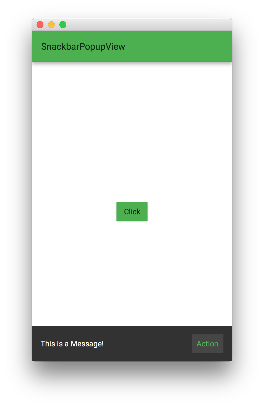
SnackbarPopupView
The SnackbarPopupView class is a layer used to provide lightweight feedback about an operation by showing a brief message at the bottom of the screen.
By default, the MobileApplication already has an instance of one SnackbarPopupView, so the developer only needs to call showMessage() with a text, and eventually the text for a button, and the event handler for that button.
public class MyApp extends MobileApplication {

    @Override
    public void init() {
        addViewFactory(HOME_VIEW, () -> {
            Button button = new Button("Click");
            button.setOnAction(e -> showMessage("This is a Message!", "Action", t -> System.out.println("Snackbar")));
            return new View(button) {
                @Override
                protected void updateAppBar(AppBar appBar) {
                    appBar.setTitleText("SnackbarPopupView");
                }
            };
        });
    }
}
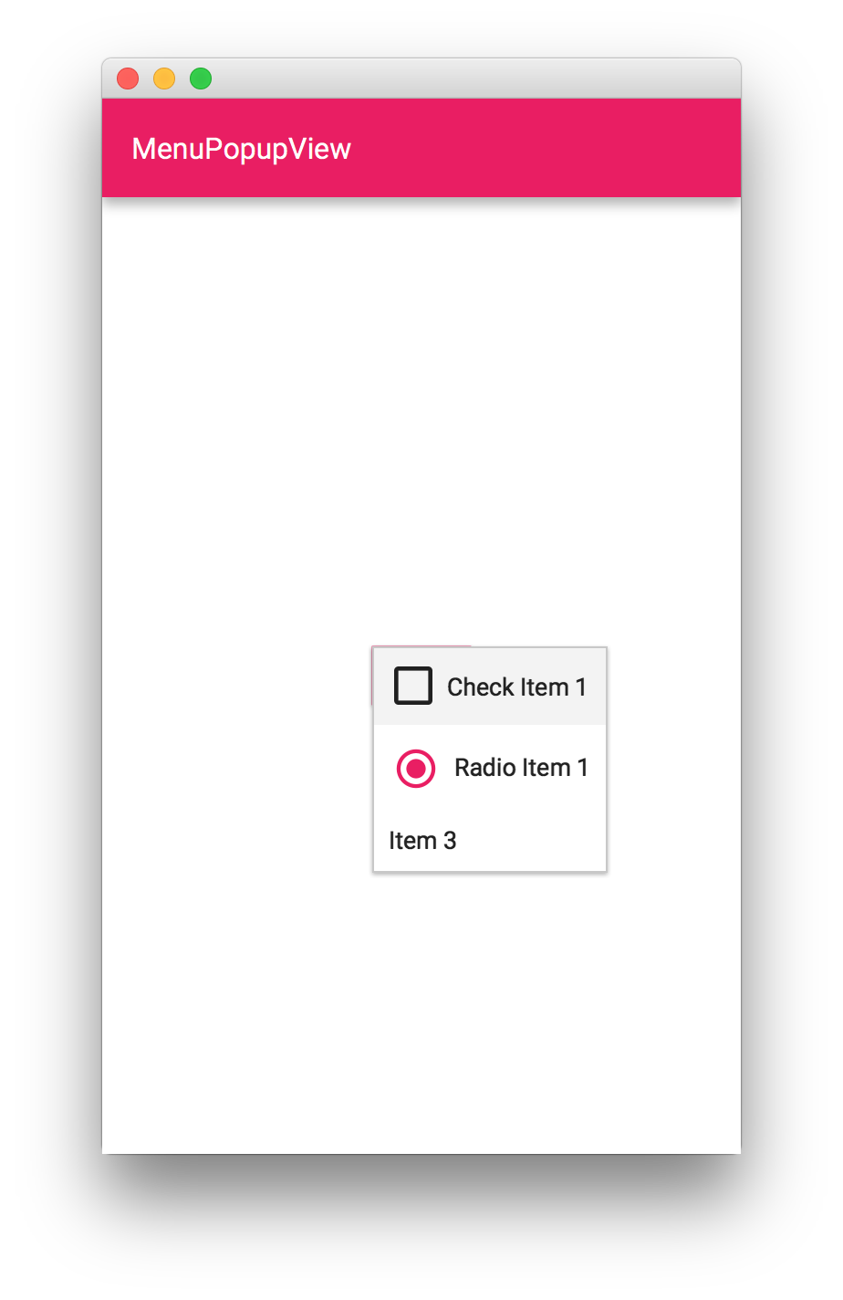
MenuPopupView
The MenuPopupView class layer is used to show JavaFX Menu instances within the user interface and it will appear relative to the given owner node.
public class MyApp extends MobileApplication {

    private Button buttonMenu;

    @Override
    public void init() {
        addViewFactory(HOME_VIEW, () -> {
            buttonMenu = new Button("Click");
            buttonMenu.setOnAction(e -> showLayer("New Layer"));
            return new View(buttonMenu) {
                @Override
                protected void updateAppBar(AppBar appBar) {
                    appBar.setTitleText("MenuPopupView");
                }
            };
        });
        addLayerFactory("New Layer", () -> {
            Menu menu = new Menu();
            menu.getItems().addAll(new CheckMenuItem("Check Item 1"), new RadioMenuItem("Radio Item 1"), new MenuItem("Item 3"));
            return new MenuPopupView(buttonMenu, menu);
        });
    }
}
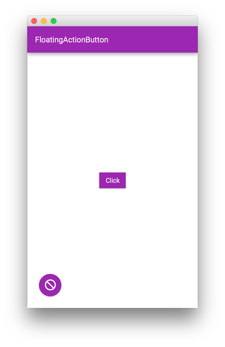
FloatingActionButton
TThe floating action button is a layer that can be placed in to any MobileLayoutPane to provide users with a quick way of performing a primary action in a user interface.
A function can be set at any time to specify the position of this button. By default it is at the right bottom. Setting a new position. like BOTTOM_LEFT will be done with an animation, moving the action button from its actual poistion towards its new destination.
public class MyApp extends MobileApplication {

    @Override
    public void init() {
        addViewFactory(HOME_VIEW, () -> {
            FloatingActionButton fab = new FloatingActionButton(MaterialDesignIcon.DO_NOT_DISTURB.text, e -> System.out.println("action"));
            final Button button = new Button("Click");
            button.setOnAction(e -> fab.setFloatingActionButtonHandler(FloatingActionButton.BOTTOM_LEFT));
            View view = new View(button) {
                {
                    getLayers().add(fab);
                }

                @Override
                protected void updateAppBar(AppBar appBar) {
                    appBar.setTitleText("FloatingActionButton");
                }
            };
            return view;
        });
    }
}
Dialogs
SideMenu
3.1.4. UI Controls
UI Control #1
3.2. Glisten CSS Overview
An overview of the CSS style classes and properties that are available to users of the Gluon Charm Glisten library. Users of Glisten CSS should be familiar with the JavaFX CSS functionality.
3.2.1. Glisten Themes
Glisten ships with two CSS themes: light and dark. Despite the connotation, the amount of CSS required to specify these themes is incredibly minimal - and as a courtesy is reproduced here:
.root{
  -fx-background: white;
  -fx-text-fill: -text-light;
  -fx-prompt-text-fill: rgba(0,0,0,.3);

  -text-disabled: -text-disabled-light;
  -background-disabled:rgba(0,0,0,.12);
  -background-fill: -text-light;

  -flat-button-hover-background: rgba(#999999,.2);
  -flat-button-pressed-background: rgba(#999999,.4);
  -flat-button-disabled-fill: rgba(#000000,.26);
}.root{
-fx-background: #333333;
-fx-text-fill: -text-dark;
-fx-prompt-text-fill: rgba(255,255,255,.3);
-text-disabled: -text-disabled-dark;
-background-disabled:rgba(255,255,255,.12);
-background-fill: -text-dark;
-flat-button-hover-background: rgba(#CCCCCC,.15);
-flat-button-pressed-background: rgba(#CCCCCC,.25);
-flat-button-disabled-fill: rgba(#FFFFFF,.3);
}3.2.2. Glisten CSS Properties
There are a number of global properties that can be used by any application that uses Glisten. These properties allow for custom controls to be styled in a way that should relatively closely match up with the Glisten-styled controls. What follows is a list of such properties.
Swatches
Perhaps most importantly, Glisten supports swatches, where each swatches populates a series of pre-specified CSS properties which can be used within your own CSS. The properties that are populated for each swatch are the following:
-primary-swatch-50
-primary-swatch-100
-primary-swatch-200
-primary-swatch-300
-primary-swatch-400
-primary-swatch-500
-primary-swatch-600
-primary-swatch-700
-primary-swatch-800
-primary-swatch-900
-alternate-swatch-100
-alternate-swatch-200
-alternate-swatch-400
-alternate-swatch-700
Each of these properties is simply a color along a certain color spectrum. All swatches provided by Glisten are based on the Material Design color style guide. The Glisten CSS files do not typically make use of all swatch colors, so it is also advised that any use of these colors be restrained, outside of the -primary-swatch-500, and possibly -primary-swatch-200, -primary-swatch-600, and -primary-swatch-700.
An example of how such a property could be used is shown in the sample code below:
.button {
  -fx-background-color: -primary-swatch-500;
}

.button:hover {
  -fx-background-color:-primary-swatch-600;
}
Other Properties
There are a number of other properties that are available to use. Some of these are custom Glisten properties, but many are standard JavaFX CSS properties that Glisten simply modifies to the appropriate value. Some notable properties include the following (refer to the JavaFX CSS Reference Guide for more details of any that start with -fx-) :
-
-text-light: This is a light-colored text, best used on a dark background. -
-text-dark: This is a dark-colored text, best used on a light background. -
-fx-text-fill: This is populated based on the theme that is currently set (i.e. light or dark). -
-text-disabled: This is used in controls where the control is disabled. It takes
Text Fill
It is important to understand how text fill works in Glisten, as the underlying JavaFX CSS engine is significantly more powerful than normal CSS engines. In particular, when it comes to deciding what color text fill to use, you can use JavaFX CSS laddering to decide. In other words, it is never a good idea to use -fx-text-fill directly, as -fx-text-fill does not take into account the background color behind the text (so it is possible that the text is unreadable).
In cases where a custom text fill is desired, it is much better to do something such as the following:
.button {
  -fx-background-color: -primary-swatch-500;
  -fx-text-fill: ladder(-primary-swatch-500, -text-dark 49%, -text-light 50%)
}
This code states to use -text-dark or -text-light, depending on the darkness of the first value, in this case -primary-swatch-500. The result of this is that when -primary-swatch-500 is a very light color (such as a bright yellow), the -fx-text-fill will be -text-light (and therefore appear as a dark color). When -primary-swatch-500 is a very dark color, -text-dark is used, and is therefore a light color that is readable on a dark background.
3.2.3. Glisten Style Classes
By default, when a UI control is instantiated in Glisten, the control does not receive any additional style classes over what is provided by the underlying JavaFX technology. However, depending on the use case for each individual control, it can make sense to apply additional style classes to have Glisten apply additional styling to these controls.
There exists a class called GlistenStyleClasses that is located in the com.gluonhq.glisten.visual package. This class provides a number of predefined style classes that can be applied to a control, via one of two methods:
final ToggleButton toggleVisibilityButton = new ToggleButton("Toggle Visibility");

/*
 * TOGGLE_BUTTON_SWITCH is a static import from GlistenStyleClasses.
 * It is simply a String consisting of 'switch'.
 */
toggleVisibilityButton.getStyleClass.add(TOGGLE_BUTTON_SWITCH);final ToggleButton toggleVisibilityButton = new ToggleButton("Toggle Visibility");
/*
* Both applyStyleClass and TOGGLE_BUTTON_SWITCH are static
* imports from GlistenStyleClasses
*/
applyStyleClass(toggleVisibilityButton, TOGGLE_BUTTON_SWITCH);Both approaches are more or less equivalent, but the second approach is recommended.
Once these additional style classes have been applied, both Glisten CSS and your own CSS can be applied as applicable. For example, a button that has been styled to be flat (using GlistenStyleClasses.BUTTON_FLAT) will be able to receive alternate styling via css such as the following:
.button.flat {
  ...
}
Of course, as noted, any styling of UI controls based on style classes from the GlistenStyleClasses class will be styled differently by Glisten CSS, so there is no need (unless desired) to apply additional styling.
What follows is a list of additional CSS style classes that are available to some UI controls:
Buttons have the CSS style class .button. There are the following additional style classes that are available in Glisten:
Style Class |
GlistenStyleClasses Property |
Description |
|
|
The |
|
|
The |
Toggle buttons have the CSS style class .toggle-button.
Style Class |
GlistenStyleClasses Property |
Description |
|
|
The |
3.2.4. Other Questions
If this document does not answer all your questions regarding Glisten CSS functionality, please reach out to Gluon staff and ask any questions. They will help us to improve future versions of this document.
4. Connect Overview
The Gluon Charm Connect library is the client-side counterpart of the Gluon Cloud service. In case your application needs to make data persistent or shared across different devices or users, you can use the Gluon Charm Connect library. Connect communicates with the Gluon Cloud service in two directions:
-
your data is stored in the cloud when you want to, and
-
your data is updated locally when it is updated in the cloud.
4.1. Application Registration
Before you can start using the Gluon Charm Connect library, you will need to register your application on the Gluon Cloud Portal. If you haven’t got an account yet, just fill in the sign up form by clicking the link below the login button. Once you are successfully logged in, you are able to create a Gluon Application by providing a name in the form on the Dashboard page. An application key and secret will be generated for you when the application is created.
4.2. Storage and Synchronization
The Gluon Cloud makes sure your data is consistent across the different devices. Depending on your preferences, changes on one device propagate immediately to other devices. Or they might only be stored in Gluon Cloud and the devices will manually request the latest version whenever they want.
4.2.1. Gluon Cloud Access Point
The GluonClient class is the access point from Charm Connect to the Gluon Cloud service. You can get a reference to a GluonClient
instance by using the GluonClientBuilder:
GluonClient gluonClient = GluonClientBuilder.create()
        .credentials(new GluonCredentials(applicationKey, applicationSecret))
        .build();
The credentials are the key/secret pair of your application which you can obtain from the dashboard on the Gluon Cloud Portal. Connect will use these credentials to sign all requests that are made to the Gluon Cloud service. This is required in order to let the Gluon Cloud service know on whose behalf a request is made.
4.2.2. Retrieving Data
Once you have a GluonClient reference, you can obtain a StorageService from it:
StorageService storageService = gluonClient.getStorageService();The StorageService can be used to retrieve data from and store data to a storage location. There are two storage
locations available which are defined in the StorageWhere enum constants:
-
StorageWhere.DEVICE: data is stored on the storage of the local device
-
StorageWhere.GLUONCLOUD: data is stored on the Gluon Cloud service
There are two different types of data that can be managed:
-
single objects, and
-
lists of objects
Because these objects and lists are maintained remotely, we will call them remote entities. Every remote entity is identified by a unique name.
Retrieving lists
For example, retrieving a remote list with the name notes can be done with the following code:
ListView<Note> notesListView = new ListView<>();
CharmObservableList<Note> notes = storageService.<Note>retrieveList("notes", Note.class);
notesListView.setItems(notes);
In it’s simplest form the retrieveList method returns an instance of CharmObservableList that is stored on the local
device without any synchronization flags. You can specify the location where the list should be stored by providing one
of the StorageWhere definitions. Retrieving a list that is maintained on Gluon Cloud is done as follows:
CharmObservableList<Note> gluonCloudNotes = storageService.<Note>retrieveList("notes", Note.class, StorageWhere.GLUONCLOUD);You may have noticed that there is no method for creating a new list. That is because a Gluon Cloud list always exists.
When a list is retrieved the first time, an empty list will automatically be created for you on the specified
StorageWhere location.
Retrieving objects
A remote object works a bit differently than a list, because in contrast to a list, an object has the notion of existence.
This explains why we have three methods for managing remote objects:
retrieveObject, storeObject and deleteObject.
// store the object
Note note = new Note();
note.setContent("This is the content for the note.");
CharmObservableObject<Note> charmNote = storageService.storeObject("a-single-note", note, StorageWhere.GLUONCLOUD);

// retrieve the object
CharmObservableObject<Note> charmNote = storageService.retrieveObject("a-single-note", Note.class, StorageWhere.GLUONCLOUD);

// delete the object
storageService.deleteObject(charmNote);
As with the retrieveList methods, the default storage location is StorageWhere.DEVICE.
CharmObservable State
All the operations on the StorageService are asynchronous in nature and are executed in a separate background thread. You can listen for changes on the state property of the returned CharmObservable object to monitor the progress of the background operation. Listed below you’ll find a number of common use cases when working with remote objects.
Create a remote object when it does not yet exist
When retrieving an object from the storage service, you can detect if this object was stored previously by using the following pattern:
CharmObservableObject<Note> charmNote = storageService.retrieveObject("a-single-note", Note.class, StorageWhere.GLUONCLOUD);
charmNote.stateProperty().addListener((observable, oldState, newState) -> {
    if (newState == CharmObservable.State.INITIALIZED) {
        if (charmNote.get() == null) {
            // object not yet stored, initiate it now with a new object
            charmNote.set(new Note("This is some text for the note"));
            charmNote.sync();
        } else {
            // object already stored previously
            Note note = charmNote.get();
            System.out.println("Stored note: " + note.getText());
        }
    }
});
Initialize an empty list with default objects
When you retrieve a list for the first time, an empty list will be created for you by the storage system. Sometimes you wish to populate this empty list with some default objects. You can do that with the following pattern:
CharmObservableList<Note> charmNotes = storageService.retrieveList("notes", Note.class, StorageWhere.GLUONCLOUD);
charmNotes.stateProperty().addListener((observable, oldState, newState) -> {
    if (newState == CharmObservable.State.INITIALIZED) {
        if (charmNotes.isEmpty()) {
            // initialize the list with some default notes
            charmNotes.addAll(
                    new Note("Text for note number 1."),
                    new Note("Text for note number 2.")
            );
            charmNotes.sync();
        }
    }
});
4.2.3. Supported Data Types
The second parameter of the retrieveList and retrieveObject methods specify the type of data that is stored
in the requested remote list or remote object. Charm Connect supports three different data types: String, Map and custom
classes. Inside a Map and for the fields of the custom class, the following field types can be used:
-
boolean and BooleanProperty
-
int and IntegerProperty
-
long and LongProperty
-
float and FloatProperty
-
double and DoubleProperty
-
String and StringProperty
The Property types are a requirement when a remote list or remote object is retrieved in combination with the
OBJECT_WRITE_THROUGH synchronization flag. See the Synchronizing data section for more information.
String
The String data type is the most basic of the three supported types. It simply stores and retrieves the strings from the specified storage location.
Map
The Map represents a convenient key/value store in which you can store arbitrary data. It is the most flexible data type, but is less type safe. The keys of the Map must be strings, while the value can be any of the supported field types that are listed above. If the Map contains a value that is not supported, those values will be ignored when storing or retrieving data.
Custom Class
As a final option, you can define your data structure inside a Custom Class. Charm Connect will inspect the provided class for all declared fields of which the type matches any of the supported field types. Note that only non-static fields and non-final primitive fields will be considered. All other field declarations will be ignored when storing or retrieving data.
4.2.4. Synchronizing data
By default, no synchronization flags are configured when calling any of the methods we mentioned above. To enable
synchronization, you can pass any of the SyncFlag enum constants to the method. There are four different types of
SyncFlag:
-
OBJECT_READ_THROUGH: changes that occur on an object in Gluon Cloud will be reflected to the fields on the local object
-
OBJECT_WRITE_THROUGH: changes on Observable fields will be automatically written to the configured storage location
-
LIST_READ_THROUGH: adding and removing objects on a list in Gluon Cloud will be reflected to the local list
-
LIST_WRITE_THROUGH: adding and removing objects locally will automatically add and remove them to the list on the configured storage location
Note that the OBJECT_READ_THROUGH and LIST_READ_THROUGH flags don’t have any effect when used in combination with the StorageWhere.DEVICE storage
location.
Also note that the SyncFlag.OBJECT_WRITE_THROUGH will only work on non-static Observable fields of the object.
As an example, the code snippet below retrieves an instance of CharmObservableList that is stored on Gluon
Cloud and that is configured to be list read and list write through. This means that any changes that are done on the
client, either adding or removing items, are propagated back to Gluon Cloud. The reverse is true as well: all changes
that occur in Gluon Cloud will be reflected back to the local list. Changes that occur on the objects inside the list
won’t be propagated.
CharmObservableList<Note> notes = storageService.<Note>retrieveList("notes", Note.class, StorageWhere.GLUONCLOUD, SyncFlag.LIST_READ_THROUGH, SyncFlag.LIST_WRITE_THROUGH);4.3. User Authentication
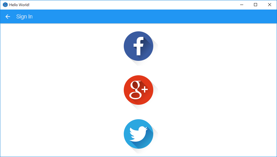
Charm Connect allows you to link your data to an authenticated user. The following authentication methods are available out of the box:
-
Facebook: authenticate users with Facebook
-
Google+: authenticate users with Google+
-
Twitter: authenticate users with Twitter
To enable user authentication, you need to set the correct Authentication value on the StorageService. The default
authentication method is PUBLIC, which allows everyone that uses your application to read and write all of your data in Gluon Cloud. Using authentication method USER will show an
authentication view the first time the application tries to interact with Gluon Cloud.
// enable user authentication
StorageService storageService = gluonClient.getStorageService();
storageService.authentication(Authentication.USER);

// the next statement will trigger the authentication view
CharmObservableList<Note> notes = storageService.<Note>retrieveList("notes", Note.class, StorageWhere.GLUONCLOUD);
4.3.1. Configuring Login Methods
Configuring the authentication methods that should be enabled for your application can be done from the dashboard page on Gluon Cloud Portal. If you don’t have an account yet, go to the Gluon Cloud Product page and click on "Sign up" under "Free".
-
Click the link
login methodsdisplayed at the right side of the application you want to configure -
At the bottom, choose the desired login method. For Twitter, Facebook or Google+, add the application key and secret that you obtained from the respective social network
-
Click the
Addbutton to add the login method to your application
The next time you run your application with USER authentication enabled, you will see the authentication view with a
list of buttons for all the login methods that are enabled.
4.3.2. Twitter Authentication
To get started with Twitter authentication, you first need to create a new Twitter application.
Click the Create New App button at the top right of that page and fill in the application details. Use the following
link for the Callback URL: http://cloud.gluonhq.com/2/connect/callback/TWITTER.
When your application is created, you can add a login method to your application on the Gluon Cloud Portal. You can find
the correct application credentials in the Keys and Access Tokens tab on the dashboard of your Twitter application.
Copy the Consumer Key and Consumer Secret into the appropriate input fields in the login method form.
4.3.3. Facebook Authentication
To get started with Facebook authentication, you first need to create a new Facebook application.
Click the Add a New App button at the top right of that page and select the Website platform. Provide the App ID and
click Create New Facebook App ID. Select your application’s category and click Create App ID. Click Skip Quick Start at the
top right of the page to skip the quickstart configuration wizard. On the application’s dashboard, click the Settings button
from the menu on the left. Insert cloud.gluonhq.com in the App Domains and set the Website URL to http://gluonhq.com/.
Click Save Changes to apply the configuration settings.
When your application is created, you can add a login method to your application on the Gluon Cloud Portal. You can find
the correct application credentials in the same Settings page mentioned previously, from the dashboard of your Facebook
application. Copy the App-ID and App Secret into the appropriate input fields in the login method form.
4.3.4. Google Authentication
To get started with Google authentication, you first need to create a new Google application.
Click the Create Project button on that page and fill in a name for your application. Once your application is created, choose
APIs & auth → Credentials from the menu on the left-hand side. Click the Add credentials button and choose OAuth 2.0 client ID.
Google asks you to first fill in your application details in the Consent Screen. After you have provided your application
details there, you will be redirected back to this page. Choose Web application as the Application type. Enter http://cloud.gluonhq.com
in the Authorized JavaScript origins field and http://cloud.gluonhq.com/2/connect/callback/GOOGLE_PLUS in the Authorized redirect URIs field.
For Gluon Cloud, you also need to add the Google+ API. From the menu on the left, choose APIs & auth → APIs. Click on Google+ API
under the Social APIs category and click the Enable API button at the top of the new page.
When your application is correctly configured, you can add a login method to your application on the Gluon Cloud Portal. You can find
the correct application credentials from the same APIs & auth → Credentials page mentioned previously, from the dashboard
of your Google application. Click on the Client ID and copy the Client ID and Client secret into the appropriate input
fields in the login method form.
4.3.5. Step-by-step guide
A step-by-step guide on how to setup and configure your Gluon Cloud application can be found here.
5. IDE Plugins
5.1. The Gluon Plugin for NetBeans
In this section, we’ll explain briefly how to install the plugin on NetBeans and how to use it to create a sample application that can be deployed on desktop, Android and iOS devices. Before you start, be sure that you have checked the list of prerequisites.
5.1.1. Plugin Installation
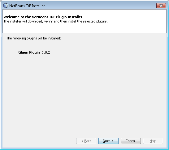
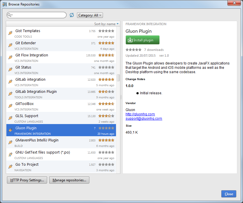
You can get it from here, or you can directly install it from NetBeans: click Tools→Plugins. Now select Available Plugins… and find Gluon Plugin.
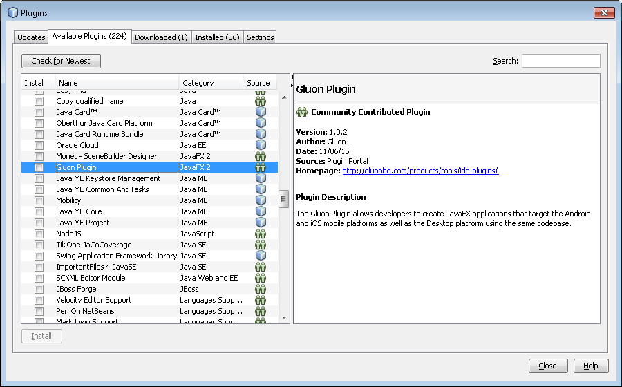
Select the plugin and click Install, and follow the steps:
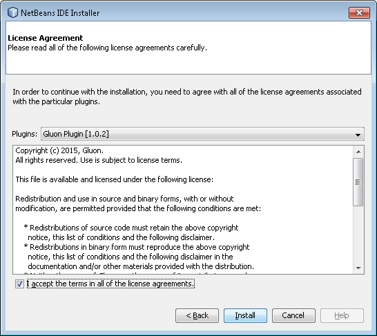
Accept the license and click Install:
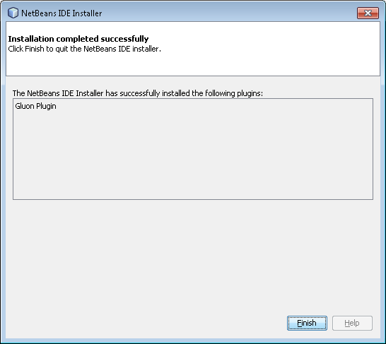
Wait until the Gluon Plugin is installed.
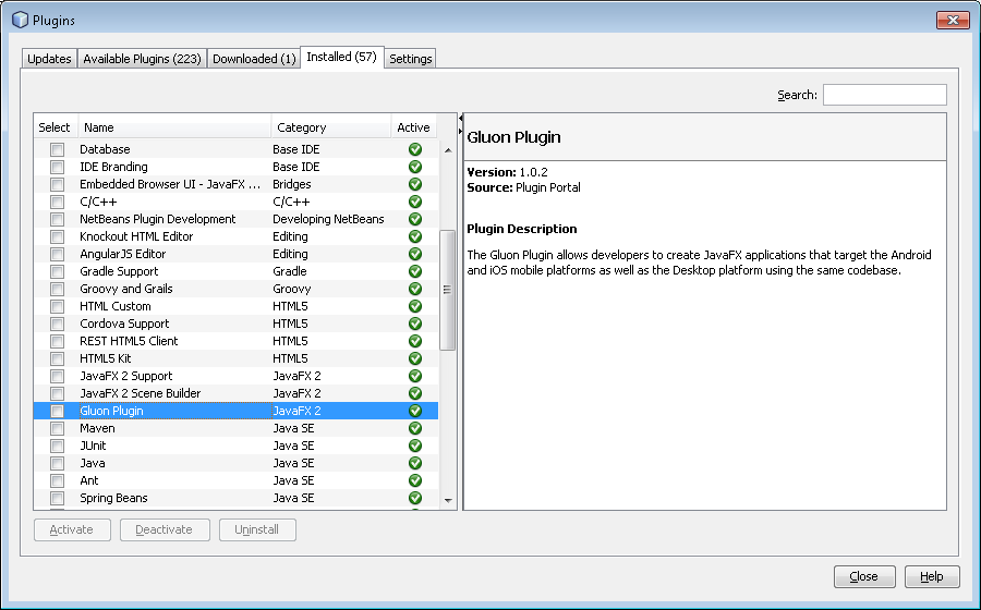
You will find the plugin under the Installed tab:
5.1.2. Creating a new Gluon project
Now that we have the plugin installed, we are going to use it to create a sample application.
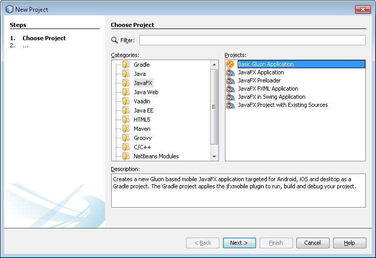
In NetBeans, click File→New→Project… and select JavaFX on the left, and Basic Gluon Application on the right. Press Next.
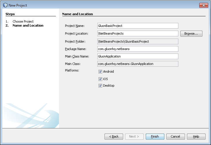
Type the name of the project, find a proper location, add the package name and the main class name. Note that you can select what platforms the project will be deployed to.
Press Finish and the project will be created and opened.
If you are familiar with the JavaFXPorts project, you will see the different folders created:
-
mainfor the code that is common to all platforms -
desktopfor the code that is specific to the desktop -
androidfor the code that is specific to the Android platform -
iosfor the code that is specific to the iOS platform
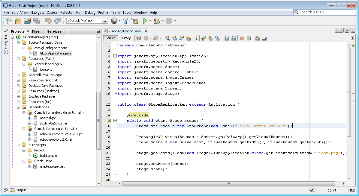
There’s some default code in the main class, so we’ll be able to run it without adding a single line of code.
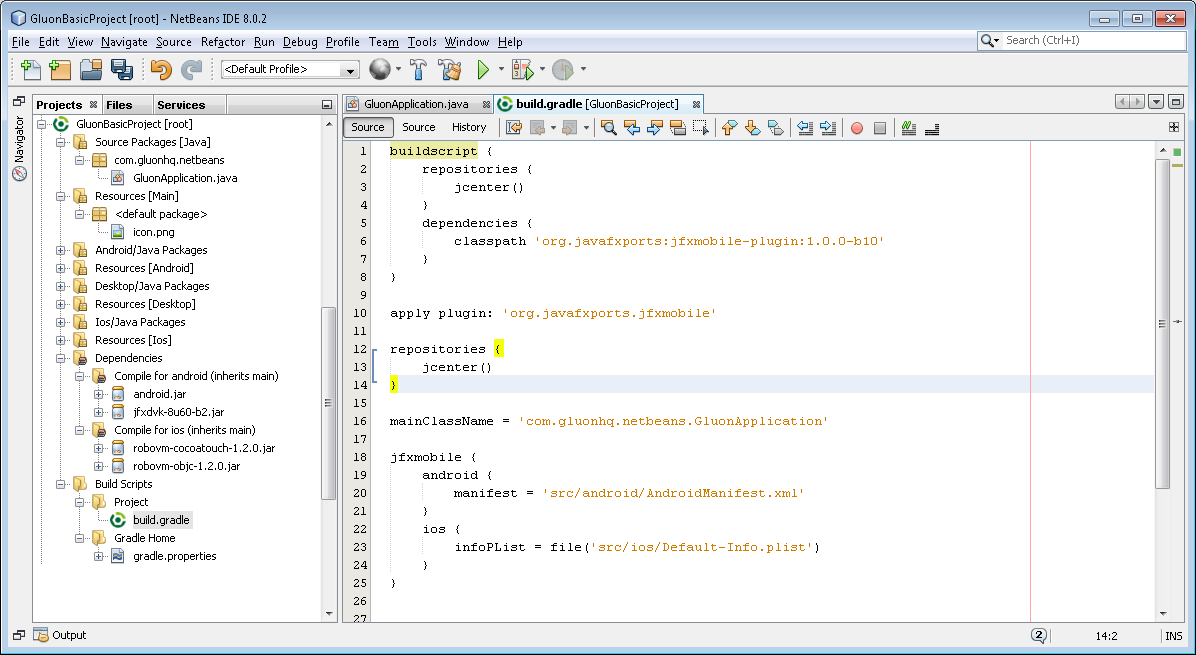
Before that, notice the jfxmobile-plugin is constantly evolving and by the time of this writing the version is 1.0.6, so edit the build.gradle file and update it, if needed to.
Note that it is really convenient to set the ANDROID_HOME property in the .gradle/gradle.properties file in your user home directory. It should point to an Android SDK folder on your file system.
5.1.3. Deploying the project
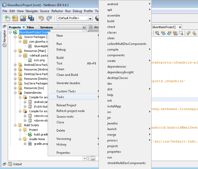
The plugin includes a series of tasks, and to access them we just need to right click on the root of the project and select Tasks. A menu will appear, showing all the available gradle tasks.
Before deploying on mobile it’s easier to run the application on desktop first and verify that there are no errors.
To do that, select run from the task list. Verify that all the tasks are executed without errors, and the project runs fine on your desktop.
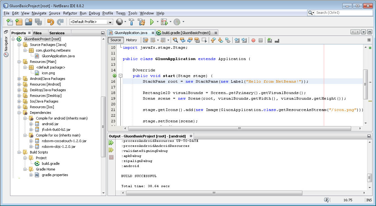
Let’s make a slight change to the code:
StackPane root = new StackPane(new Label("Hello from NetBeans!"));and run it again to see that the new message shows up on your desktop.
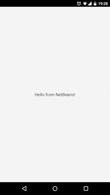
Now you are ready for deploying on an Android or iOS device.
For Android, for instance, select android→android from the tasks list to create the apk or android→androidInstall if you have an Android device connected to your PC.
After the build completes, the application should be installed on your device. Find the application and open it up:
5.1.4. Conclusion
If you have made it here without problems, congratulations!
If you have found any difficulties along the way, please review the lists of prerequisites and try again, and if the problems still persist, you can visit our Forums, and ask any question there if you don’t find a suitable solution.
We encourage you to start developing new projects that can be deployed on desktop, Android and iOS devices using the Gluon plugin on your favorite IDE.
5.2. The Gluon Plugin for IntelliJ IDEA
In this section, we’ll explain briefly how to install the plugin on IntelliJ IDEA and how to use it to create a sample application that can be deployed on desktop, Android and iOS devices. Before you start, be sure that you have checked the list of prerequisites.
5.2.1. Plugin Installation
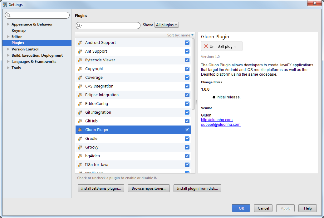
You can get it from here, or you can directly install it from IntelliJ IDEA: click File→Settings and select Plugins on the left. You will see the installed plugins on your system.
Now click Browse Repositories…, find Gluon Plugin, click Install plugin, and confirm installation:
The Gluon Plugin will be downloaded and installed. You may need to restart the IDE.
5.2.2. Creating a new Gluon project
Now that we have the plugin installed, we are going to use it to create a sample application.
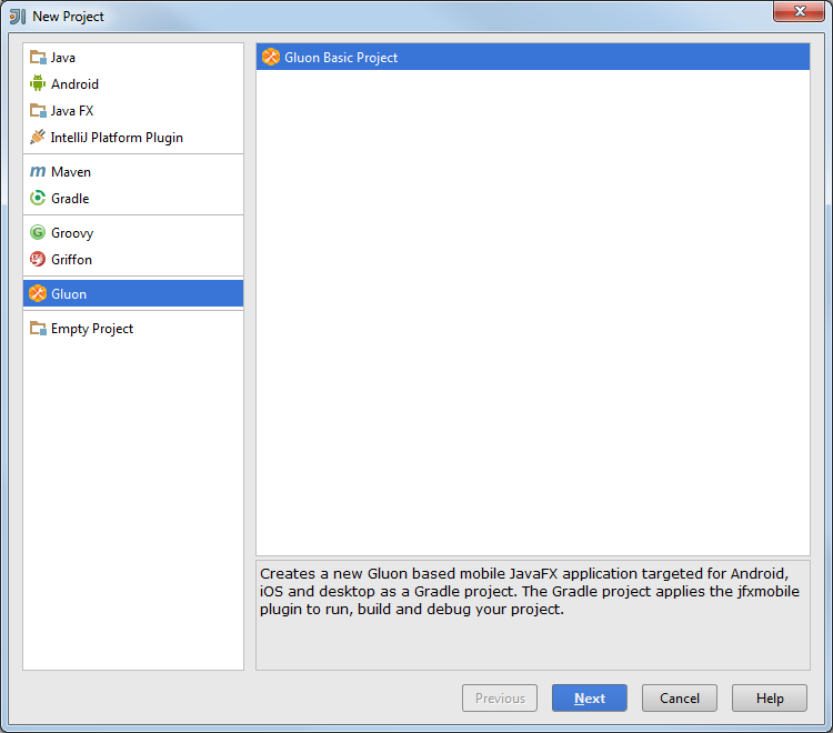
In IntelliJ IDEA, click File→New→Project… and select Gluon on the left, and press Next.
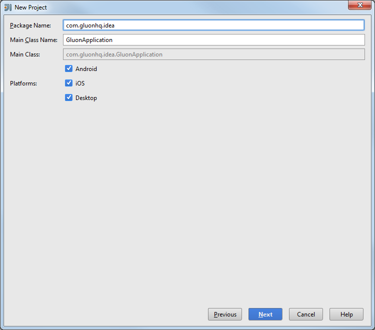
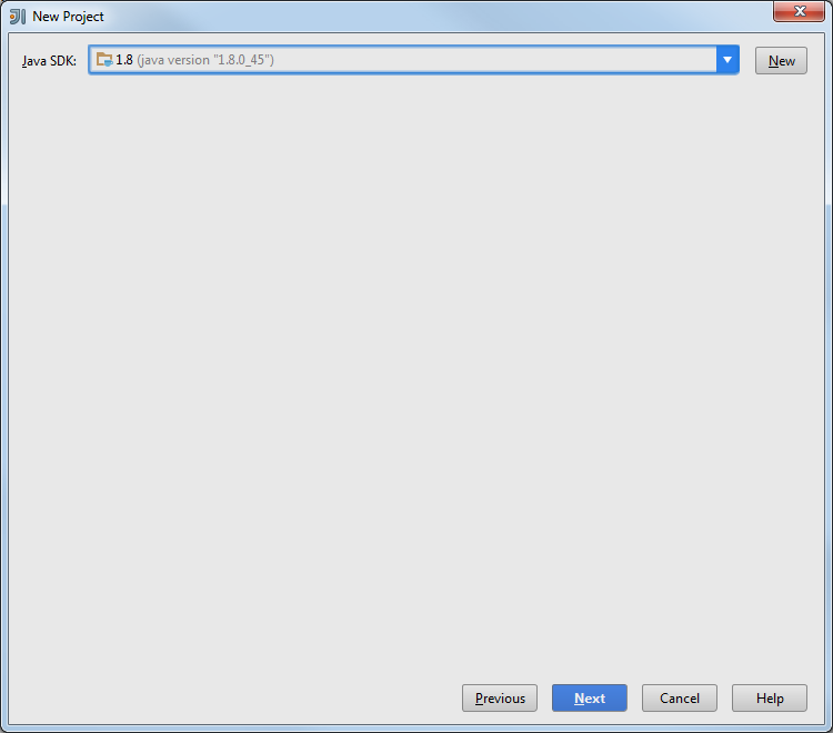
Type the package name and the main class name. Note that you can select what platforms the project will be deployed to. Press Next.
Select a valid Java JDK and press Next.
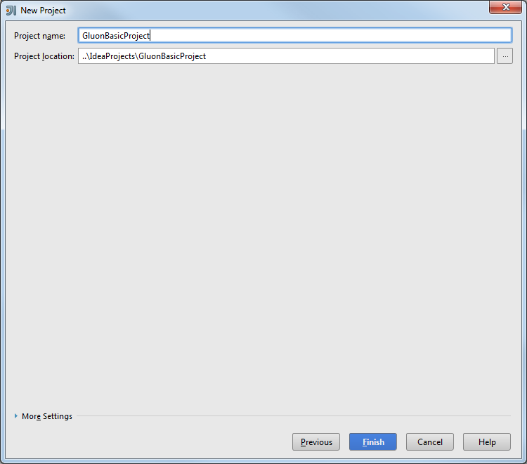
Now find a name and a location for the project and press Finish.
IDEA detects we are trying to import a Gradle project, and asks for some options. We can select the default ones:
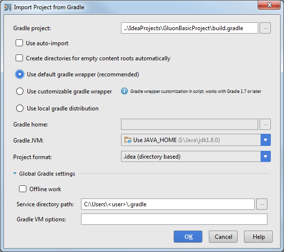
Note that it is really convenient to set the ANDROID_HOME property in the .gradle/gradle.properties file in your user home directory. It should point to an Android SDK folder on your file system.
Press OK and the project will be imported and opened.
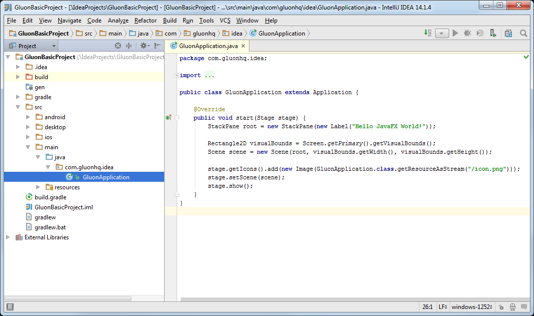
If you are familiar with the JavaFXPorts project, you will see the different folders created:
-
mainfor the code that is common to all platforms -
desktopfor the code that is specific to the desktop -
androidfor the code that is specific to the Android platform -
iosfor the code that is specific to the iOS platform
There’s some default code in our main class, so we’ll be able to run it without adding a single line of code.
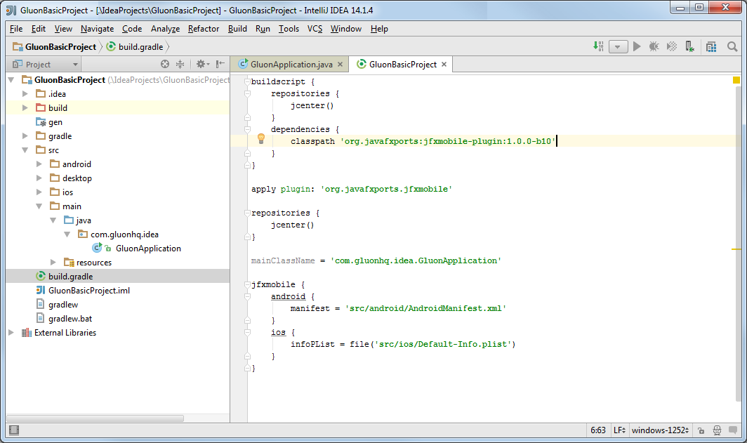
Before that, notice the jfxmobile-plugin is constantly evolving and by the time of this writing the version is 1.0.6, so edit the build.gradle file and update it, if needed to.
5.2.3. Deploying the project
The plugin includes a series of tasks, and to access them we just need to click View→Tool Windows→Gradle and a panel will show up on the right side revealing a list of all the available gradle tasks.
Before deploying on mobile it’s easier to run the application on desktop first and verify that there are no errors.
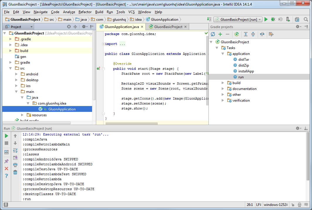
To do that, select application→run from the task list. Verify that all the tasks are executed without errors, and the project runs fine on your desktop.
Let’s make a slight change to the code:
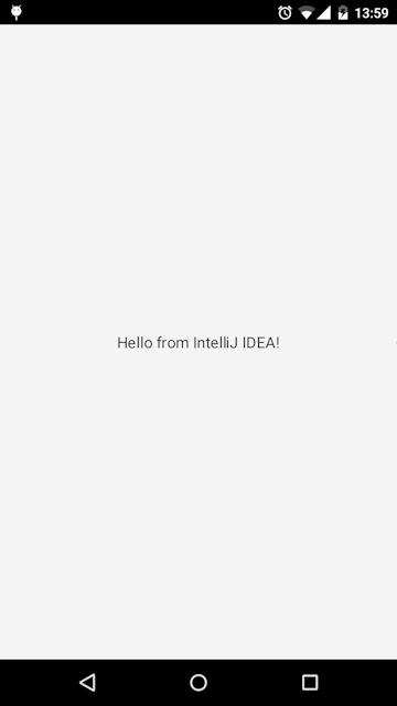
StackPane root = new StackPane(new Label("Hello from IntelliJ IDEA!"));and run it again to see that the new message shows up on your desktop.
Now you are ready for deploying on an Android or iOS device.
For Android, for instance, select other→android from the tasks list to create the apk or other→androidInstall if you have an Android device connected to your PC.
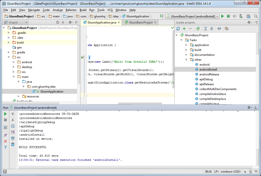
After the build completes, the application should be installed on your device. Find the application and open it up:
5.2.4. Conclusion
If you have made it here without problems, congratulations!
If you have found any difficulties along the way, please review the lists of prerequisites and try again, and if the problems still persist, you can visit our Forums, and ask any question there if you don’t find a suitable solution.
We encourage you to start developing new projects that can be deployed on desktop, Android and iOS devices using the Gluon plugin on your favorite IDE.
5.3. The Gluon Plugin for Eclipse
In this section, we’ll explain briefly how to install the plugin on Eclipse and how to use it to create a sample application that can be deployed on desktop, Android and iOS devices. Before you start, be sure that you have checked the list of prerequisites.
5.3.1. Plugin Installation
Eclipse Marketplace
The easiest way to install the Gluon Plugin can be done through the Eclipse Marketplace. Open Eclipse and choose Help→Eclipse Marketplace….
Type gluon in the search field and press Go to find the plugin.
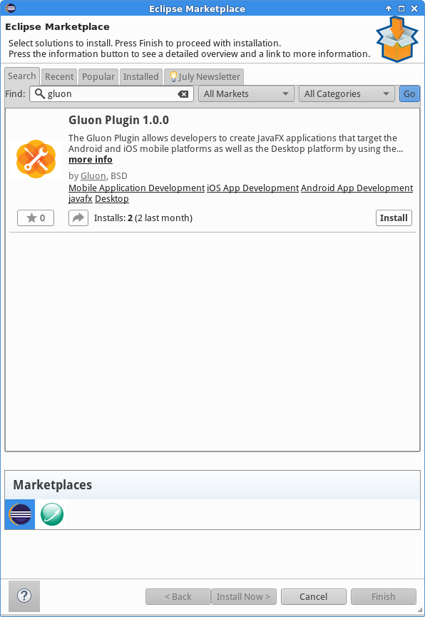
Press the Install button to begin the installation. Select the Gluon package and optionally the e(fx)clipse package. e(fx)clipse is highly recommended as it adds a lot of functionality for JavaFX applications development.
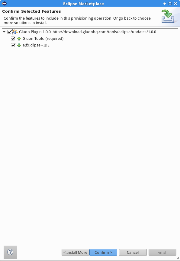
Press Confirm and accept the terms of the license agreements.
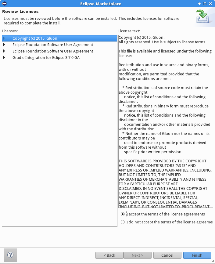
Press Finish to begin the installation of the plugin. The Gluon Plugin will be downloaded and installed.
During the installation process, Eclipse will ask you to trust the Gluon certificate.
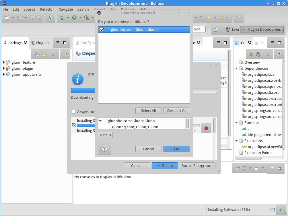
Select the Gluon certificate and click OK to continue the installation. When the installation is completed, Eclipse will ask you to restart your IDE for the changes to take effect.
You can now continue to Creating a new Gluon Project.
Update Site
Alternatively, you can install the Gluon Plugin by providing an update site.
Open Eclipse and choose Help→Install New Software…. Paste the following Update Site URL in the Work with: text field: http://download.gluonhq.com/tools/eclipse/updates/1.0.0.
Select the Gluon package and optionally the e(fx)clipse package. e(fx)clipse is highly recommended as it adds a lot of functionality for JavaFX applications development.
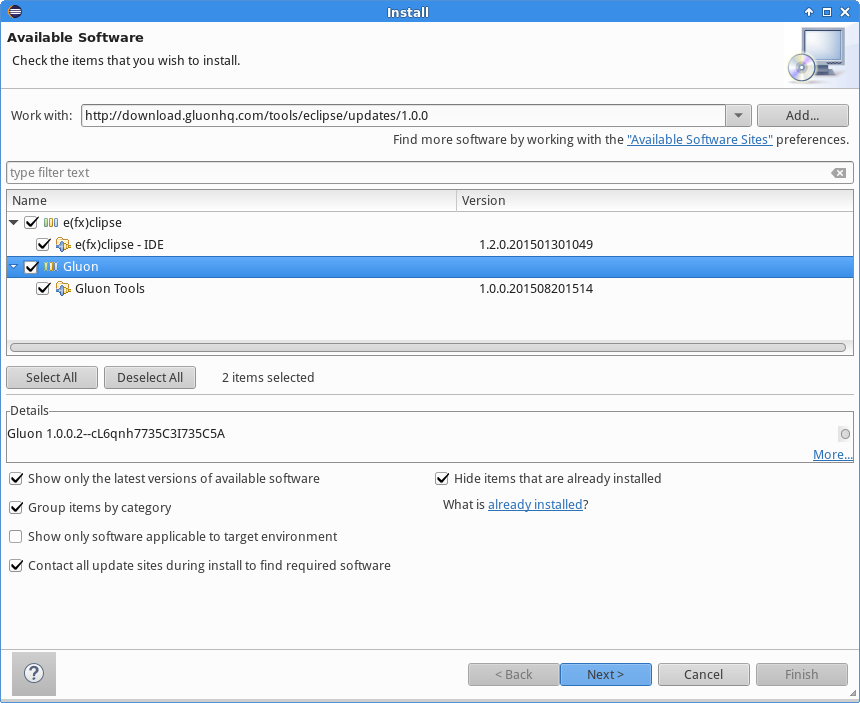
Press Next and review the items that are going to be installed.
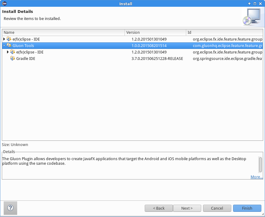
Press Next again and accept the terms of the license agreements.
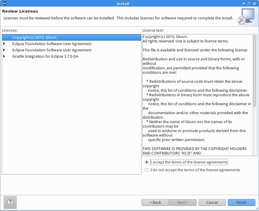
Press Finish to begin the installation of the plugin. The Gluon Plugin will be downloaded and installed.
During the installation process, Eclipse will ask you to trust the Gluon certificate.
Select the Gluon certificate and click OK to continue the installation. When the installation is completed, Eclipse will ask you to restart your IDE for the changes to take effect.
5.3.2. Creating a new Gluon project
Now that the plugin is installed, we can use it to create a sample application.
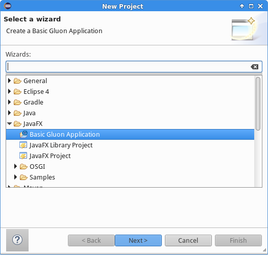
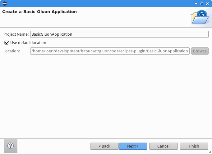
In Eclipse, click File→New→Project… and select Basic Gluon Application from the JavaFX category and click Next.
Provide a name for the project, optionally choose a custom location to store the project and click Next.
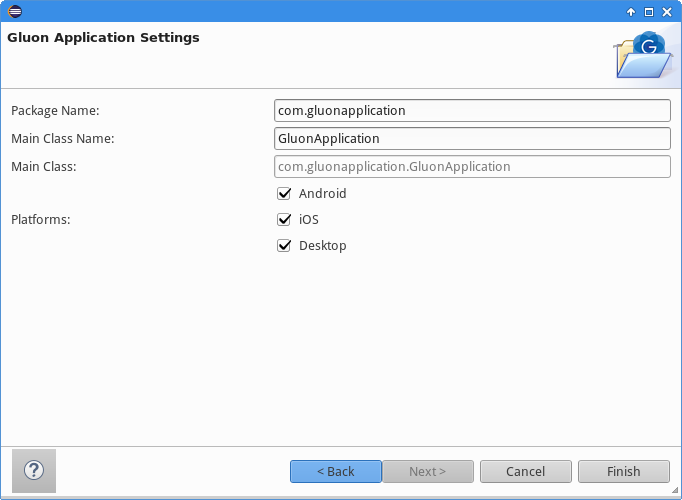
The plugin will generate a JavaFX application class. In the following step you can configure the name of the package and the name of the class that will be generated. Furthermore, the plugin will prepare the directory structure and necessary files for every selected platform. Click Finish to complete the creation of the Gluon project.
Please note, creating a Gluon project for the first time, might take a while to complete. This is because the gradle build process will initially download all the dependencies of the project.
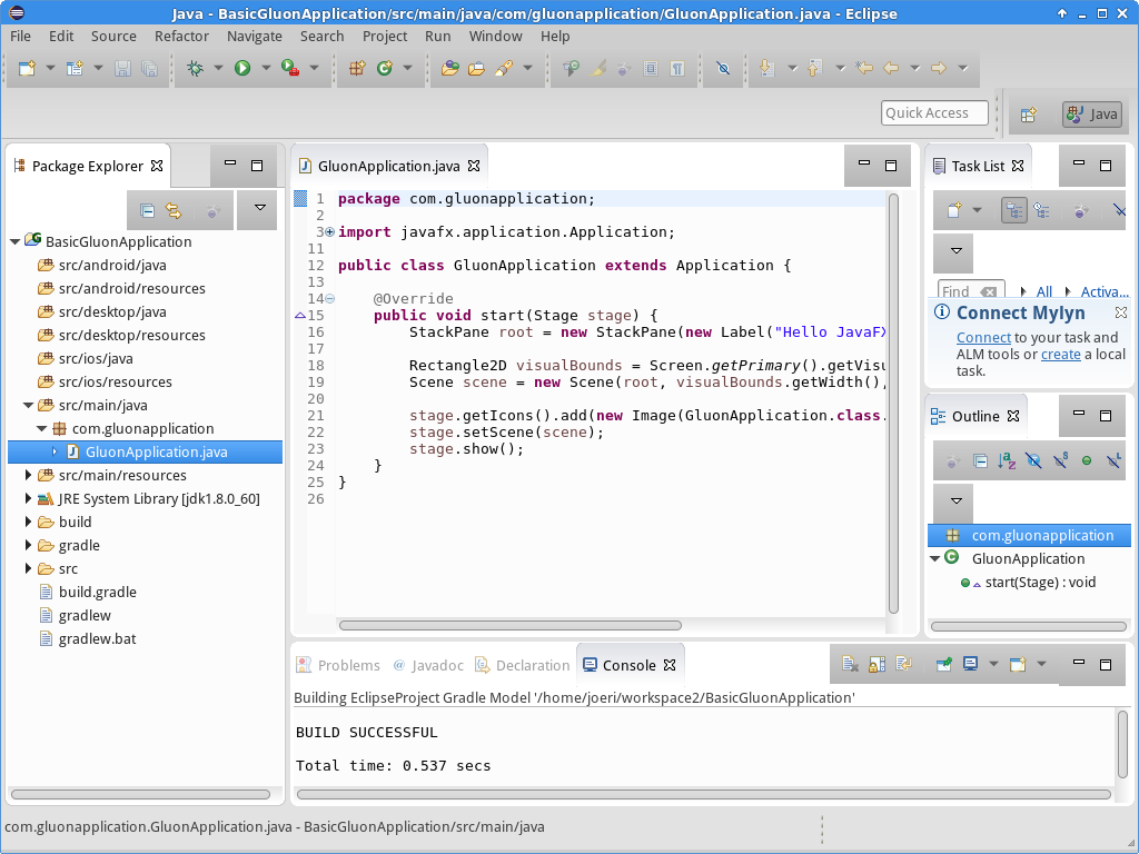
If you are familiar with the JavaFXPorts project, you will see the different folders created:
-
mainfor code that is common to all platforms -
desktopfor code that should only run on a desktop -
androidfor Android specific code -
iosfor iOS specific code
There’s also the default JavaFX application class, so we’ll be able to run it without adding a single line of code.
5.3.3. Deploying the application
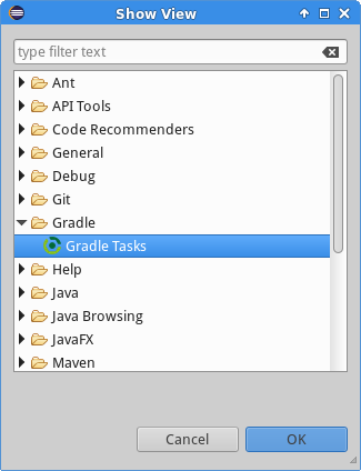
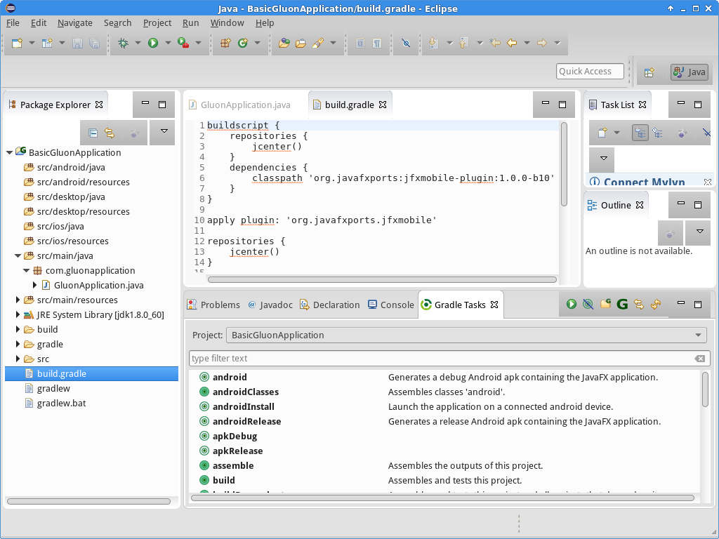
The project that is created by the plugin is a Gradle project, which already has the jfxmobile-plugin applied. The jfxmobile-plugin provides a series of gradle tasks that can be used to run your application on any of the supported platforms. To get an overview of the different tasks, open the Gradle Tasks view by selecting Window→Show View→Other…. You can find the view under the Gradle category.
In the Gradle Tasks view, select the project you just created in the Project combobox and it will load all the available gradle tasks.
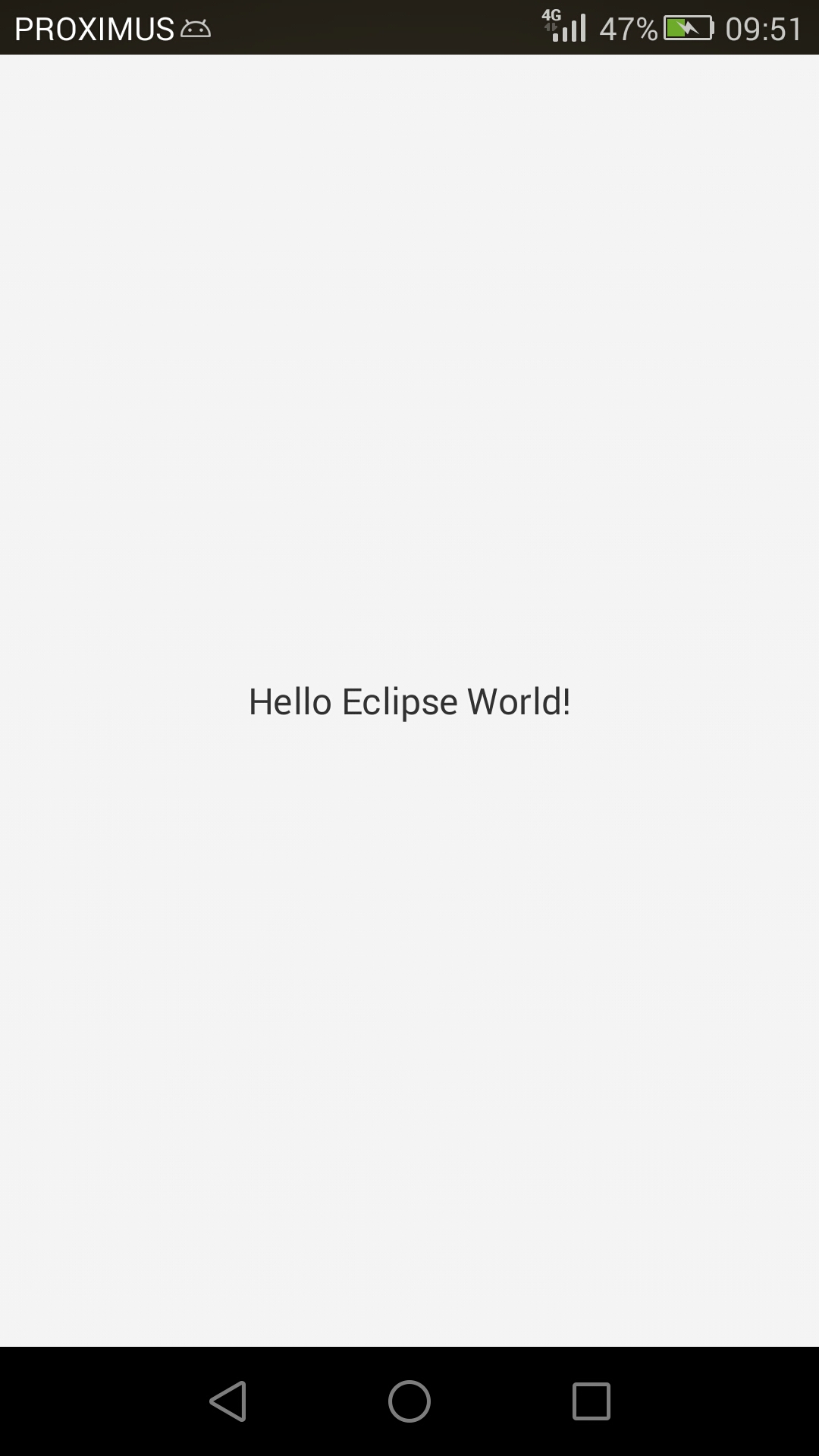
Before deploying on mobile it’s easier to run the application on desktop first to verify there are no errors. Double click the run task from the list of tasks to launch the application on your desktop. After a while, a window should appear showing a label with a single line of text: “Hello JavaFX World!”. If all went fine we can make a small change to the code. Update the text of the label on line 16 to the following:
StackPane root = new StackPane(new Label("Hello Eclipse World!"));Run the application again to verify that the text inside the label has changed. As a final task, we can try and install the application on a mobile device. Again, make sure that you have followed the prerequisites of the jfxmobile plugin for the platform that you are going to install the application to. When you are ready and your mobile device is plugged in, choose the task androidInstall for Android, or launchIOSDevice for iOS. Please note, that any of these tasks might take a while to complete. Especially for iOS, because when the task is run for the first time, it has to convert the entire RoboVM and JavaFX runtime to iOS native code. If everything went successful, you should see something on your device like the screenshot below:
5.3.4. Conclusion
If you have made this far without problems, congratulations!
If you have found any difficulties along the way, please review the prerequisites and try again. If the problems persist, you can visit our Support Forums and ask any question there if you don’t find a suitable solution.
We encourage you to start developing new applications that can be deployed on desktop, Android and iOS devices using the Gluon Plugin on your favorite IDE.