- java.lang.Object
-
- javafx.scene.Node
-
- javafx.scene.Parent
-
- javafx.scene.layout.Region
-
- javafx.scene.control.Control
-
- com.gluonhq.charm.glisten.control.NavigationDrawer
-
- All Implemented Interfaces:
Styleable,EventTarget,Skinnable
@DefaultProperty("items")
public class NavigationDrawer
extends Control
NavigationDrawer is a panel that displays the application main navigation options on the edge of the screen. It is hidden most of the time, but is revealed whenopen()is called. This method is generally called when the user touches the nav icon in theAppBar.NavigationDrawer can be initialized on demand and made available throughout the application via
AppManager.getDrawer(). This is recommended way of using this control.Navigation Drawer is logically divided into three vertical sections:
- Header - Top most section of Navigation Drawer and usually consists of
an image, title and subtitle. The recommended node for header is
NavigationDrawer.Header. However, a user is not restricted to useNavigationDrawer.Headerand can use anyNode, with custom style(s). - Items - The list of nodes that a user wants to display beneath the header node.
The recommended node for items is
NavigationDrawer.Item. However, a user is not restricted to useNavigationDrawer.Itemand can use anyNode, with custom style(s). - Footer - Bottom most section of the Navigation Drawer and is usually used for
showing secondary items like help, settings, and feedback. These items
cannot be selected i.e. they do not retain a special selection style when clicked or pressed unlike,
NavigationDrawer.Item. The recommended node for footer isNavigationDrawer.Footer. However, a user is not restricted to useNavigationDrawer.Footerand can use anyNode, with custom style(s).
None of the above sections are mandatory. A user may set one or more sections as per their requirements.
Example
The following example creates a
Viewthat has a navigation button which, when pressed, shows aSidePopupViewwith a NavigationDrawer. ThatViewis set as the initialView.public class NavigationDrawerSample extends MobileApplication { @Override public void init() { NavigationDrawer navigationDrawer = getDrawer(); Header header = new Header("GluonHQ", "support@gluonhq.com"); navigationDrawer.setHeader(header); navigationDrawer.getItems().setAll(new Item("Inbox", MaterialDesignIcon.INBOX.graphic()), new Item("Starred", MaterialDesignIcon.STAR.graphic())); Node footer = new Footer("Settings", MaterialDesignIcon.SETTINGS.graphic()); navigationDrawer.setFooter(footer); addViewFactory(HOME_VIEW, () -> { View view = new View(); view.showingProperty().addListener((obs, oldValue, newValue) -> { if (newValue) { AppBar appBar = MobileApplication.getInstance().getAppBar(); Button navButton = MaterialDesignIcon.MENU.button(); navButton.setOnAction(event -> navigationDrawer.open()); appBar.setNavIcon(navButton); appBar.setTitleText("NavigationDrawer"); } }); return view; }); } }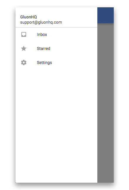
- Since:
- 2.0.0
-
-
Property Summary
Properties Type Property Description ObjectProperty<Node>footerThe footer represents the bottom most node of Navigation Drawer and is usually used for showing secondary items like help, settings, and feedback.ObjectProperty<Node>headerThe header represents the top most node of Navigation Drawer and usually consists of an image, title and subtitle.ReadOnlyBooleanPropertyopenRepresents whether this NavigationDrawer is currently open or close.ReadOnlyObjectProperty<Node>selectedItemRefers to the selected item property, which is used to indicate the currently selected item in the selection model.ObjectProperty<Side>sideDefines the side from which this NavigationDrawer will draw itself out.-
Properties inherited from class javafx.scene.control.Control
contextMenu, skin, tooltip
-
Properties inherited from class javafx.scene.layout.Region
background, border, cacheShape, centerShape, height, insets, maxHeight, maxWidth, minHeight, minWidth, opaqueInsets, padding, prefHeight, prefWidth, scaleShape, shape, snapToPixel, width
-
Properties inherited from class javafx.scene.Parent
needsLayout
-
Properties inherited from class javafx.scene.Node
accessibleHelp, accessibleRoleDescription, accessibleRole, accessibleText, blendMode, boundsInLocal, boundsInParent, cacheHint, cache, clip, cursor, depthTest, disabled, disable, effectiveNodeOrientation, effect, eventDispatcher, focused, focusTraversable, focusVisible, focusWithin, hover, id, inputMethodRequests, layoutBounds, layoutX, layoutY, localToParentTransform, localToSceneTransform, managed, mouseTransparent, nodeOrientation, onContextMenuRequested, onDragDetected, onDragDone, onDragDropped, onDragEntered, onDragExited, onDragOver, onInputMethodTextChanged, onKeyPressed, onKeyReleased, onKeyTyped, onMouseClicked, onMouseDragEntered, onMouseDragExited, onMouseDragged, onMouseDragOver, onMouseDragReleased, onMouseEntered, onMouseExited, onMouseMoved, onMousePressed, onMouseReleased, onRotate, onRotationFinished, onRotationStarted, onScrollFinished, onScroll, onScrollStarted, onSwipeDown, onSwipeLeft, onSwipeRight, onSwipeUp, onTouchMoved, onTouchPressed, onTouchReleased, onTouchStationary, onZoomFinished, onZoom, onZoomStarted, opacity, parent, pickOnBounds, pressed, rotate, rotationAxis, scaleX, scaleY, scaleZ, scene, style, translateX, translateY, translateZ, viewOrder, visible
-
-
Nested Class Summary
Nested Classes Modifier and Type Class Description static classNavigationDrawer.FooterA convenience class for creating a default footer forNavigationDrawerwith styled implementations according to Material Design Guidelines.static classNavigationDrawer.HeaderA convenience class for creating a default header forNavigationDrawerwith styled implementations according to Material Design Guidelines.static classNavigationDrawer.ItemA convenience class for creating a default items forNavigationDrawerwith styled implementations according to Material Design Guidelines.static classNavigationDrawer.ViewItemA convenience class for creating a default items forNavigationDrawerwith styled implementations according to Material Design Guidelines.
-
Field Summary
Fields Modifier and Type Field Description static EventType<Event>ITEM_SELECTEDEvent type that happens whenever a item on the drawer is selected, regardless if it was already selected or not-
Fields inherited from class javafx.scene.layout.Region
USE_COMPUTED_SIZE, USE_PREF_SIZE
-
Fields inherited from class javafx.scene.Node
BASELINE_OFFSET_SAME_AS_HEIGHT
-
-
Constructor Summary
Constructors Constructor Description NavigationDrawer()Creates a default NavigationDrawer.NavigationDrawer(ObservableList<Node> items)Creates a default NavigationDrawer which will stack the contents retrieved from the provideditemsvertically.NavigationDrawer(Node header, ObservableList<Node> items)Creates a default NavigationDrawer which will stack the contents retrieved from the provided header anditemsvertically.NavigationDrawer(Node header, Node footer, ObservableList<Node> items)Creates a default NavigationDrawer which will stack the contents retrieved from the provided header, footer anditems.
-
Method Summary
All Methods Instance Methods Concrete Methods Modifier and Type Method Description voidclose()Animates the NavigationDrawer out of the view.protected Skin<?>createDefaultSkin()ObjectProperty<Node>footerProperty()The footer represents the bottom most node of Navigation Drawer and is usually used for showing secondary items like help, settings, and feedback.NodegetFooter()Returns an node which is used as the footer of NavigationDrawer.NodegetHeader()Returns an object of the header.ObservableList<Node>getItems()Returns anObservableListthat contains the items currently being shown to the user in the content area.NodegetSelectedItem()Returns the currently selected object.SidegetSide()Gets the value of the property side.ObjectProperty<Node>headerProperty()The header represents the top most node of Navigation Drawer and usually consists of an image, title and subtitle.booleanisOpen()Represents whether this NavigationDrawer is currently open or close.voidopen()Animates the NavigationDrawer into the view.ReadOnlyBooleanPropertyopenProperty()Represents whether this NavigationDrawer is currently open or close.ReadOnlyObjectProperty<Node>selectedItemProperty()Refers to the selected item property, which is used to indicate the currently selected item in the selection model.voidsetFooter(Node footer)Sets the underlying footer for the NavigationDrawer.voidsetHeader(Node header)Sets the underlying header for the NavigationDrawer.voidsetSelectedItem(Node value)Sets the value of the property selectedItem.voidsetSide(Side value)Sets the value of the property side.ObjectProperty<Side>sideProperty()Defines the side from which this NavigationDrawer will draw itself out.-
Methods inherited from class javafx.scene.control.Control
computeMaxHeight, computeMaxWidth, computeMinHeight, computeMinWidth, computePrefHeight, computePrefWidth, contextMenuProperty, executeAccessibleAction, getBaselineOffset, getClassCssMetaData, getContextMenu, getControlCssMetaData, getCssMetaData, getInitialFocusTraversable, getSkin, getTooltip, isResizable, layoutChildren, queryAccessibleAttribute, setContextMenu, setSkin, setTooltip, skinProperty, tooltipProperty
-
Methods inherited from class javafx.scene.layout.Region
backgroundProperty, borderProperty, cacheShapeProperty, centerShapeProperty, getBackground, getBorder, getHeight, getInsets, getMaxHeight, getMaxWidth, getMinHeight, getMinWidth, getOpaqueInsets, getPadding, getPrefHeight, getPrefWidth, getShape, getUserAgentStylesheet, getWidth, heightProperty, insetsProperty, isCacheShape, isCenterShape, isScaleShape, isSnapToPixel, layoutInArea, layoutInArea, layoutInArea, layoutInArea, maxHeight, maxHeightProperty, maxWidth, maxWidthProperty, minHeight, minHeightProperty, minWidth, minWidthProperty, opaqueInsetsProperty, paddingProperty, positionInArea, positionInArea, prefHeight, prefHeightProperty, prefWidth, prefWidthProperty, resize, scaleShapeProperty, setBackground, setBorder, setCacheShape, setCenterShape, setHeight, setMaxHeight, setMaxSize, setMaxWidth, setMinHeight, setMinSize, setMinWidth, setOpaqueInsets, setPadding, setPrefHeight, setPrefSize, setPrefWidth, setScaleShape, setShape, setSnapToPixel, setWidth, shapeProperty, snappedBottomInset, snappedLeftInset, snappedRightInset, snappedTopInset, snapPosition, snapPositionX, snapPositionY, snapSize, snapSizeX, snapSizeY, snapSpace, snapSpaceX, snapSpaceY, snapToPixelProperty, widthProperty
-
Methods inherited from class javafx.scene.Parent
getChildren, getChildrenUnmodifiable, getManagedChildren, getStylesheets, isNeedsLayout, layout, lookup, needsLayoutProperty, requestLayout, requestParentLayout, setNeedsLayout, updateBounds
-
Methods inherited from class javafx.scene.Node
accessibleHelpProperty, accessibleRoleDescriptionProperty, accessibleRoleProperty, accessibleTextProperty, addEventFilter, addEventHandler, applyCss, autosize, blendModeProperty, boundsInLocalProperty, boundsInParentProperty, buildEventDispatchChain, cacheHintProperty, cacheProperty, clipProperty, computeAreaInScreen, contains, contains, cursorProperty, depthTestProperty, disabledProperty, disableProperty, effectiveNodeOrientationProperty, effectProperty, eventDispatcherProperty, fireEvent, focusedProperty, focusTraversableProperty, focusVisibleProperty, focusWithinProperty, getAccessibleHelp, getAccessibleRole, getAccessibleRoleDescription, getAccessibleText, getBlendMode, getBoundsInLocal, getBoundsInParent, getCacheHint, getClip, getContentBias, getCursor, getDepthTest, getEffect, getEffectiveNodeOrientation, getEventDispatcher, getId, getInitialCursor, getInputMethodRequests, getLayoutBounds, getLayoutX, getLayoutY, getLocalToParentTransform, getLocalToSceneTransform, getNodeOrientation, getOnContextMenuRequested, getOnDragDetected, getOnDragDone, getOnDragDropped, getOnDragEntered, getOnDragExited, getOnDragOver, getOnInputMethodTextChanged, getOnKeyPressed, getOnKeyReleased, getOnKeyTyped, getOnMouseClicked, getOnMouseDragEntered, getOnMouseDragExited, getOnMouseDragged, getOnMouseDragOver, getOnMouseDragReleased, getOnMouseEntered, getOnMouseExited, getOnMouseMoved, getOnMousePressed, getOnMouseReleased, getOnRotate, getOnRotationFinished, getOnRotationStarted, getOnScroll, getOnScrollFinished, getOnScrollStarted, getOnSwipeDown, getOnSwipeLeft, getOnSwipeRight, getOnSwipeUp, getOnTouchMoved, getOnTouchPressed, getOnTouchReleased, getOnTouchStationary, getOnZoom, getOnZoomFinished, getOnZoomStarted, getOpacity, getParent, getProperties, getPseudoClassStates, getRotate, getRotationAxis, getScaleX, getScaleY, getScaleZ, getScene, getStyle, getStyleableParent, getStyleClass, getTransforms, getTranslateX, getTranslateY, getTranslateZ, getTypeSelector, getUserData, getViewOrder, hasProperties, hoverProperty, idProperty, inputMethodRequestsProperty, intersects, intersects, isCache, isDisable, isDisabled, isFocused, isFocusTraversable, isFocusVisible, isFocusWithin, isHover, isManaged, isMouseTransparent, isPickOnBounds, isPressed, isVisible, layoutBoundsProperty, layoutXProperty, layoutYProperty, localToParent, localToParent, localToParent, localToParent, localToParent, localToParentTransformProperty, localToScene, localToScene, localToScene, localToScene, localToScene, localToScene, localToScene, localToScene, localToScene, localToScene, localToSceneTransformProperty, localToScreen, localToScreen, localToScreen, localToScreen, localToScreen, lookupAll, managedProperty, mouseTransparentProperty, nodeOrientationProperty, notifyAccessibleAttributeChanged, onContextMenuRequestedProperty, onDragDetectedProperty, onDragDoneProperty, onDragDroppedProperty, onDragEnteredProperty, onDragExitedProperty, onDragOverProperty, onInputMethodTextChangedProperty, onKeyPressedProperty, onKeyReleasedProperty, onKeyTypedProperty, onMouseClickedProperty, onMouseDragEnteredProperty, onMouseDragExitedProperty, onMouseDraggedProperty, onMouseDragOverProperty, onMouseDragReleasedProperty, onMouseEnteredProperty, onMouseExitedProperty, onMouseMovedProperty, onMousePressedProperty, onMouseReleasedProperty, onRotateProperty, onRotationFinishedProperty, onRotationStartedProperty, onScrollFinishedProperty, onScrollProperty, onScrollStartedProperty, onSwipeDownProperty, onSwipeLeftProperty, onSwipeRightProperty, onSwipeUpProperty, onTouchMovedProperty, onTouchPressedProperty, onTouchReleasedProperty, onTouchStationaryProperty, onZoomFinishedProperty, onZoomProperty, onZoomStartedProperty, opacityProperty, parentProperty, parentToLocal, parentToLocal, parentToLocal, parentToLocal, parentToLocal, pickOnBoundsProperty, pressedProperty, pseudoClassStateChanged, relocate, removeEventFilter, removeEventHandler, requestFocus, resizeRelocate, rotateProperty, rotationAxisProperty, scaleXProperty, scaleYProperty, scaleZProperty, sceneProperty, sceneToLocal, sceneToLocal, sceneToLocal, sceneToLocal, sceneToLocal, sceneToLocal, sceneToLocal, sceneToLocal, screenToLocal, screenToLocal, screenToLocal, setAccessibleHelp, setAccessibleRole, setAccessibleRoleDescription, setAccessibleText, setBlendMode, setCache, setCacheHint, setClip, setCursor, setDepthTest, setDisable, setDisabled, setEffect, setEventDispatcher, setEventHandler, setFocused, setFocusTraversable, setHover, setId, setInputMethodRequests, setLayoutX, setLayoutY, setManaged, setMouseTransparent, setNodeOrientation, setOnContextMenuRequested, setOnDragDetected, setOnDragDone, setOnDragDropped, setOnDragEntered, setOnDragExited, setOnDragOver, setOnInputMethodTextChanged, setOnKeyPressed, setOnKeyReleased, setOnKeyTyped, setOnMouseClicked, setOnMouseDragEntered, setOnMouseDragExited, setOnMouseDragged, setOnMouseDragOver, setOnMouseDragReleased, setOnMouseEntered, setOnMouseExited, setOnMouseMoved, setOnMousePressed, setOnMouseReleased, setOnRotate, setOnRotationFinished, setOnRotationStarted, setOnScroll, setOnScrollFinished, setOnScrollStarted, setOnSwipeDown, setOnSwipeLeft, setOnSwipeRight, setOnSwipeUp, setOnTouchMoved, setOnTouchPressed, setOnTouchReleased, setOnTouchStationary, setOnZoom, setOnZoomFinished, setOnZoomStarted, setOpacity, setPickOnBounds, setPressed, setRotate, setRotationAxis, setScaleX, setScaleY, setScaleZ, setStyle, setTranslateX, setTranslateY, setTranslateZ, setUserData, setViewOrder, setVisible, snapshot, snapshot, startDragAndDrop, startFullDrag, styleProperty, toBack, toFront, toString, translateXProperty, translateYProperty, translateZProperty, usesMirroring, viewOrderProperty, visibleProperty
-
Methods inherited from class java.lang.Object
clone, equals, finalize, getClass, hashCode, notify, notifyAll, wait, wait, wait
-
Methods inherited from interface javafx.css.Styleable
getStyleableNode
-
-
-
-
Property Detail
-
header
public final ObjectProperty<Node> headerProperty
The header represents the top most node of Navigation Drawer and usually consists of an image, title and subtitle.- Returns:
- An
ObjectPropertycontaining the header instance.
-
footer
public final ObjectProperty<Node> footerProperty
The footer represents the bottom most node of Navigation Drawer and is usually used for showing secondary items like help, settings, and feedback.- See Also:
getFooter(),setFooter(Node)
-
selectedItem
public final ReadOnlyObjectProperty<Node> selectedItemProperty
Refers to the selected item property, which is used to indicate the currently selected item in the selection model. Since NavigationDrawer do not show selected item. The selected item is the item corresponding to which user can do an action. For example, change the view. In NavigationDrawer, the selected item is either null, to represent that there is no selection, or an Object that is retrieved from the underlying data model of the control the selection model is associated with.Whenever a change is triggered, a call to
close()is made automatically. To change this behavior,NavigationDrawer.Item.autoCloseshould be set to false.- See Also:
getSelectedItem(),setSelectedItem(Node)
-
side
public final ObjectProperty<Side> sideProperty
Defines the side from which this NavigationDrawer will draw itself out.- Default value:
Side.LEFT- Since:
- 5.0.0
- See Also:
getSide(),setSide(Side)
-
open
public final ReadOnlyBooleanProperty openProperty
Represents whether this NavigationDrawer is currently open or close.- Since:
- 5.0.0
- See Also:
isOpen()
-
-
Constructor Detail
-
NavigationDrawer
public NavigationDrawer()
Creates a default NavigationDrawer.
-
NavigationDrawer
public NavigationDrawer(ObservableList<Node> items)
Creates a default NavigationDrawer which will stack the contents retrieved from the provideditemsvertically.- Parameters:
items- An ObservableList ofnodesto set as items in Navigation Drawer.
-
NavigationDrawer
public NavigationDrawer(Node header, ObservableList<Node> items)
Creates a default NavigationDrawer which will stack the contents retrieved from the provided header anditemsvertically.- Parameters:
header- The header of Navigation Drawer.items- An ObservableList ofnodesto set as items in Navigation Drawer.
-
NavigationDrawer
public NavigationDrawer(Node header, Node footer, ObservableList<Node> items)
Creates a default NavigationDrawer which will stack the contents retrieved from the provided header, footer anditems.- Parameters:
header- The header of Navigation Drawer.footer- The footer of Navigation Drawer.items- An ObservableList ofnodesto set as items in Navigation Drawer.
-
-
Method Detail
-
open
public void open()
Animates the NavigationDrawer into the view.- Since:
- 5.0.0
-
close
public void close()
Animates the NavigationDrawer out of the view.- Since:
- 5.0.0
-
getHeader
public final Node getHeader()
Returns an object of the header.- Returns:
- A
Nodecontaining the header object.
-
headerProperty
public final ObjectProperty<Node> headerProperty()
The header represents the top most node of Navigation Drawer and usually consists of an image, title and subtitle.- Returns:
- An
ObjectPropertycontaining the header instance.
-
setHeader
public final void setHeader(Node header)
Sets the underlying header for the NavigationDrawer. The header when set here is fixed and cannot be scrolled. If you want the header to scroll, place it inside items.Normally, a user is advised to add a
NavigationDrawer.Headeras the node. ANavigationDrawer.Headerprovides appropriate methods to set the necessary details and it receives the appropriate styling automatically. Nevertheless, a user is not restricted to aNavigationDrawer.Headerand may add any node with custom style.- Parameters:
header- The header node of theNavigationDrawer.
-
getFooter
public final Node getFooter()
Returns an node which is used as the footer of NavigationDrawer.- Returns:
- A
Nodecontaining the footer object.
-
footerProperty
public final ObjectProperty<Node> footerProperty()
The footer represents the bottom most node of Navigation Drawer and is usually used for showing secondary items like help, settings, and feedback.- See Also:
getFooter(),setFooter(Node)
-
setFooter
public final void setFooter(Node footer)
Sets the underlying footer for the NavigationDrawer. The footer when set here is fixed and cannot be scrolled. If you want the footer to scroll, place it inside items.Normally, a user is advised to add a
NavigationDrawer.Footeras the node. ANavigationDrawer.Footerprovides appropriate methods to set the necessary details and receives the appropriate styling automatically. Nevertheless, a user is not restricted to a footer and may add any node with custom style.- Parameters:
footer- The footer node of Navigation Drawer.
-
getItems
public final ObservableList<Node> getItems()
Returns anObservableListthat contains the items currently being shown to the user in the content area.- Returns:
- An
ObservableListcontaining the items to be shown to the user.
-
selectedItemProperty
public final ReadOnlyObjectProperty<Node> selectedItemProperty()
Refers to the selected item property, which is used to indicate the currently selected item in the selection model. Since NavigationDrawer do not show selected item. The selected item is the item corresponding to which user can do an action. For example, change the view. In NavigationDrawer, the selected item is either null, to represent that there is no selection, or an Object that is retrieved from the underlying data model of the control the selection model is associated with.Whenever a change is triggered, a call to
close()is made automatically. To change this behavior,NavigationDrawer.Item.autoCloseshould be set to false.- See Also:
getSelectedItem(),setSelectedItem(Node)
-
setSelectedItem
public final void setSelectedItem(Node value)
Sets the value of the property selectedItem.- Property description:
- Refers to the selected item property, which is used to indicate
the currently selected item in the selection model. Since NavigationDrawer do
not show selected item. The selected item is the item corresponding to which
user can do an action. For example, change the view.
In NavigationDrawer, the selected item is either null,
to represent that there is no selection, or an Object that is retrieved
from the underlying data model of the control the selection model is
associated with.
Whenever a change is triggered, a call to
close()is made automatically. To change this behavior,NavigationDrawer.Item.autoCloseshould be set to false.
-
getSelectedItem
public final Node getSelectedItem()
Returns the currently selected object.- Returns:
- The selected node.
-
sideProperty
public final ObjectProperty<Side> sideProperty()
Defines the side from which this NavigationDrawer will draw itself out.- Default value:
Side.LEFT- Since:
- 5.0.0
- See Also:
getSide(),setSide(Side)
-
getSide
public final Side getSide()
Gets the value of the property side.- Property description:
- Defines the side from which this NavigationDrawer will draw itself out.
- Default value:
Side.LEFT- Since:
- 5.0.0
-
setSide
public final void setSide(Side value)
Sets the value of the property side.- Property description:
- Defines the side from which this NavigationDrawer will draw itself out.
- Default value:
Side.LEFT- Since:
- 5.0.0
-
openProperty
public final ReadOnlyBooleanProperty openProperty()
Represents whether this NavigationDrawer is currently open or close.- Since:
- 5.0.0
- See Also:
isOpen()
-
isOpen
public final boolean isOpen()
Represents whether this NavigationDrawer is currently open or close.- Returns:
- A boolean representing whether the NavigationDrawer is open or closed.
- Since:
- 5.0.0
-
createDefaultSkin
protected Skin<?> createDefaultSkin()
- Overrides:
createDefaultSkinin classControl
-
-